About 40-90 hours a year the spot price is over $1000/MWh. This adds about 15%-30% to the annual average cost
Generators able to supply when others can’t make lots of money, maybe $500 m of revenue in South Australia last year. That suggests there is a good market entry opportunity for reserve batteries. Let’s assume a battery installed has a cost of $0.65 m/MWh. To get a 10% revenue to cost ratio you need $65,000 revenue per year. If you ran that battery last year for the 70 or so hours when the price was over $1000 you would have received $315,000 or basically more than 50% of the battery’s cost recovered in the first year. That assumes you were able to operate your battery in every one of those hours, but due to duration you would have missed some. Still in the past 12 months a 5 hour battery would have covered you for all those peak hours and across the NEM over the past 5 years a 2 hour battery would have covered the vast majority of high price events.
This analysis tends to support a view that Governments eg State Owned Gentailers, not a business class I approve of, could get far more bang for their buck by building reserve battery capacity than stuffing round with your Borumbas and your Snowys and whatever other pumped hydro thing is out there. You could do it with gas as well, but far better to have some quick to install, installable on the distribution networks, distributed reserve capacity. Such batteries could also provide sub station level black out support and so on.
It’s fair to say gentailers including Snowy have a lot of market power in this space. But equally I think they have a lot to lose. If coal generators are getting a significant quantity of revenue from 1% of the hours in the year, and that can be competed away just like that, then I would see it as a material risk.
Nor is it wrong in my opinion for gentailers to take advantage of those times. The high prices are essential, absolutely essential to provide the market signal and the rewards for supply that is held in reserve for exactly those times. However what we don’t want is to have all that reserve supply held by an oligopoly. We want enough supply so that the scarcity/rationing price provides a return to reserve supply but no more.
Right now that scarcity price is too high, sending the signal that more supply in that space is needed.
What you see isn’t what you get
Recently I’ve been working on the ITK AEMO dashboard with lots of wonderful charts.
One of the visualisations I was working on was prices. So I showed the dashboard to my brother and my nephew looking for a pat on the back and got the usual “very good Uncle Dave what’s the footie score” but they did ask about the variability of prices which I wasn’t showing. I promised them I’d do something and in the course of doing it was reminded about optical illusions. What you see isn’t what you get.
Here’s the entire prices tab of the dashboard. Don’t bother looking at this unless you have a desktop monitor, its not designed for phones (responsive)
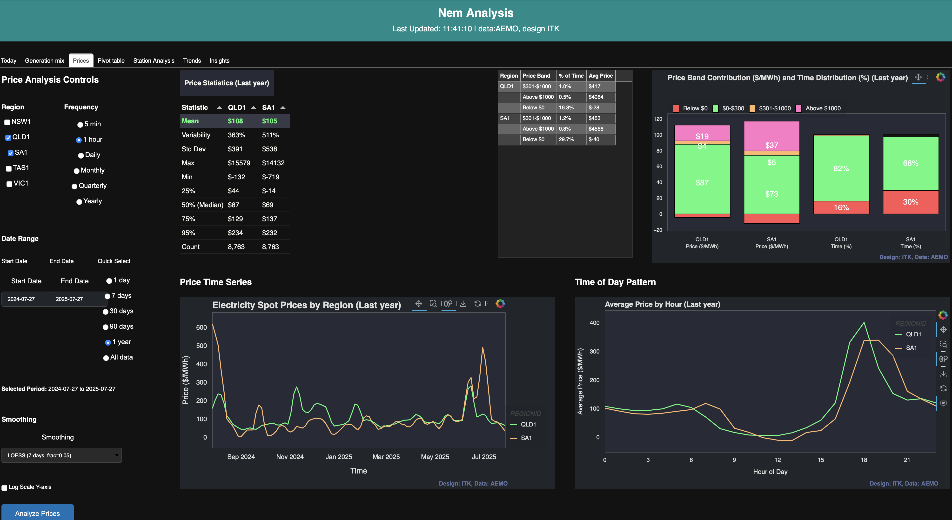
And what’s of interest is the figure and table top right. Let’s start with the figure, Noting I’ve selected two States, South Australia and QLD, because one has lots of renewables and the other less so. And the time period is the last 365 days.
What are the messages here?
QLD’s price is a fraction less than that in South Australia.
30% of the time prices were negative in South Australia, much less so in QLD.
$37/MWh or about 35% of the average South Australian price in the past year was due to periods when prices were over $1000/MWh and a lesser but still meaningful 18% of the QLD average price was due to prices over $1000/MWh
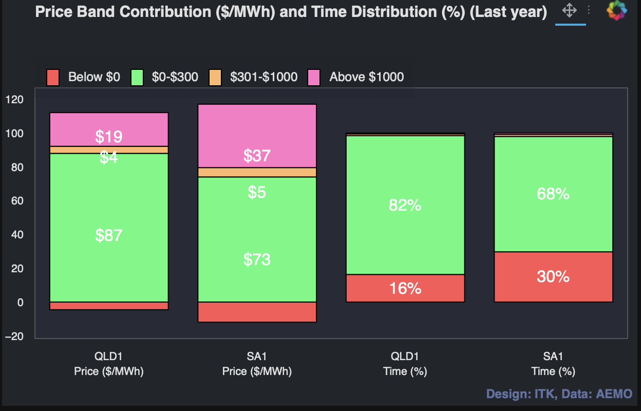
But wait why can’t I see the percentage of time prices were over $1000 in the right hand graphs. I must have miscoded (again). So let’s now look at the baby table because you can’t show it on the figure that easily.
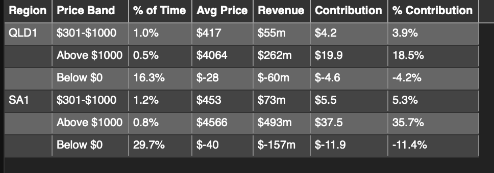
Pric component detail. Data:AMEMO, visualisation:ITK Now we are getting somewhere. In QLD prices were over $1000 for just 0.5% of the half hours, that is to say about 45 hours in the year but the average price during those 45 hours was over $4000/MWh pushing the average for the year up by $20.
In South Australia the 0.8% or to say 65 hours in the year the “rationing” price was $4,566 lifting the average price over the year factored into customer bills by $37/MWh.
So this is why I say it’s an optical illusion, 30% of the time in South Australia the price will be negative. That mostly happens in the day when I tend to look at the screen. But all that negative price stuff is much less important than the 60 hours, when electricity is really scarce and the price reflects that. I think in financial markets we used to talk about “rationing prices”.
Implications
There are implications for both consumers and producers. The most important point to note is that prices are a signal. And what this signal clearly shows is that there is near $0.5 bn of annual revenue available to producers who can supply when no one else can. So for the time being this is typically gas and diesel. However to my way of thinking that revenue pool is big enough to reward “reserve” batteries. That is supply that is held in reserve for shortages. In QLD the revenue pool in the most recent 12 months was a lesser but still significant $0.25 bn.
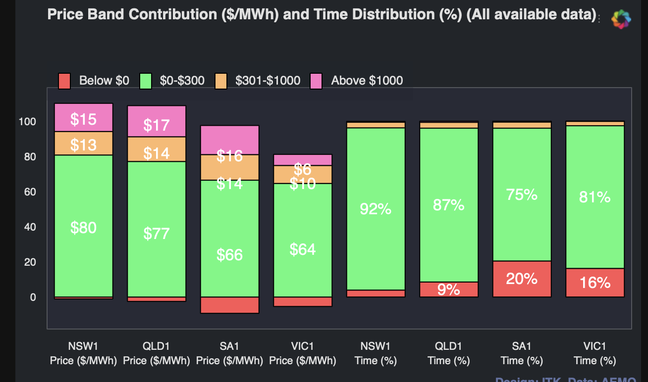
Looking over the 5.5 years of data in my set, we can see that high price events typically represent about 15-20% of the average price over that time period.
Weighted prices 2020 to 2025.Data:AEMO, Visualisation ITK
It’s less in Victoria because, as a general statement, at least until Yallourn is closed Victoria is over supplied.
For consumers, particularly as household batteries come along there is an indication that using your household or EV or both battery during those peak periods could be rewarding. $4000/MWh is $4/KWh which for a Tesla power wall with say 5KW of output power you could get $20 for 40 hours or about $800 a year, probably a bit less. The $20 is 5kw x $4/KWh. Equally there are other opportunities for the $100-$300 price band.
Competition as well as capacity matters
At the moment the reserve power market is controlled by the large Gentailers including Snowy and to some extent by AEMOs RERT and IRR process. Let’s leave AEMO’s role as out of scope for this note.
The investment in reserve capacity needs to come from independent suppliers if its to result in more competition in those peak events. Fortunately with batteries it is possible, in my imagination, to see reserve batteries being built by independents and operating purely as reserve merchants. No contract necessary. Batteries are modular and can be installed on distribution networks.
For any business exposed to the spot price, there is a clear demand response opportunity. However demand response has to be independent of gentailers. Let’s say you were an aluminium smelter and your gentailer contract allowed the gentailer to switch you off for an hour say four times a year. Since the gentailer probably owns capacity that benefits from “rationing prices” they aren’t going to ask you to switch off most likely, unless the lights really are going out.
A summary of prices over $1000/MWh between 2020 and today
I did use Claude to provide this summary. A run is a length of time when prices stay over $1000
Queensland (QLD1) experienced the most high-price events, with 489 runs, accounting for 0.39% of the total time. South Australia (SA1) followed with 388 runs (0.30%), while New South Wales (NSW1) had 338 runs (0.23%). Tasmania (TAS1) experienced 115 runs, equivalent to 0.17% of the time. Victoria (VIC1) had the fewest events, with 84 runs or just 0.05% of the time.
| Region | Number of Runs | % of Time Over $1000 |
|---|---|---|
| QLD1 | 489 | 0.39% |
| SA1 | 388 | 0.30% |
| NSW1 | 338 | 0.23% |
| TAS1 | 115 | 0.17% |
| VIC1 | 84 | 0.05% |
The majority of high-price events were short-lived, with between 52% and 63% lasting less than 30 minutes. On average, these events lasted between 1.1 and 1.5 hours across all regions. Some extreme events did occur: the longest recorded was in QLD, where prices remained above $1000 for 45.5 hours in July 2022. In NSW1, the longest event lasted 21.5 hours in May 2024, reaching prices as high as $16,600.
High-price events most commonly began at around 17:00 (5 PM), which coincides with the evening peak in electricity demand. The year 2022 stands out as the most active period for high prices across all regions. In contrast, the data for 2025 so far suggests a lower frequency of such events.
QLD was the most volatile region, not only experiencing the highest number of high-price events but also the longest sustained runs. SA had a high frequency of events as well, though they tended to be shorter in duration. Nevertheless, SA recorded the highest average peak prices. NSW1 had a moderate number of events but included some of the longest durations. VIC was the least affected region overall, although when high-price events did occur, they tended to last around 1.5 hours.
A couple of plots, note that because the duration runs from 0.5 half hours to 40 a log scale was needed.
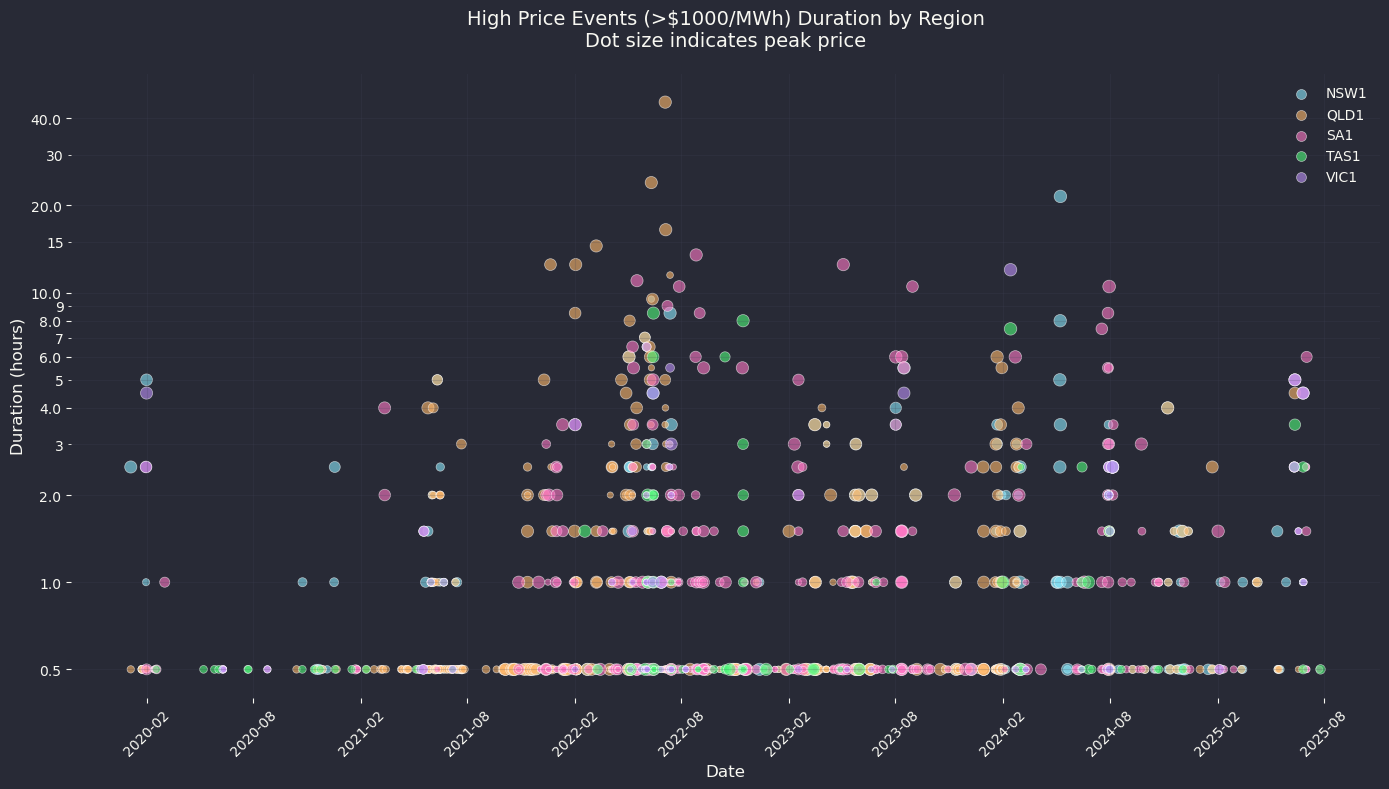
You should get a sense from this plot that in fact the number of high price events has declined, particularly longer duration from the 2022 period when we had shortages of gas and coal. Equally just looking at the spread of colors shows that the high price events are spread around the regions and certainly not, so far, concentrated in areas of high renewable energy.
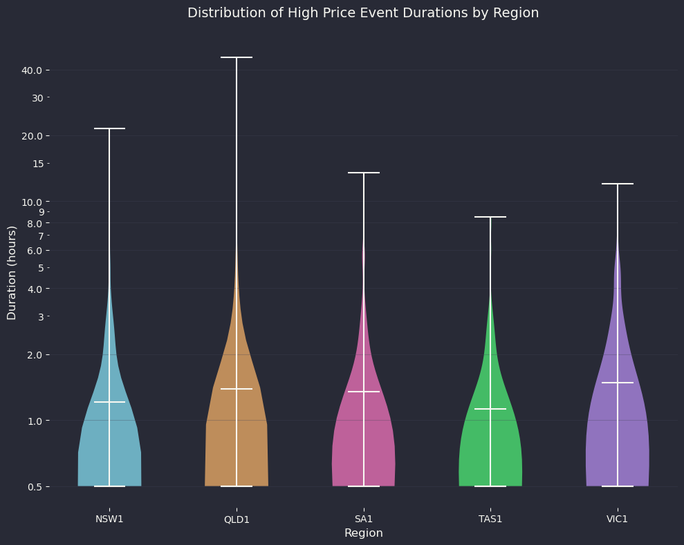
Next I have finally found a use for a violin plot, after years of seeing them in plotting packages. This is an exciting event in the life of a keyboard warrior.
Summary - an insurance role could make a difference
I only did this work in response to a question from the extended family. Obviously there is much more analysis to be done. My first question would be how many MW of power are needed given that the history says duration is not the issue, but a lack of power. In general though the results suggest that if say the NSW Govt owned Retailer was to invest in a battery reserved for high price events they could probably make a difference to average prices paid by consumers.
An aluminium centre or data centre able to respond to high price events could arguably earn a return. And so on.