El Niño, La Niña and ENSO
What they are, how they work, and how to read the charts
A self-contained explainer. Assumes you know that warm air rises and that water is denser than air — nothing else. Figures are schematic unless labelled otherwise.
The 90-second version
Across the tropical Pacific, the trade winds normally blow from east to west. They drag warm surface water with them, piling it up near Indonesia and leaving the ocean off South America comparatively cold. Every few years that arrangement breaks down: the winds slacken, the warm water sloshes back east, and the Pacific ends up warm where it is usually cool. That is El Niño. When the same arrangement instead intensifies — stronger winds, colder east — that is La Niña.
The two are opposite phases of one see-saw, which is why scientists talk about a single phenomenon: the El Niño–Southern Oscillation, or ENSO. (“Southern Oscillation” is the atmospheric half — the pressure see-saw between Darwin and Tahiti that Gilbert Walker documented in the 1920s, before anyone realised it was the same thing as the ocean warming Peruvian fishers had named after the Christ child.)
ENSO matters because the tropical Pacific is enormous. Shifting where its rain falls rearranges weather across most of the planet for a year or more, and shifts global average surface temperature by a couple of tenths of a degree.
Contents
- The ocean has a lid: the thermocline
- The default Pacific
- El Niño
- La Niña
- Why it grows: the Bjerknes feedback
- Why it stops, and flips
- How the signal travels: ocean waves
- How we measure it
- The record since 1950
- What it does to weather
- Forecasting: what’s easy, what isn’t
- Worked example: the 2026/27 event
- Glossary · Check your understanding · Sources
1. The ocean has a lid: the thermocline
Start with a single column of tropical ocean water. Sunlight heats the top, and wind and waves stir that heat down through the first few tens of metres, producing a warm, well-mixed surface layer. Below it sits cold water that was last at the surface far away, in the subtropics of both hemispheres, and which has since been carried to the equator at depth. Between the two is a thin zone where temperature falls very sharply with depth. That zone is the thermocline.
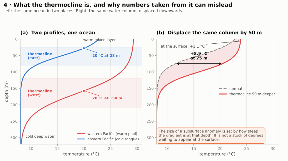
Two things about panel (a) matter for everything that follows.
The thermocline is sharp. In the tropical Pacific, temperature can drop the better part of 10 °C over 50 vertical metres. Because it is so sharp, oceanographers track it with a single number: the depth of the 20 °C isotherm — literally, how deep you must go to find water at 20 °C. When you see a black line snaking across a subsurface ocean plot, that is usually what it is.
Its depth is not the same everywhere. In the west it sits around 150–200 m down. In the east it can be within 50 m of the surface. That tilt is not an accident; the trade winds create it, and Section 2 explains how.
Panel (b) is a warning about how these plots are read, and it will matter in Section 12. Take the eastern profile and push the whole thing down 50 m. At 75 m depth the water is now 8.9 °C warmer than before — an enormous-looking anomaly. At the surface it is only about 1 °C warmer. Nothing inconsistent has happened: the size of a subsurface temperature anomaly depends on how steep the temperature gradient is at that depth. Where the profile is steep, a modest vertical displacement produces a spectacular number. Where it is flat — the mixed layer, the deep ocean — the same displacement produces almost nothing.
That does not mean a deep thermocline is unimportant. It very much is important, for the reason in the next section. It means that a subsurface anomaly is not a stock of degrees waiting to appear at the surface, and you cannot convert one into the other by eye.
2. The default Pacific
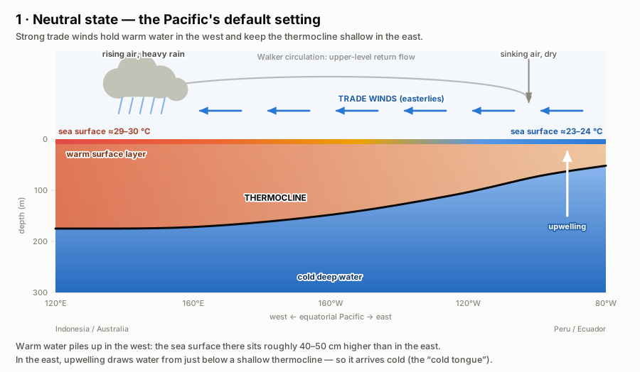
Read the diagram from the top down.
The trade winds blow persistently from east to west along the equator, a consequence of Earth’s rotation and the general circulation of the atmosphere.
They drag surface water west with them. Over the width of the Pacific this piles up a genuine mound of warm water — the sea surface near Indonesia sits roughly 40–50 cm higher than near Ecuador, and the warm layer there is far thicker. This is the Western Pacific Warm Pool, the largest expanse of water above 28 °C on Earth.
Water removed from the east has to be replaced. It is replaced from below, by upwelling. And here is the crucial link: upwelling draws water up from a roughly fixed depth range, around 50–100 m. Whether that water arrives warm or cold therefore depends on where the thermocline is sitting relative to that depth. In the east the thermocline is shallow — above the source depth — so the water arriving is cold. The result is the cold tongue, a band of cool surface water stretching west from South America along the equator. (It is worth being clear that the cold tongue is what normal looks like here, not an anomaly.)
The atmosphere responds to that pattern. Air rises over the warmest water (the warm pool), producing deep cloud and heavy rain over Indonesia and northern Australia. It sinks over the cold tongue, producing the dry conditions that make coastal Peru a desert. Rising in the west, sinking in the east, flowing westward at the surface and eastward aloft: that closed loop is the Walker circulation.
Notice that the loop is self-consistent. The winds create the temperature pattern, and the temperature pattern drives the winds. Hold that thought.
3. El Niño
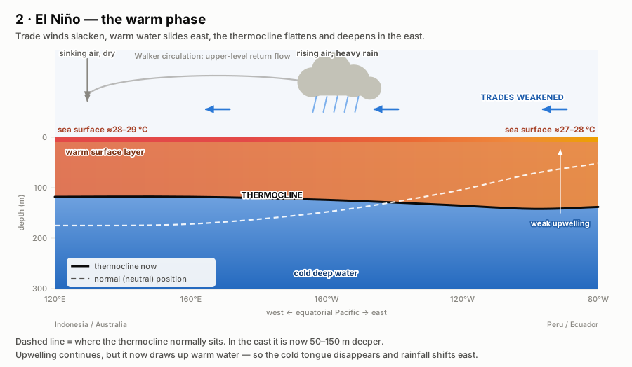
Now weaken the trade winds. The mound of warm water in the west is no longer held in place, and it slumps eastward. The thermocline flattens: shallower in the west, deeper in the east — the dashed line shows where it normally sits.
Upwelling in the east does not stop. But it is now drawing water from above a much deeper thermocline, so what comes up is warm. The cold tongue fades. Sea surface temperatures in the central and eastern Pacific rise by 1–3 °C.
The atmosphere follows the warm water. The main zone of rising air and heavy rain migrates from over Indonesia to over the central Pacific — in a large event, thousands of kilometres east of where it belongs. Indonesia, Papua New Guinea and eastern Australia find themselves under sinking, drying air instead. The Walker circulation weakens, and can partly break into two cells.
That migration of rainfall is the mechanism behind essentially every remote El Niño impact. The ocean warming is the cause; the relocated thunderstorms are the messenger.
4. La Niña
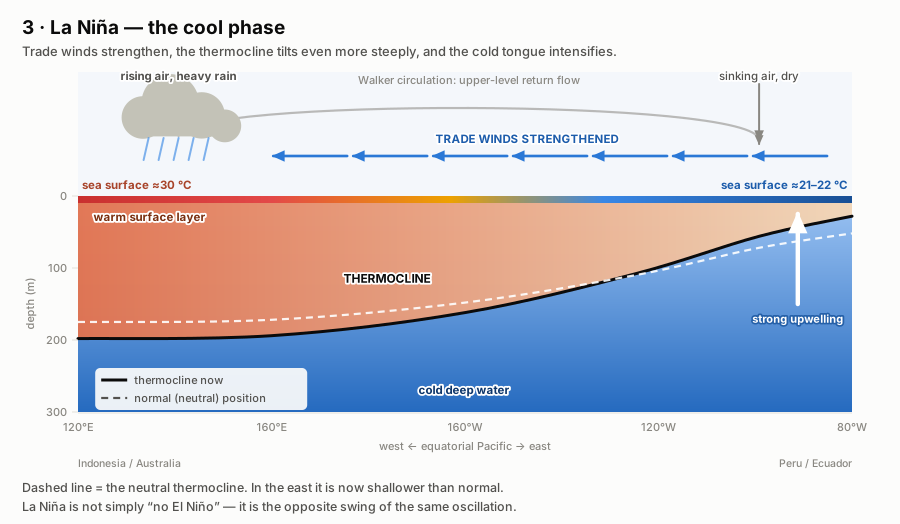
La Niña is the same machinery run harder in the normal direction. Trades strengthen, warm water is packed even more tightly into the west, the thermocline tilts more steeply, upwelling intensifies, and the cold tongue becomes colder and extends further west.
It is worth being explicit that La Niña is not “no El Niño.” Neutral is no El Niño. La Niña is an active departure in the opposite direction, with its own distinct impacts — and, for Australia, often the more consequential of the two.
5. Why it grows: the Bjerknes feedback
Why does a small nudge become a basin-wide event, rather than fading away?
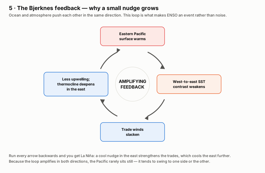
The Norwegian meteorologist Jacob Bjerknes worked this out in the 1960s, and it is one of the foundational ideas in the subject. Follow the loop:
- Something warms the eastern Pacific slightly.
- The temperature contrast between the warm west and the cool east weakens.
- The anomalous east–west wind responds to that contrast — so the trades slacken. (The mean trades are driven by the general circulation, as in Section 2; it is the departure from them that responds to sea surface temperature.)
- Weaker trades mean less upwelling and a deeper thermocline in the east.
- Which warms the eastern Pacific further. Return to step 1.
This is a positive feedback: the output feeds back and reinforces the input. Ocean and atmosphere are pushing each other in the same direction, so a perturbation that would otherwise dissipate instead grows into a coupled ocean–atmosphere event lasting months.
Run every arrow backwards and you have La Niña. A cool nudge strengthens the contrast, strengthens the trades, deepens the upwelling and cools the east further. The system amplifies departures in both directions, which is why perturbations that might otherwise fade instead tend to organise into one phase or the other.
6. Why it stops, and flips
An amplifying loop with nothing to stop it would run away. Something must eventually reverse it. There are several conceptual frameworks for what does — the delayed oscillator, the western Pacific oscillator, the advective–reflective oscillator, and the one below — and they are usually treated as complementary rather than competing. The one forecasters lean on most is the recharge–discharge oscillator, formalised by Fei-Fei Jin in 1997.
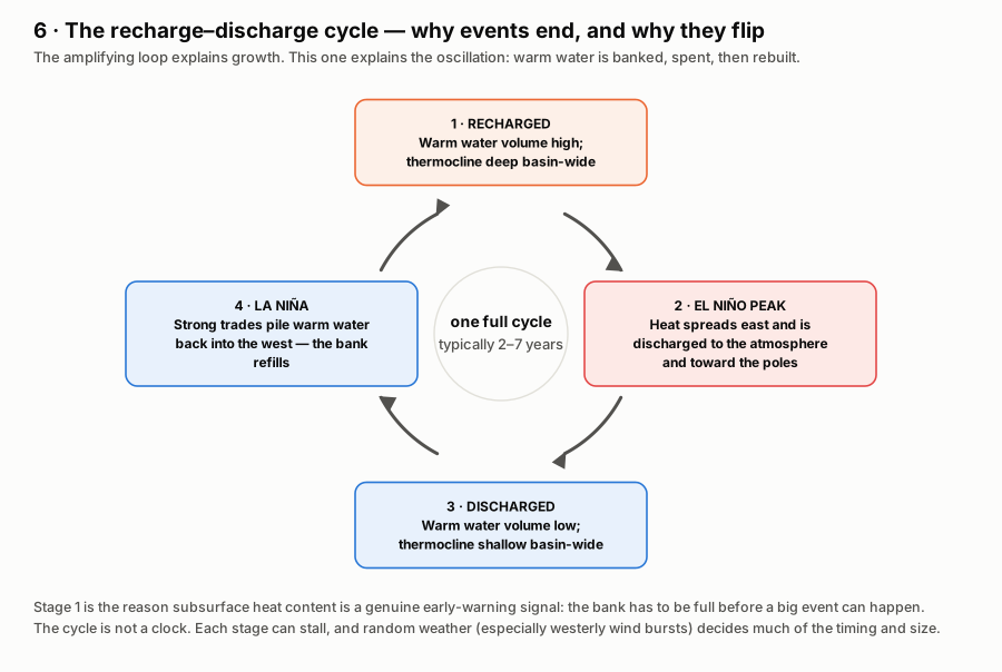
Think of the equatorial Pacific as a bank account holding warm water volume — the total amount of above-thermocline water in the basin.
- Recharged. After a period of strong trades, the account is full. The thermocline is deep basin-wide. Nothing has happened at the surface yet, but the fuel is in place.
- El Niño. The event fires. Warm water spreads east and shallows out, and — the part that does the real work in Jin’s framework — anomalous winds drive a net transport of warm water away from the equator, poleward. The account is being spent.
- Discharged. The event ends leaving the basin depleted. The thermocline is shallow everywhere along the equator.
- La Niña. With a shallow thermocline, upwelling brings up cold water easily, and the strengthened trades pump warm water back into the west. The account refills — and the cycle can begin again.
Two consequences follow, and both are practically important.
Warm water volume leads sea surface temperature by several months. This is why forecasters monitor subsurface heat content so intently: the bank has to be full before a large event is possible. A recharged Pacific is a genuine early warning, months before anything shows at the surface.
The system tends to overshoot. Because discharging is part of the event itself, a big El Niño leaves the Pacific primed to swing the other way. Large El Niños are often followed by La Niña — sometimes for two or three years running.
The typical cycle takes 2–7 years, but “typical” is doing a lot of work in that sentence. This is not a clock. Stages stall, and random weather — particularly the wind bursts in the next section — has a large say in the timing and the size.
7. How the signal travels: ocean waves
One question the cartoons above skip: how does a change in the wind near Indonesia become a temperature change 15,000 km away off Peru?
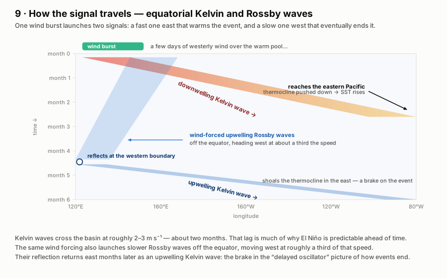
Not by water flowing all the way across — that would take years. It travels as a wave in the thermocline.
A few days of anomalous westerly wind over the warm pool — a westerly wind burst, often associated with tropical cyclone pairs or the Madden–Julian Oscillation — pushes down on the thermocline and sets off an equatorial Kelvin wave. It is trapped near the equator (Earth’s rotation prevents it spreading north or south), it can only travel east, and it moves at roughly 2–3 m s⁻¹: fast for the ocean, but still about two months to cross the Pacific.
When it arrives in the east it depresses the thermocline there, upwelling starts drawing warm water instead of cold, and the surface warms. That two-month lag is a large part of why El Niño is predictable at all — by the time the warming appears at the surface, the cause happened months ago and was observable.
The same wind forcing does something else at the same time, and this is the part usually garbled in popular accounts. Away from the equator it also launches Rossby waves of the opposite sign — upwelling waves — which travel west, at roughly a third of the Kelvin wave’s speed. Months later they reach the western boundary and reflect there as an upwelling Kelvin wave, which crosses back east and shoals the thermocline, opposing the event that started it.
That delayed, self-cancelling return is the core of the delayed oscillator picture of how El Niño ends. Note that it is the western boundary reflection that supplies the brake; reflection off the eastern boundary is comparatively unimportant, and returns the same sign rather than the opposite one.
Wind bursts are the reason ENSO retains a stubbornly random component. They are weather — essentially unpredictable more than a couple of weeks ahead — but they can determine whether a marginal event becomes a large one.
8. How we measure it
“El Niño” is a description; forecasting needs a number. That number comes from averaging sea surface temperature over a defined box and comparing it with a long-term average for the same time of year.
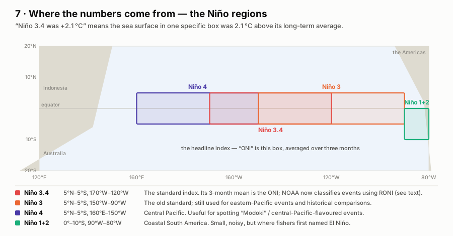
The headline index is Niño 3.4 (5°N–5°S, 170°W–120°W). Its three-month running mean is the Oceanic Niño Index (ONI), which was NOAA’s operational yardstick for decades and remains the standard historical record. The conventional bands:
| ONI | Category |
|---|---|
| +0.5 to +0.9 | Weak El Niño |
| +1.0 to +1.4 | Moderate |
| +1.5 to +1.9 | Strong |
| +2.0 and above | Very strong (“super”) |
with the mirror image for La Niña. NOAA requires the threshold to be met for at least five consecutive overlapping seasons before an event is declared.
The complication worth knowing about
An anomaly is measured against a baseline — currently a 30-year average. But the whole tropical ocean has been warming. That means part of a modern “+2 °C” is background warming shared by every ocean basin, not the ENSO signal itself.
This matters more than it sounds, because the atmosphere does not respond to absolute temperature. Deep convection forms where water is warm relative to its surroundings. If the entire tropics warms by half a degree, the Pacific’s rainfall pattern barely notices — but the ONI goes up.
The response has been to switch to a relative index that subtracts the tropical-mean sea surface temperature:
- NOAA’s Relative Oceanic Niño Index (RONI), which became CPC’s official monitoring and prediction index in February 2026. The legacy ONI series continues to be published for continuity.
- The Bureau of Meteorology adopted a Relative Niño 3.4 index in September 2025, with thresholds of ±0.8 °C sustained, alongside the SOI (±7).
Practical consequence: the same event can be described with two different numbers depending on which index is quoted, and relative indices generally run lower than the traditional ones for recent events. When you see a record claim, check which index it is using. (Note also that BoM and NOAA have never used identical thresholds, so the two agencies can legitimately disagree about whether an event has been declared.)
9. The record since 1950
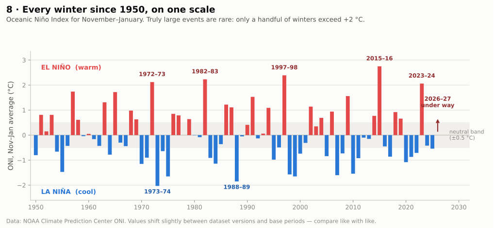
The chart is worth studying for a moment, because it corrects two common misimpressions.
Big events are genuinely rare. In 76 winters, only five exceed +2 °C: 1972–73, 1982–83, 1997–98, 2015–16 and 2023–24. When someone says “we know what a super El Niño does to California / Queensland / the Horn of Africa,” they are generalising from a handful of cases — and the sample is small enough that a single unusual outcome badly distorts the average.
Most events are modest. Of the 76 winters shown, 27 are on the El Niño side of ±0.5 °C and 26 on the La Niña side — but four-fifths of all winters fall within ±1.5 °C. Bear in mind, too, that this chart shows only the peak season; averaged across the whole year, neutral conditions are considerably more common than the picture suggests. ENSO is a major climate driver, not the only one, and in many years it is not doing much at all.
The peak values under the current dataset version: 2015–16 reached +2.75 °C, 1997–98 +2.40 °C (Oct–Dec), 1982–83 +2.23 °C, 1972–73 +2.12 °C, 2023–24 +2.06 °C. Treat these to two significant figures at best — they shift by a tenth or so between dataset versions and base periods.
10. What it does to weather
The mechanism is always the same: the tropical rainfall belt moves, which changes where heat is released into the atmosphere, which sends stationary waves through the upper atmosphere that nudge jet streams and storm tracks in the mid-latitudes. Meteorologists call these remote linkages teleconnections.
The word to keep in mind is probability. El Niño does not cause a drought; it loads the dice.
The final column matters as much as the other two. These relationships are not equally reliable, and presenting them in a uniform table tends to imply they are.
| Region | Typical El Niño | Typical La Niña | How reliable |
|---|---|---|---|
| Eastern Australia | Drier winter–spring; hotter days in the south; higher bushfire risk; later monsoon onset; fewer tropical cyclones | Wetter, higher flood risk; cooler days; more tropical cyclones; earlier monsoon | Strong |
| Indonesia, PNG, Philippines | Drought, haze from fires | Wetter than normal | Strong |
| Coastal Peru & Ecuador | Heavy rain, flooding; fisheries collapse as nutrient upwelling shuts down | Dry; strong fisheries | Strong |
| Atlantic hurricanes | Suppressed (increased wind shear) | Enhanced | Strong |
| Global mean temperature | Boosted, peaking a few months after the ocean peak | Suppressed | Strong |
| Southern USA | Wetter, cooler; active subtropical jet | Drier — a contributor to southwest US drought | Moderate |
| Southern Africa | Drier — a repeated contributor to maize failure | Wetter | Moderate |
| East Africa (short rains) | Wetter | Drier | Moderate — often dominated by the Indian Ocean Dipole rather than by ENSO directly |
| India (summer monsoon) | Weaker on average | Slightly stronger on average | Weak — the correlation has faded markedly since the 1980s, in both directions |
| Pacific Northwest / western Canada | Drier, milder | Wetter, colder | Weak — the noisiest relationship in this table |
The Australian row of that table looks like this on the ground. The maps below composite the 23 El Niño events since 1951, comparing each one against the local average for that season, so what is left is the El Niño signal rather than the long-term warming trend.
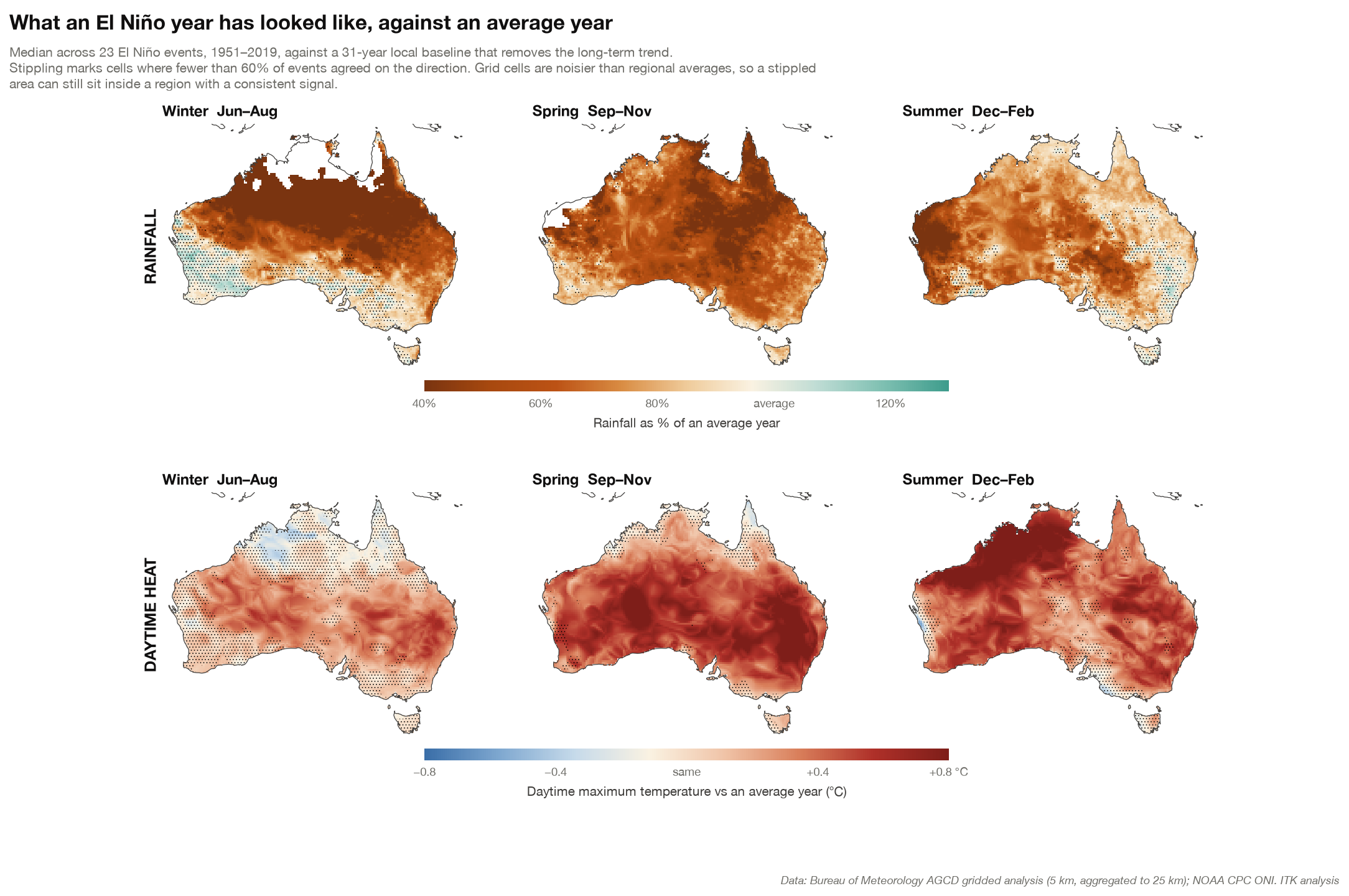
Three things in that picture generalise beyond Australia. The signal is seasonal — winter dries the tropical north, spring spreads the deficit almost continent-wide, and by summer the east has largely recovered while the north-west has not. It is regional rather than national: the deepest drying sits in the north and east, while Tasmania and south-west Western Australia are barely touched. And it is unevenly reliable, which is what the stippling is for. Spring rainfall is the standout — fewer than 3% of grid cells are stippled, so almost everywhere the events agreed with each other. Winter heat is the opposite, with more than 40% of cells stippled: an El Niño winter is not dependably a warm one. A single map colour therefore carries quite different weight from panel to panel, and reading the composite without the stippling would flatten that away.
Three caveats that separate a good understanding from a superficial one:
ENSO is never the only driver. For Australia especially, the Indian Ocean Dipole and the Southern Annular Mode can reinforce or cancel the ENSO signal. A positive IOD alongside El Niño is a notably dry combination; a negative IOD can offset it substantially.
Flavour matters as much as size. Events where the warming is centred in the eastern Pacific behave differently from central Pacific (sometimes “Modoki”) events, which can produce quite different rainfall patterns despite a similar headline index. This is a live research area rather than a settled taxonomy.
Impacts do not scale linearly with the index. A +2.5 °C event is not “twice” a +1.2 °C event. Some responses saturate; others depend on the state of other systems entirely.
11. Forecasting: what’s easy, what isn’t
What forecasters actually watch: subsurface heat content and warm water volume; the depth of the 20 °C isotherm; Kelvin wave activity; trade wind anomalies and westerly wind bursts; the SOI and outgoing longwave radiation (a proxy for where convection is); and an ensemble of coupled ocean–atmosphere models, plotted together as a “plume.”
The spring predictability barrier. Forecasts issued during the northern spring / southern autumn — roughly March to May — are markedly less skilful than those issued mid-year. Several things contribute: the coupled feedback is at its seasonal weakest then, so small perturbations have outsized influence; and the ENSO signal itself is near its annual minimum while the noise is not, so the signal-to-noise ratio bottoms out. How much of the barrier is intrinsic to the system and how much is an artefact of how forecasts are initialised is still argued over, and there is evidence it has weakened in recent decades. The practical upshot holds regardless: a February forecast for the following summer deserves real scepticism; a July forecast for the following December is in the high-skill window.
What stays hard, even in the good window:
- Amplitude. Whether an event peaks at +1.5 or +2.5 depends partly on wind bursts that have not happened yet.
- Flavour. Where exactly the warming centres.
- Timing of the turnaround. When it decays, and whether it flips to La Niña.
- Regional impacts. By far the weakest link. The ocean forecast can be excellent and the rainfall forecast for a given catchment still close to useless, because the small event sample means the statistical relationships have wide error bars.
A useful habit: distinguish the ocean forecast (skilful, models agree, worth acting on) from the impact forecast (much weaker, and where confident-sounding claims most often outrun the evidence).
12. Worked example: the 2026/27 event
This section is a snapshot as at early August 2026 and will date; the physics above will not.
An El Niño is developing rapidly and is forecast to become a large one. From the official products, with the index each number is on made explicit — because they are not all the same index:
| Quantity | Value | Index / basis |
|---|---|---|
| Apr–Jun 2026 ONI | +0.98 °C | legacy ONI (traditional Niño 3.4, 3-month mean) |
| Weekly Niño 3.4, mid-July | ≈ +2.1 °C | traditional Niño 3.4, IRI’s 20 July update |
| Models ≥ +2.0 °C for Oct–Dec | 23 of 26 | traditional Niño 3.4 forecast plume |
| Chance of a very strong event, Oct–Dec | ≈ 81 % | CPC strength probabilities (now issued on the RONI basis — worth confirming against the current discussion) |
NOAA’s Climate Prediction Center has an El Niño Advisory in effect. Two things are worth noticing in that table. First, the ONI value looks modest only because it is a three-month average of a signal that has been climbing steeply — it lags. Second, CPC’s own July discussion quoted a latest weekly Niño 3.4 near +1.2 °C where IRI’s late-July update quoted +2.1 °C; those are different weeks and, quite possibly, different bases. If you are going to quote a single number, check its date and its index rather than taking the largest one on offer.
So: a large event is very likely, and the June/July timing means we are past the spring predictability barrier. That part is not controversial.
Reading the plots the event has generated
Discussion of this event has circulated a particular kind of figure: a depth–longitude section of temperature anomalies along the equator. Here is a schematic version, with the features labelled.
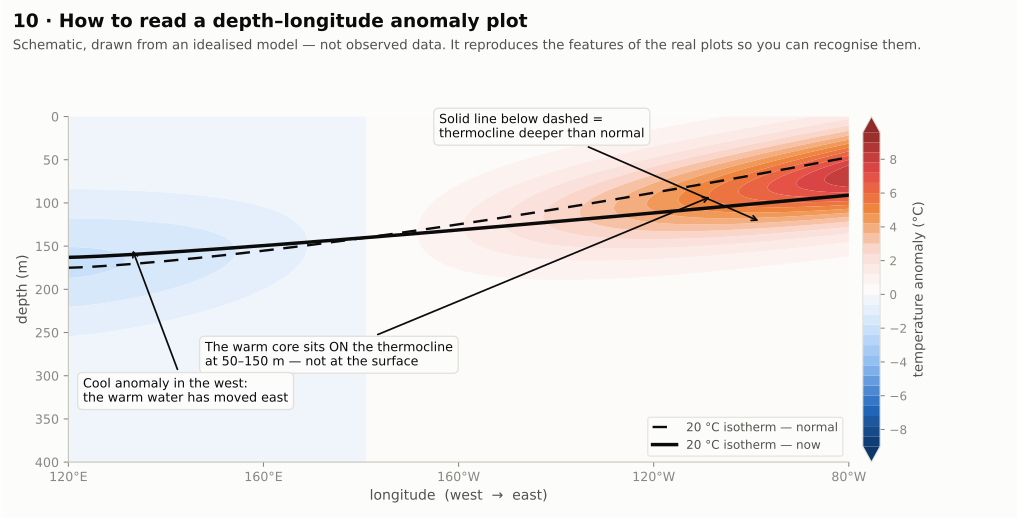
To read one of these:
- The horizontal axis is longitude, not time. West Pacific on the left, South America on the right. Most such plots are single snapshots or one frame of an animation, even when the caption says “time series.”
- The solid black line is the observed 20 °C isotherm; the dashed line is its climatological position. Solid below dashed means the thermocline is deeper than normal.
- The warm core sits on the thermocline, typically 50–150 m down — not at the surface. That is the whole point of the plot: it is showing you heat that has not yet surfaced.
- The cool anomaly in the far west is the flip side, not a contradiction. Warm water that used to be there has moved east.
- Check what dataset it is. Products like ARMOR3D are statistical blends of satellite altimetry with Argo float and other in-situ profiles. They are good, but subsurface values away from float locations are partly inferred rather than measured.
Where the reasoning gets contestable
Public commentary on this event has included the suggestion that subsurface anomalies near 9 °C make a surface anomaly around 5 °C plausible, which would exceed the “super” El Niño of 1877/78. That is a claim with several soft joints, and it is worth being precise about which parts are weak.
The subsurface-to-surface extrapolation is the weakest link. Section 1 showed why: a large subsurface anomaly principally tells you the thermocline has moved through a region of steep temperature gradient. It is not convertible into a surface number by scaling. Two independent checks:
- Historical. NOAA’s own assessment of 1997/98 — the benchmark event — describes eastern equatorial subsurface anomalies “exceeding 7 °C at 50–100 m depth.” Peak ONI that winter was +2.40 °C.
- Physical. Sea surface temperature is strongly damped by the atmosphere. As the surface warms, evaporation increases sharply and the extra convective cloud cuts incoming sunlight; together these export the anomaly to the atmosphere rather than letting it accumulate. This negative flux feedback is one of several reasons observed peaks cluster well below +3 °C rather than tracking subsurface values — nonlinear ocean dynamics, saturation of the thermocline feedback, and the discharge process itself all help cap amplitude too.
“Strongest ever” depends on the index. Given the shift to relative indices described in Section 8, a record claim framed in traditional ONI terms and a record claim framed in RONI terms are different claims. Neither is dishonest; they are answering different questions. Always ask which.
The 1877/78 comparison rests on a shaky yardstick. Huang et al. (2020, Journal of Climate) reconstructed that event and found it “approximately equal” to 1982/83, 1997/98 and 2015/16 — explicitly stating they could not conclude it was stronger. Observational coverage of the tropical Pacific in 1877 was about 7 %, against about 78 % in 1997/98, giving an uncertainty near ±0.54 °C on the Niño-3 index. Claiming a new event would beat 1877/78 asserts a margin smaller than the error bar on the thing being beaten.
The event is still partly undetermined. Continued growth needs the atmosphere to keep cooperating — sustained trade relaxation and further westerly wind bursts. Those have an irreducibly stochastic component. Models agree closely right now, and tight agreement is evidence, but it is not the same thing as certainty: coupled models share structural biases, so they can be confidently wrong together.
A reasonable summary
A large, probably very strong El Niño is likely to peak around the end of 2026. That is well supported. Specific numerical claims about the peak, and claims about historical records, are considerably less well supported than the general expectation, and depend on choices — of index, of baseline, of historical reconstruction — that are worth naming out loud whenever the claim is made.
Glossary
Bjerknes feedback — the amplifying ocean–atmosphere loop that makes ENSO events grow. Cold tongue — the band of cool surface water along the eastern equatorial Pacific. ENSO — El Niño–Southern Oscillation; the coupled ocean–atmosphere system as a whole. Kelvin wave (equatorial) — an eastward-travelling wave trapped near the equator; the main courier of ENSO signals. Niño 3.4 / ONI / RONI — the standard index box; its three-month average; and the version with tropical-mean warming removed. Rossby wave — a slower, westward-travelling ocean wave; off-equatorial ones generated by ENSO wind anomalies carry the opposite sign and supply the delayed brake on an event. SOI — Southern Oscillation Index; the Tahiti-minus-Darwin surface pressure difference. Teleconnection — a statistical linkage between climate anomalies in distant regions. Thermocline — the layer where ocean temperature falls most steeply with depth; tracked as the depth of the 20 °C isotherm. Upwelling — the rise of deeper water to the surface, replacing water driven away by wind. Walker circulation — the east–west overturning loop of the tropical Pacific atmosphere. Warm water volume — total above-thermocline water in the equatorial Pacific; the “bank balance” of the recharge–discharge cycle. Westerly wind burst — a short episode of anomalous westerly wind over the warm pool; a common trigger for Kelvin waves.
Check your understanding
- Why is the eastern equatorial Pacific normally cold, given that it sits directly under the tropical sun?
- During El Niño, upwelling in the east continues. Why does it stop producing cold surface water?
- A plot shows a +9 °C subsurface anomaly at 100 m depth. Why can you not conclude that a +9 °C surface anomaly is coming?
- Explain, in one sentence each, what the Bjerknes feedback and the recharge–discharge cycle each account for.
- Two agencies report different numbers for the same El Niño. Give two legitimate reasons.
- Why is a forecast issued in July more trustworthy than one issued in March?
Answers
- Because the trade winds drive surface water westward, and the water replacing it is upwelled from just below a thermocline that sits shallow in the east — so it arrives cold. Sunlight matters less than where the replacement water comes from.
- Because the thermocline has deepened. Upwelling draws from above it, so what comes up is now warm water rather than cold.
- Because the size of a subsurface anomaly reflects the steepness of the vertical temperature gradient at that depth, not a quantity of heat available to the surface. The surface is also strongly damped by evaporative and radiative losses to the atmosphere. In 1997/98, subsurface anomalies exceeding 7 °C accompanied a surface peak of +2.40 °C.
- Bjerknes explains why a small perturbation grows into a full event. Recharge–discharge explains why the event ends and why the system tends to swing to the opposite phase afterwards.
- Different index (traditional versus relative), different threshold (NOAA ±0.5 °C, BoM ±0.8 °C), different dataset version or base period, or different requirements for atmospheric coupling before declaring an event. Any two.
- Because a March forecast must cross the spring predictability barrier, when the coupled system is weakest and small perturbations have outsized influence. By July the event’s trajectory is far better constrained.
Sources
Live monitoring, if you want to check the current state yourself:
- NOAA Climate Prediction Center — ENSO Diagnostic Discussion — monthly, authoritative, plain English
- IRI/CPC ENSO Forecast — model plume — every major model on one chart
- CPC Relative Oceanic Niño Index (RONI)
- Bureau of Meteorology — Southern Hemisphere monitoring and long-range forecasts — the Australian view (note: BoM’s separate “ENSO Outlook” dial has been discontinued)
Background and data used in this document:
- CPC Oceanic Niño Index data file — source of the values in Figure 8
- NOAA CPC — assessment of the 1997–98 El Niño — source of the “exceeding 7 °C at 50–100 m” figure
- Huang et al. (2020), “How Significant Was the 1877/78 El Niño?”, Journal of Climate
- NCAR Climate Data Guide — Niño SST indices — region definitions
- Bjerknes, J. (1969), “Atmospheric teleconnections from the equatorial Pacific,” Monthly Weather Review — the original feedback paper
- Jin, F.-F. (1997), “An Equatorial Ocean Recharge Paradigm for ENSO. Part I: Conceptual Model,” Journal of the Atmospheric Sciences — the recharge–discharge oscillator
Figures 1–3, 5–7 and 9–10 are schematics drawn for this document; they are qualitatively faithful but not to scale and not observational data. Figure 4 is an idealised model. Figure 8 uses observed CPC data.