El Niño in Australia: rainfall and heat, season by season
What an El Niño year has looked like against an average year, 1951–2019
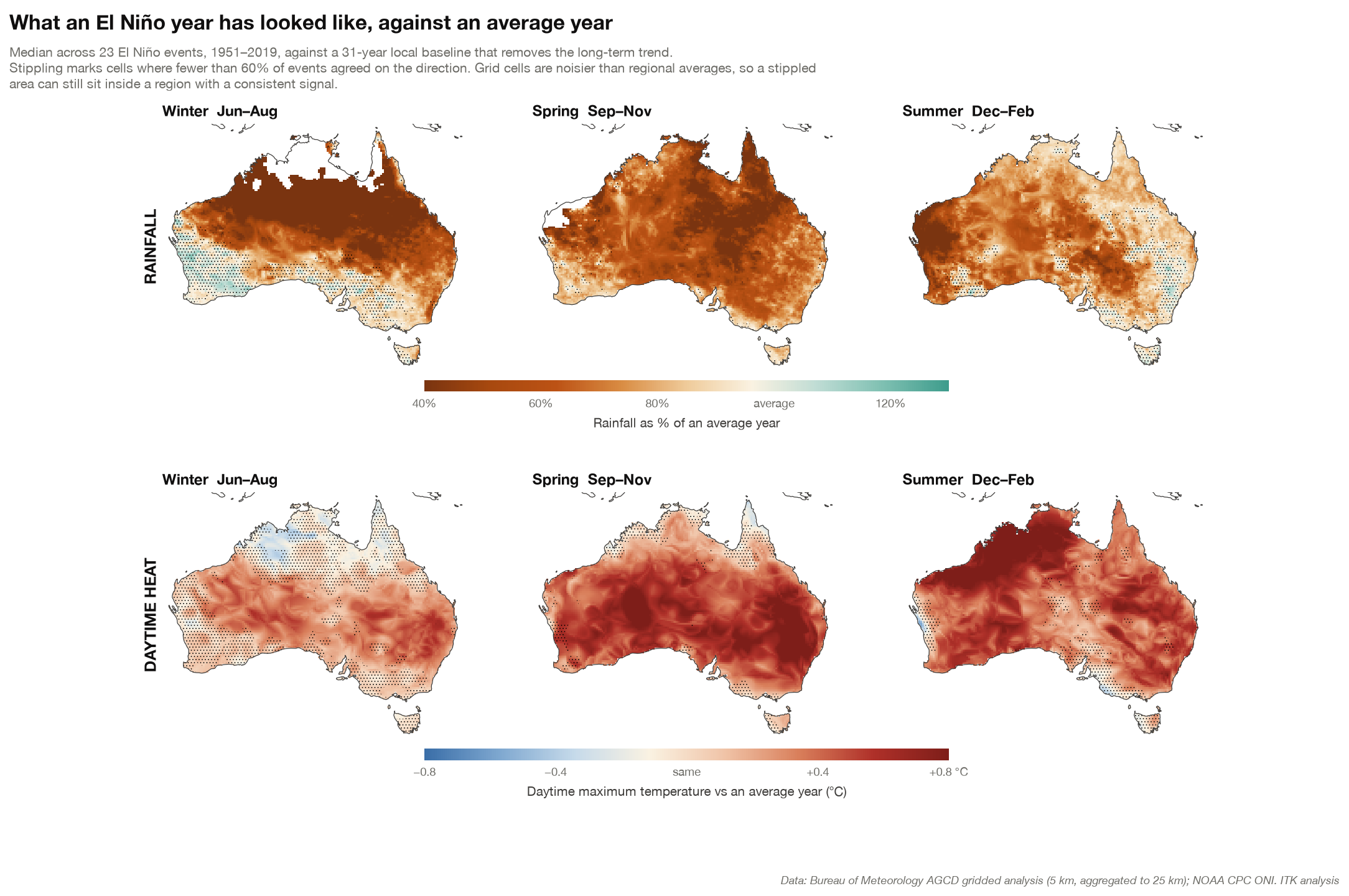
Click the map to open it full size.
How to read it
Each panel composites the 23 El Niño events since 1951, taking the median across events. Every value is measured against a 31-year local baseline, so the long-term warming trend is removed and what remains is the El Niño signal itself rather than the background climate.
Stippling marks disagreement. Where fewer than 60% of the 23 events moved in the same direction, the cell is stippled. This matters more than it might appear: the colour on an unstippled cell reflects something most events did, while the same colour on a stippled cell is an average of years that pulled both ways.
Grid cells are noisier than regional averages, so a stippled patch can still sit inside a region whose area-averaged signal is consistent.
What it shows
Rainfall is seasonal, not annual. Winter dries the tropical north and leaves the southern margins largely alone. Spring spreads the deficit across almost the whole continent — and is the most consistent signal on the map, with fewer than 3% of cells stippled. By summer the east has largely recovered while the north-west has not, because El Niño suppresses the tropical cyclones and delays the monsoon that deliver most of that region’s annual rain.
The impact is regional, not national. The deepest and most reliable drying sits in the north and east. Tasmania and south-west Western Australia are barely touched — their rainfall is governed more by the Southern Annular Mode and the Indian Ocean than by the Pacific.
Heat builds in the opposite direction to rainfall. The temperature signal is weak and inconsistent in winter — more than 40% of cells are stippled, so an El Niño winter is not dependably a warm one — then strengthens through spring across the south-east and through summer across the north.
What it is not
This is a description of what past events did, not a forecast. Across the same 24 events, the correlation between how large an El Niño gets in the Pacific and how dry the Australian spring turns out is close to zero. A bigger event in the Pacific does not reliably mean a drier year here.
Data: Bureau of Meteorology Australian Gridded Climate Data (AGCD) at 5 km, aggregated to 25 km; event dates from the NOAA Climate Prediction Center Oceanic Niño Index. The map covers 23 of the 24 events since 1951 — the AGCD collection used ends at 2020, so the 2023–24 event is not included.
The map also appears in context in El Niño, La Niña and ENSO, which explains how the phenomenon works and how to read the charts it generates.