Northern Hemisphere records just a warm up for the full El Nino theatre
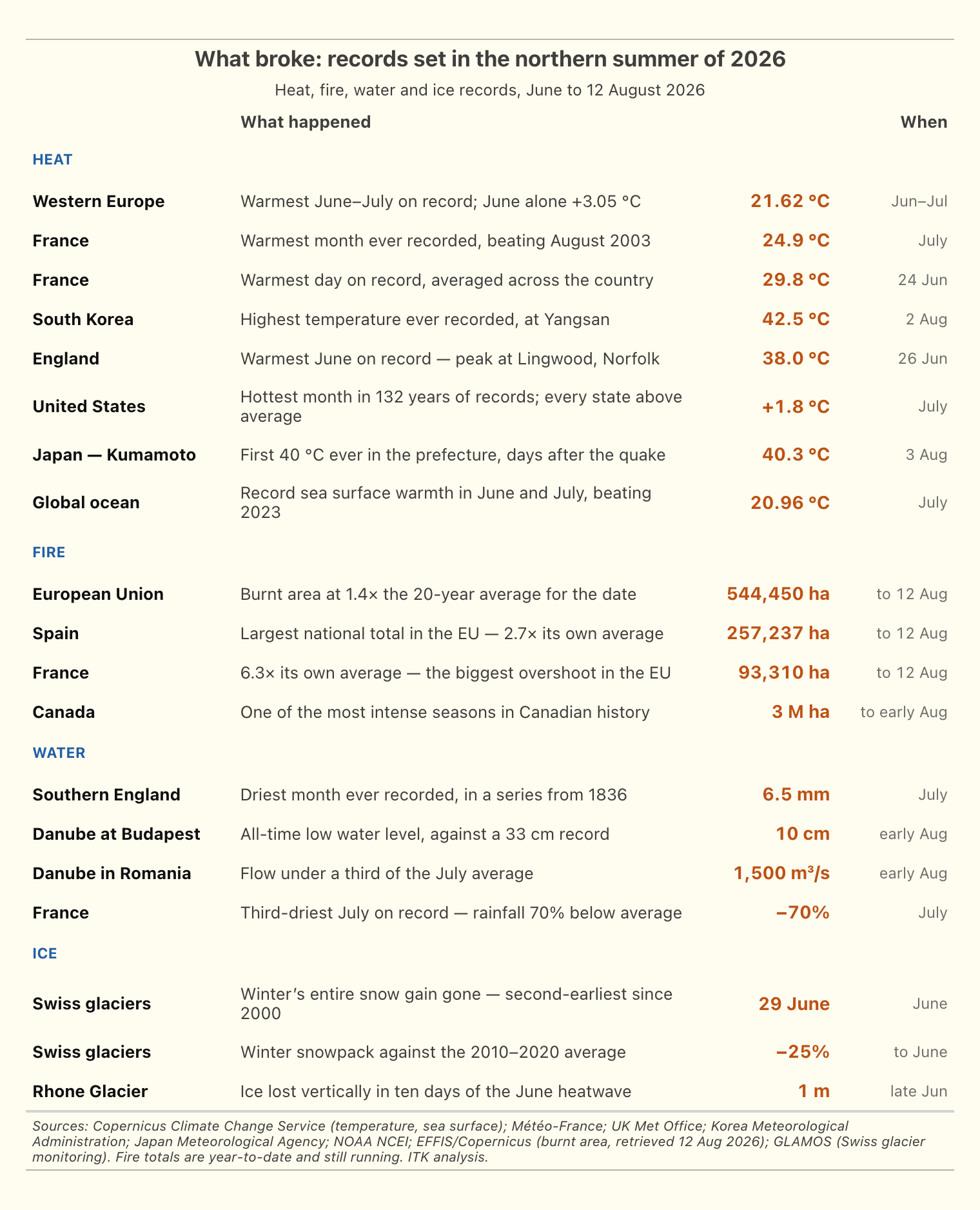
I had Claude identify some key weather records as they pertain to the Northern Hemisphere summer this year. It’s quite likely it missed some, but I think the general picture is fairly clear.
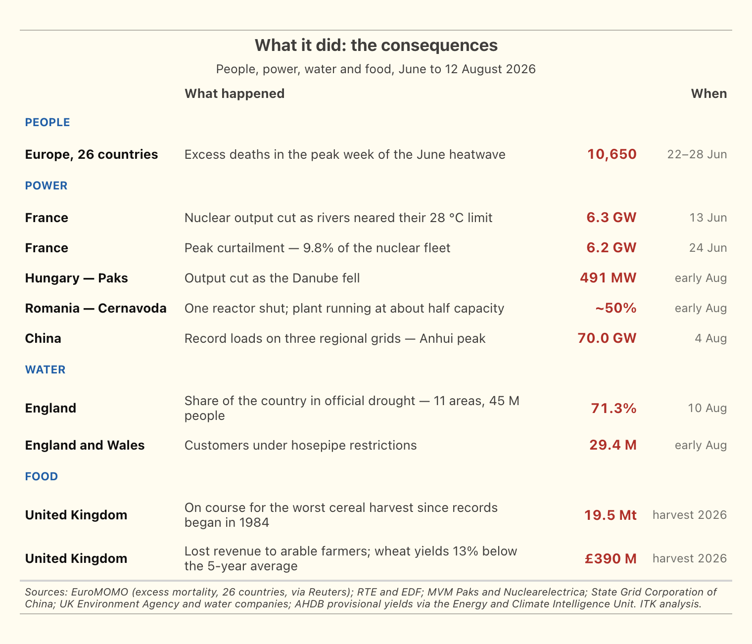
The consequences are more debatable and I suspect things have been missed.
Humans are adaptable if they are anything.
El Niño
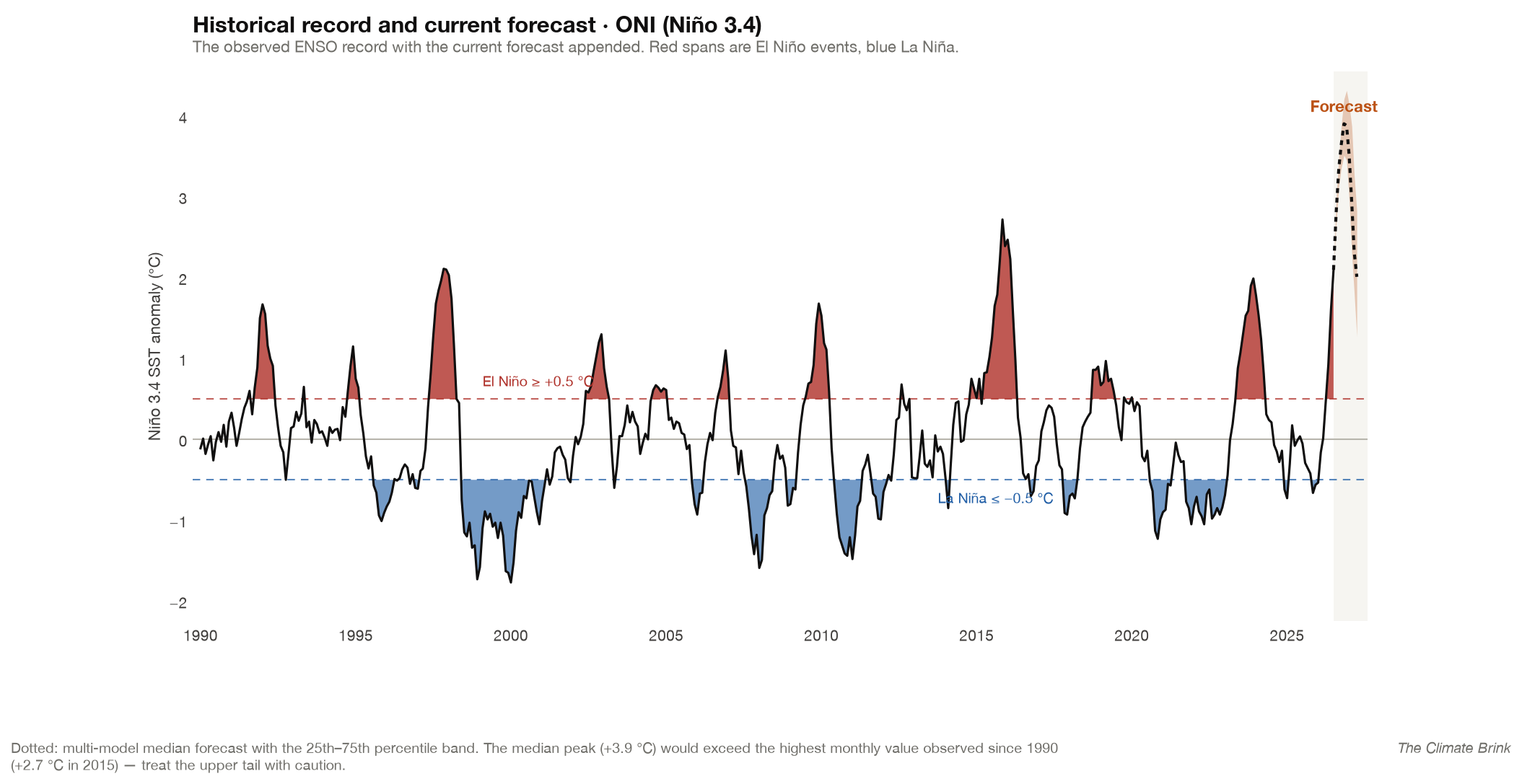
You’d have had to have been on a desert island not to have seen the news about the forthcoming likely record El Niño. El Niño can be forecast months in advance because of the change in water temperature.
First the forecast. Zeke Hausfather is arguably one of the most respected data scientists working in the area. This forecast is taken from the website he contributes to.
Second, what does El Niño mean for Australia? Not being a meteorologist, of course all I can do is read what people who understand say. Historically the answer seems to have depended on a number of things:
- which season we are in;
- whereabouts in Australia you are;
- what the Indian Ocean Dipole (IOD) is doing. NB it has now sat at the positive threshold for three consecutive weeks, although the Bureau has not yet declared an event established. Models expect one to develop, which would amplify the El Niño signal in southern Australia;
- and what the Southern Annular Mode (SAM) is doing — which, unlike ENSO, can only be forecast a week or two ahead.
Below is a composite for both rainfall and heat of previous El Niño events in Australia.
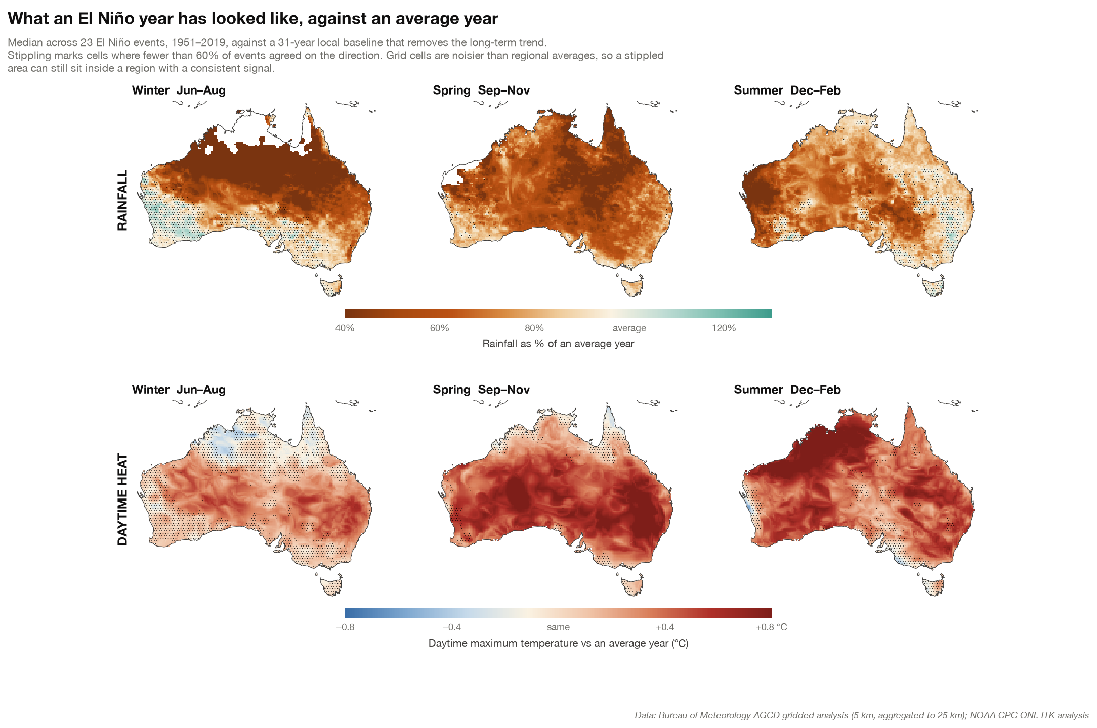
As those of you who watch the ABC news will have noted, an El Niño apparently does not necessarily mean drought in Eastern Australia, notwithstanding that when I was growing up in Northern NSW in the 1960s that was the interpretation. I guess the science has progressed in the last 50 years. Who would have thunk it.
I also had Claude write an El Niño explainer. This was solely for my benefit as I have zero academic or practical background in weather physics. However the AI has sufficiently improved over the past six months that I found not only the explanation but the explanatory diagrams to be sufficiently useful as to add the explanation to my website.
Here I simply produce a couple of diagrams that some readers may find interesting.
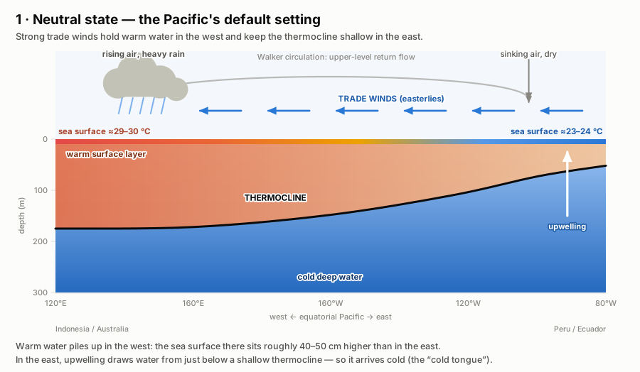
Actually, to save readers the trouble of clicking on a link, the above diagram in words.
The trade winds blow persistently from east to west along the equator, a consequence of Earth’s rotation and the general circulation of the atmosphere.
They drag surface water west with them. Over the width of the Pacific this piles up a mound of warm water — the sea surface near Indonesia sits roughly 40–50 cm higher than near Ecuador, and the warm layer there is far thicker. This is the Western Pacific Warm Pool, the largest expanse of water above 28 °C on Earth.
Water removed from the east has to be replaced. It is replaced from below, by upwelling. And here is the crucial link: upwelling draws water up from a roughly fixed depth range, around 50–100 m. Whether that water arrives warm or cold therefore depends on where the thermocline is sitting relative to that depth. In the east the thermocline is shallow — above the source depth — so the water arriving is cold. The result is the cold tongue, a band of cool surface water stretching west from South America along the equator. (It is worth being clear that the cold tongue is what normal looks like here, not an anomaly.)
The atmosphere responds to that pattern. Air rises over the warmest water (the warm pool), producing deep cloud and heavy rain over Indonesia and northern Australia. It sinks over the cold tongue, producing the dry conditions that make coastal Peru a desert. Rising in the west, sinking in the east, flowing westward at the surface and eastward aloft: that closed loop is the Walker circulation.
Notice that the loop is self-consistent. The winds create the temperature pattern, and the temperature pattern drives the winds.
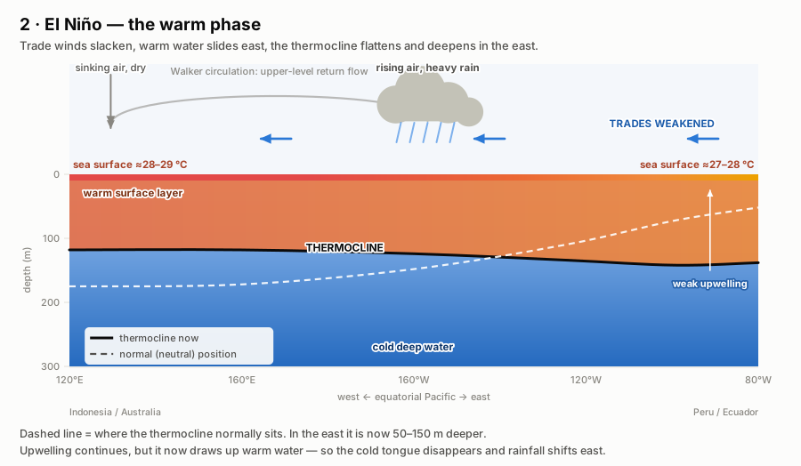
And in El Niño conditions note how the rainfall shifts east.
So what’s in store for Australia?
Chris Uhlmann, Michael Stutchbury and Chris Mitchell — ex very senior figures in mainstream media — can now find little better to do than complain about renewable energy. It must be news to them that the average Australian family might be far more concerned about the increase in insurance, food and medical costs than about the price of electricity over the past decade. But then those real problems aren’t the obvious wedge politics. They are real problems.
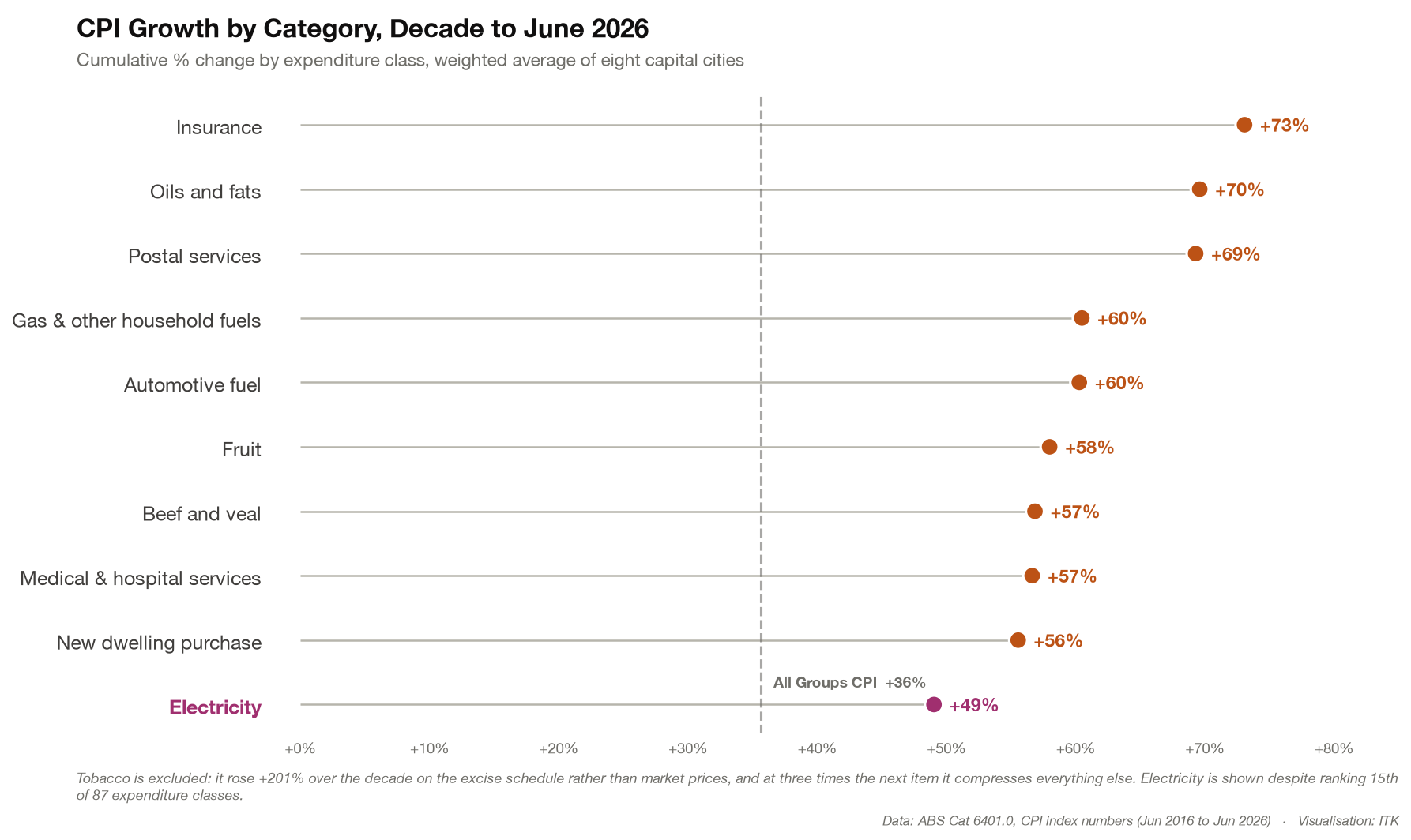
If there is a drought, it will push up food costs. Heat may have a minor effect on medical services, but unlike Europe, Australia is well used to managing heat.
A commentator on LinkedIn noted that El Niño may have some impact on wind speeds, but the data doesn’t offer strong support. The published regional effects run in opposite directions — weaker winds along the southern margin, stronger around south-eastern topography — and largely cancel out across a fleet spread over 182 sites.
Solar generation goes up with less rain but down with more heat, and demand will increase. No doubt we will find out the consequences over the next six months.
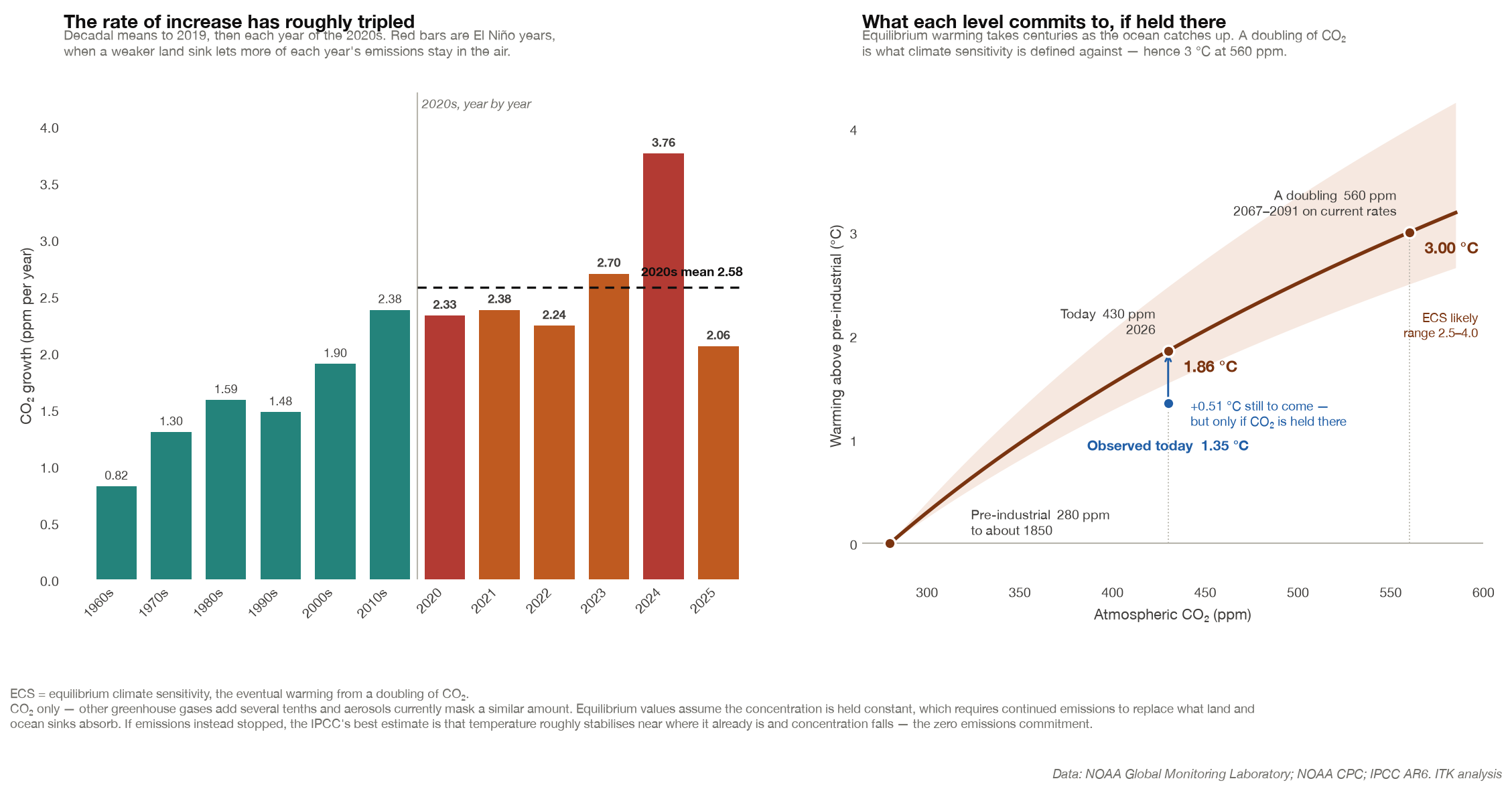
Finally the obvious point to make, and to make it simplistically, is that CO₂ atmospheric concentrations are still increasing. So this year’s El Niño might be record breaking but it’s unlikely to be the all-time record holder.