Productivity has been weak. Mining, construction and care are the culprits
Like global warming, productivity is much talked about but, I suspect, little understood; I have certainly struggled with it. I am self taught in both. For productivity at least I have some foundations: undergraduate economics, post graduate accounting and finance, and 33 years listening to some of the best economists in Australia at Ord Minnett, JP Morgan and UBS.
When you add in Claude’s own contribution, as an ever cleverer research assistant, and also helping to guide my theoretical understanding then I feel justified, once again, to venture off the reservation.
I have known since university and indeed it’s intuitively obvious that the way humankind improves its lot in life is through growth in productivity. The invention of the wheel, the industrial revolution, the computer revolution. New technology lets capital be put to work in ways that raise output relative to inputs. Some labour generally loses jobs but overall the expansion of activity leads to growth in total employment. This has been a basic truth in economics for as long as economics has existed. So when productivity slows or declines we all have a duty to take an interest.
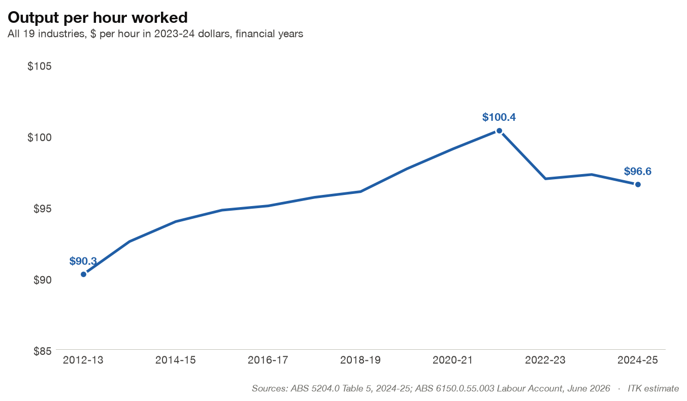
And it has declined. Output per hour worked across the economy fell after 2021-22 and is now below where it was five years ago.
The project started with a few simple questions:
Why had productivity growth slowed so much in the past five years (the natural thing was to blame the Government)?
To what extent was “big government” or a bigger share of Government in the economy dragging down the economy?
Is Australia’s performance an outlier or consistent with global experience? I won’t talk to that in this note save to say that broadly what we see is what the world sees. But we are leveraged.
The answers ended up surprising me.
Main findings
- Mining turned from adding to national productivity growth to subtracting from it. Its output per hour has fallen about 5% a year since 2019-20 as hours and capital grew and output didn’t. Part is depletion (zinc, lead, nickel, oil, legacy gas); part is miners processing lower-grade ore because prices were high. Little future volume growth can be expected so in my view writ large we need to find a new growth engine.
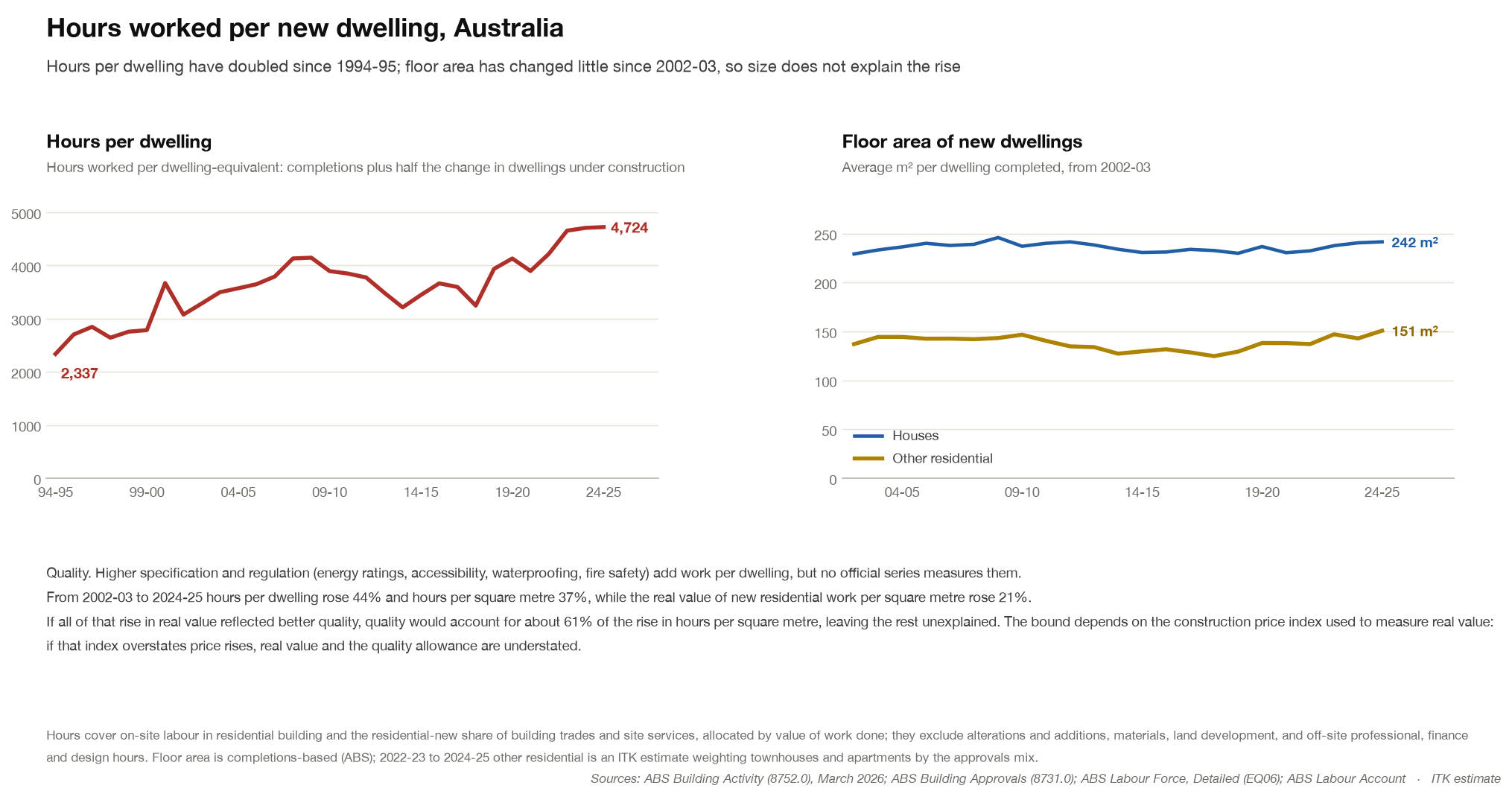
- Construction. Building a new dwelling now takes about 4,700 hours of on-site labour, twice the 2,300 of thirty years ago. Homes aren’t bigger. Better specification and more management and compliance labour could explain most of the rise since 2002-03; high-rise apartments a smaller part; individual rule changes very little. Backlogs caused by a temporary production surge are also a sort of explanation.
- Government-funded care. The growth in government isn’t administration: it’s the NDIS, aged care and child care, up from 1.5% to 3.9% of GDP in ten years, mostly delivered by private and non-profit providers. Hours in social assistance rose 91% over ten years, whereas hours in universities and TAFE rose an unbelievably paltry 5%. Because care has low measured output per hour, that shift lowers national productivity but does improve lives. Equally the lack of investment in education seems at a broader level indicative of a society no longer interested in progress or productivity.
I should add that reports by the RBA and the Productivity Commission are broadly consistent with this independent work.
Why the recent slowdown?
The first step was to split the change in productivity growth over the last five years, compared with the five before, into its parts. This produced the first shock:
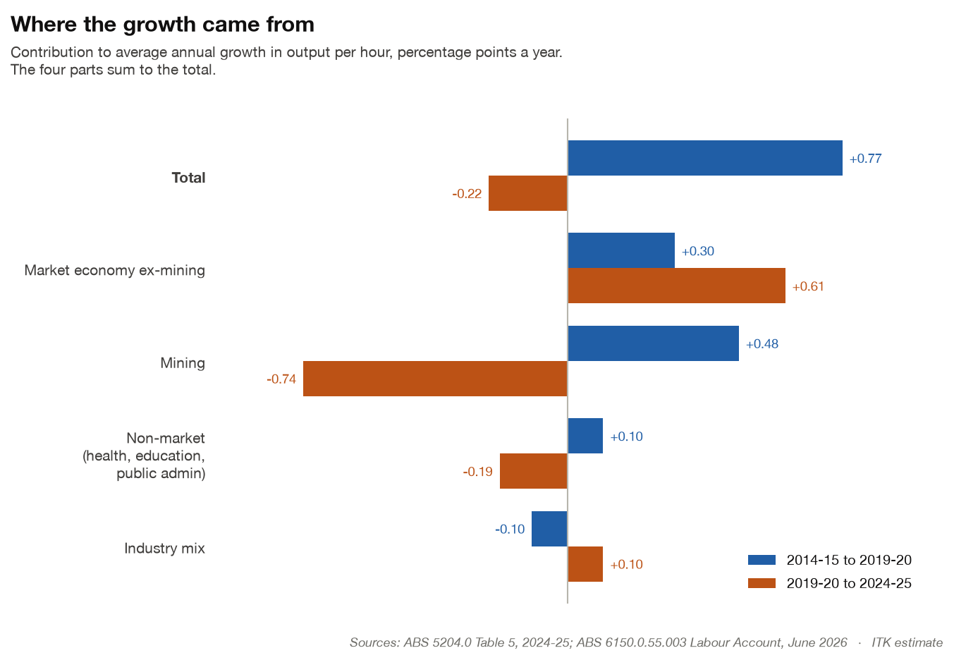
As expected the non-market sector’s contribution to productivity had declined. But I nearly fell off my chair when I saw the impact mining had had on national productivity.
It turns out that for a variety of reasons mining productivity growth has been in decline for a long time and over the past five years has gone negative. So mining needs to be taken apart and that follows but first it’s helpful to look at the size of sectors and their relative “value add”. In the following treemap, the bigger the tile, the more a 1% change in that industry’s productivity moves the national number.
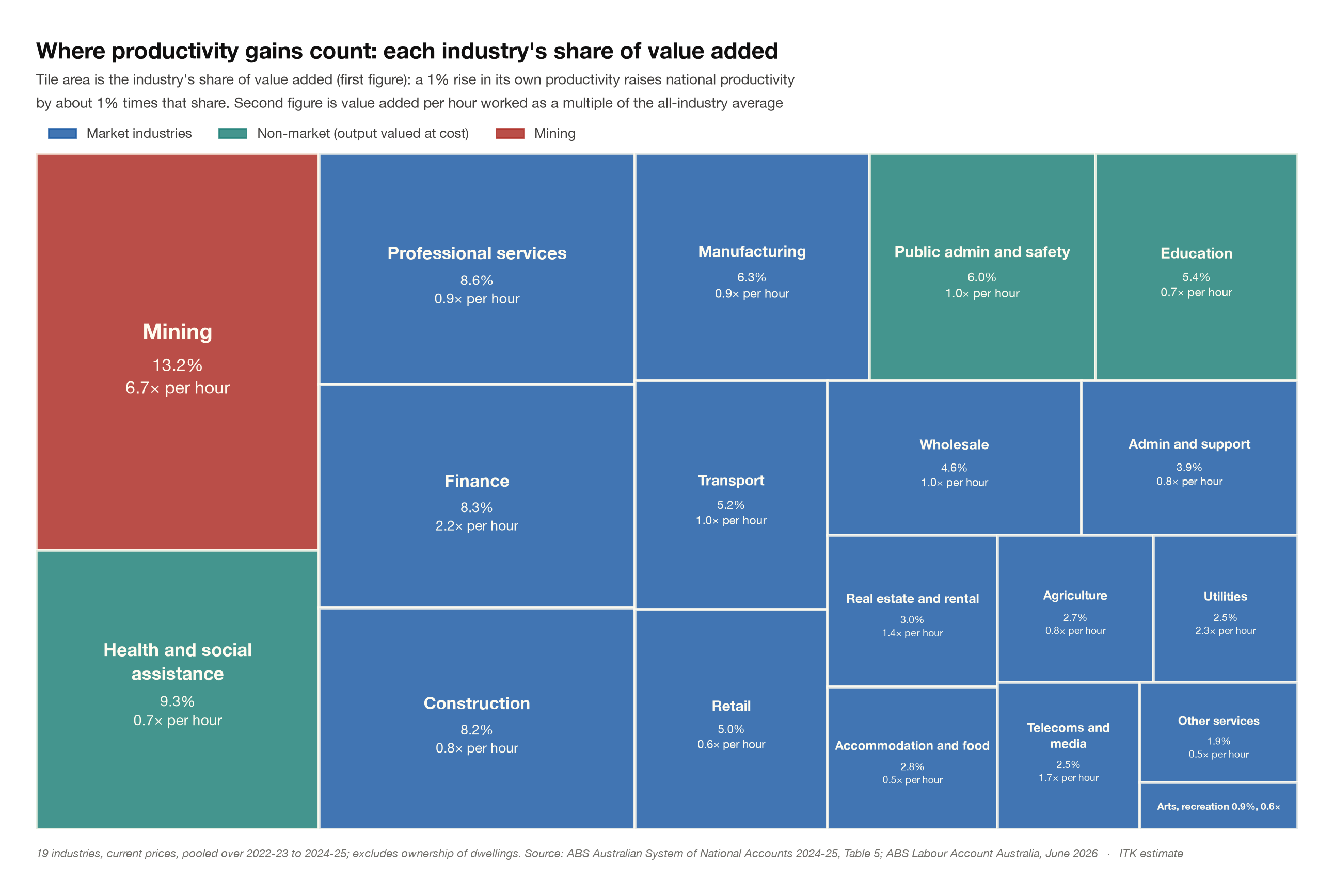
One of the problems with productivity is that services in general and government services in particular don’t really have traditional output measures. Instead the ABS counts activity (hospital separations, Medicare services, students) valued at what it costs to deliver, and for collective services such as defence it simply assumes output grows with hours worked. So measured productivity in these sectors is close to flat by construction.
The same data can be rearranged as a Marimekko chart to show both things that matter: how productive each hour is (height) and how many hours each industry uses (width). This is helpful to understand that national productivity can change when workers move from one sector to another as well as by the change in the sector’s own productivity. Workers moving from the “care or NDIS” to mining will lift national productivity mechanically. 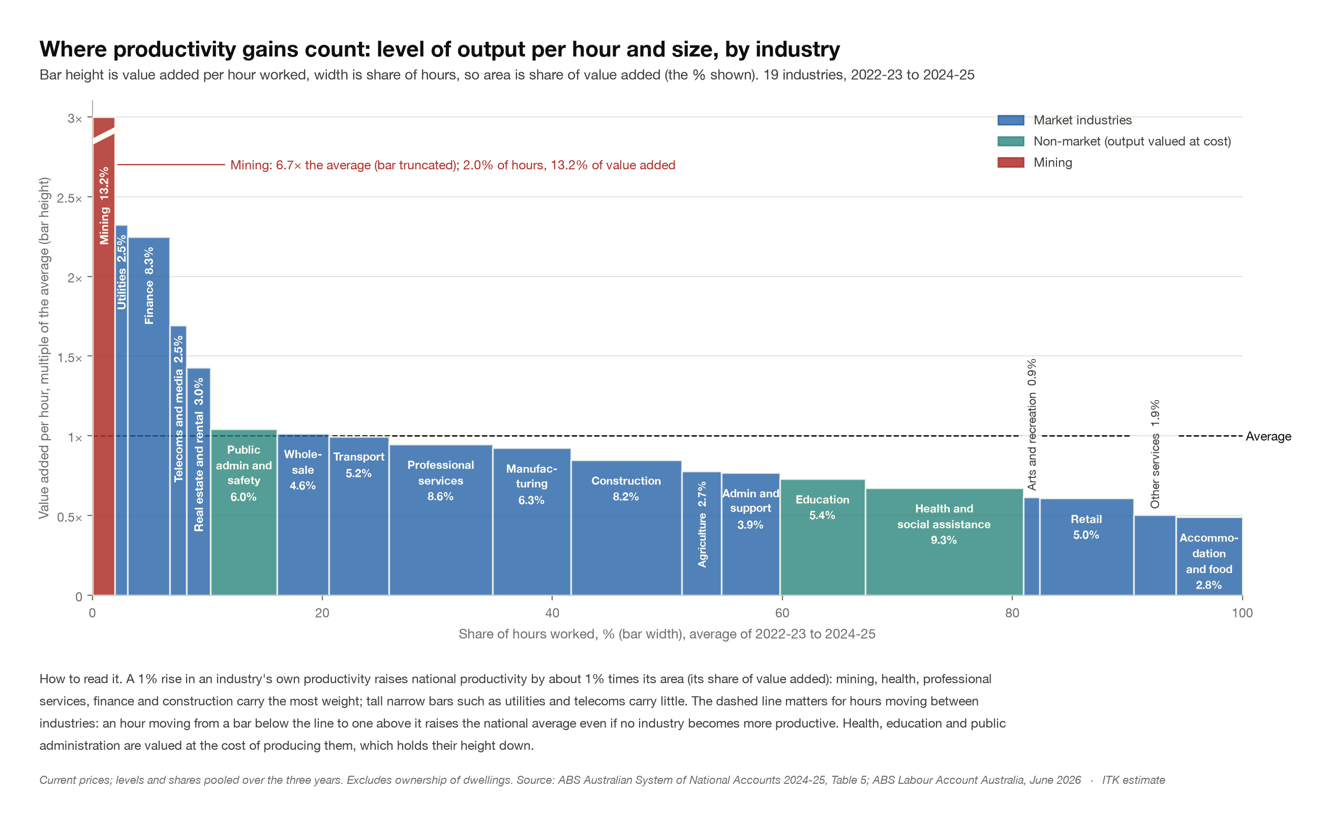
Pulling out the eight largest industries, which make up 65% of value added:
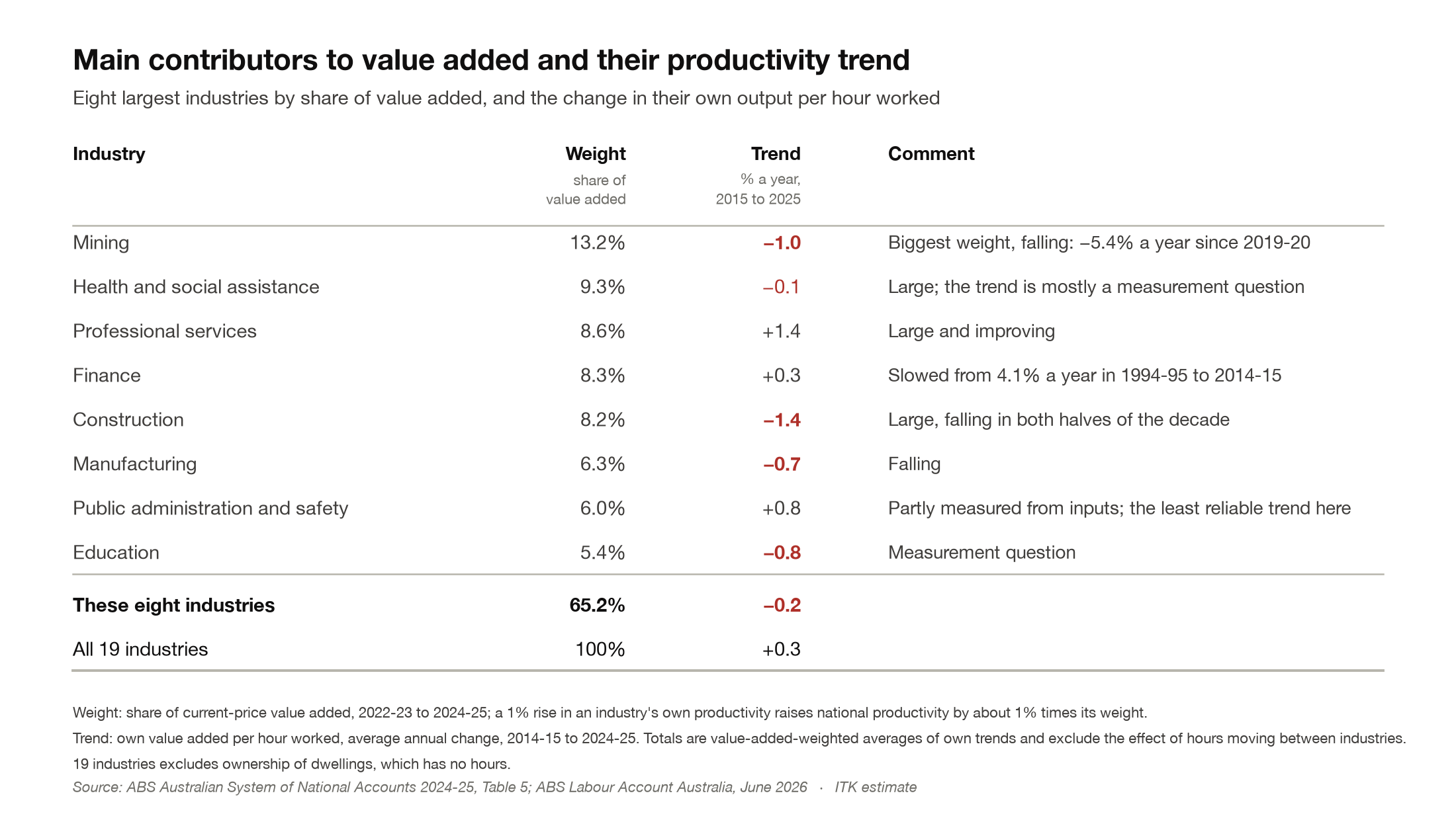
Together the eight largest industries’ own productivity went backwards over the past decade (−0.2% a year), while the other eleven averaged +1.3% a year.
In my view the main message of this piece is that Australia has to look beyond resources. We rode on the sheep’s back and then we rode in the iron ore dumpster. Our future lies in finding a new way forward. Mining is unlikely to be a major growth area.
But before getting to mining, let’s briefly look at government services.
Government
This chart covers government spending on services, not transfer payments such as unemployment or pension benefits.
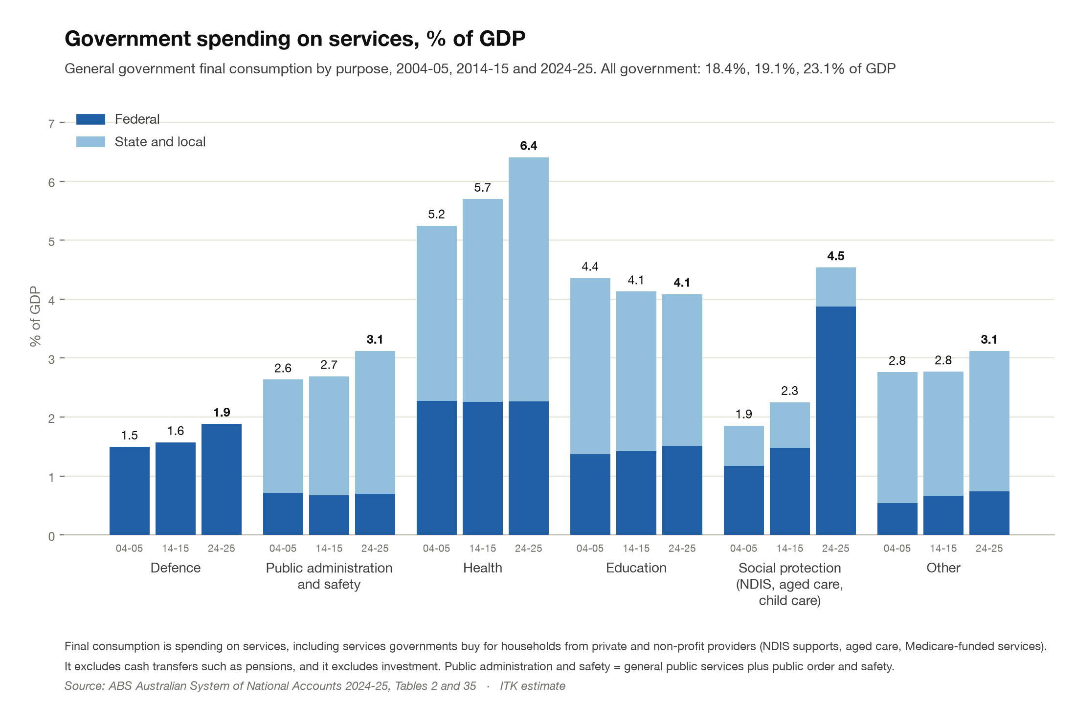
You can see when you look at the data this way that by and large State spending on health has been growing faster than GDP and over the last ten years Federal spending on Social protection (the NDIS, aged care and child care) has gone, in my words, out of control.
The next plot shows the Government on the left side but it’s really the right hand plot that stood out. That shows the change in combined public and private sector hours worked over the ten years to 2024-25. Hospital hours are up 70%, residential aged care hours are up 52%, social assistance hours, that is NDIS and child care, are up 91%
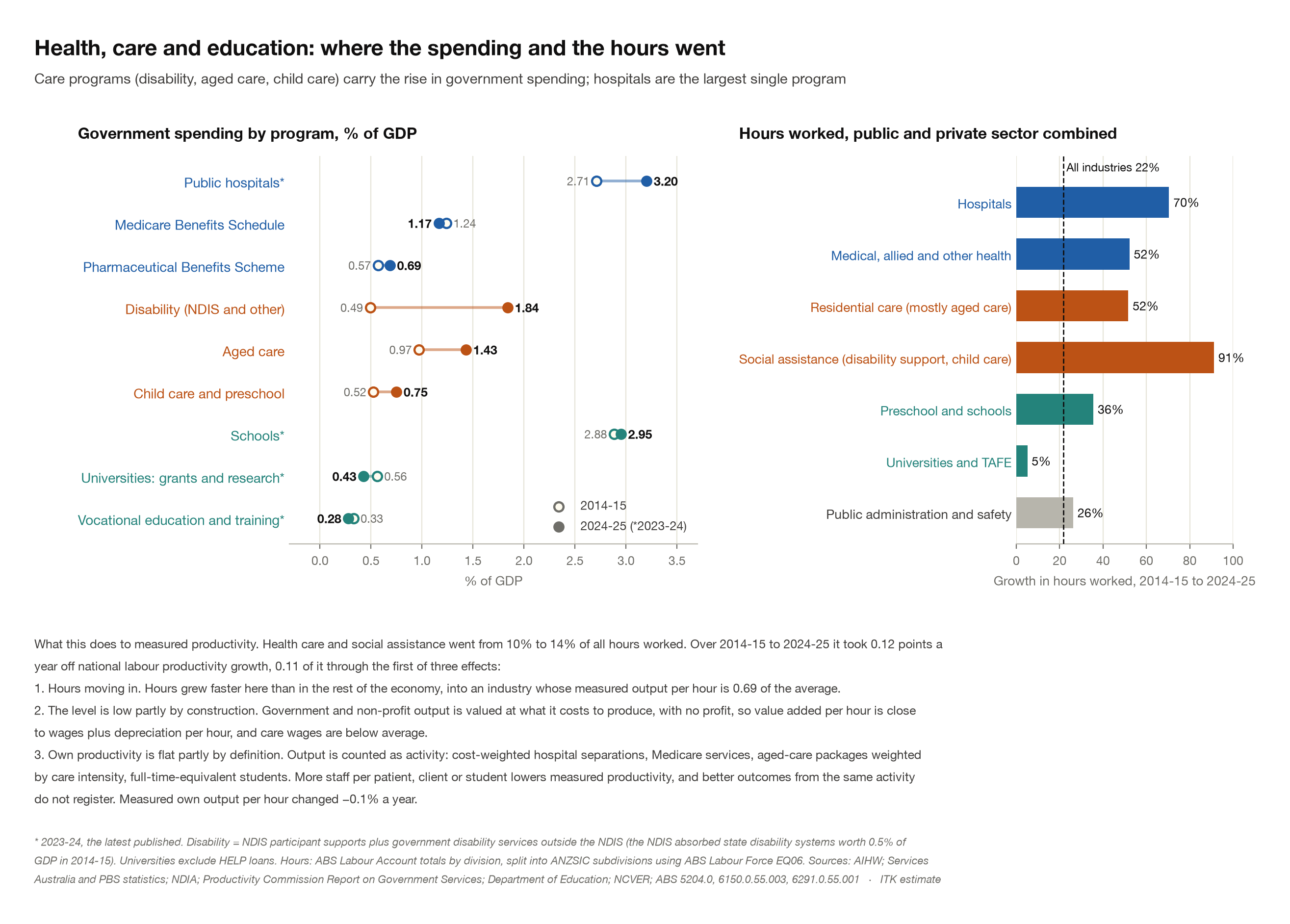
Against that University and TAFE hours are up 5%.
Noting that this is the change in hours and not the level but also noting that social protection is now a bigger share of GDP than education my personal view is that we are way underinvesting in higher education.
It’s universities that are the most likely place to originate the technology that drives productivity growth. Of course plenty of technology comes from the private sector, but it has to be sensible to fund research both pure and applied. Enough said and moving on.
Ok now to mining
First up, let’s clear the air;
- I am a resources fan. I owned lithium shares for years and still own some Lynas (rare earths) although I sold most when someone was paying what seemed to me a ridiculous price. I would buy a copper equity tomorrow if I could find the right one, been looking for years;
- Oil and gas fall under the mining banner.
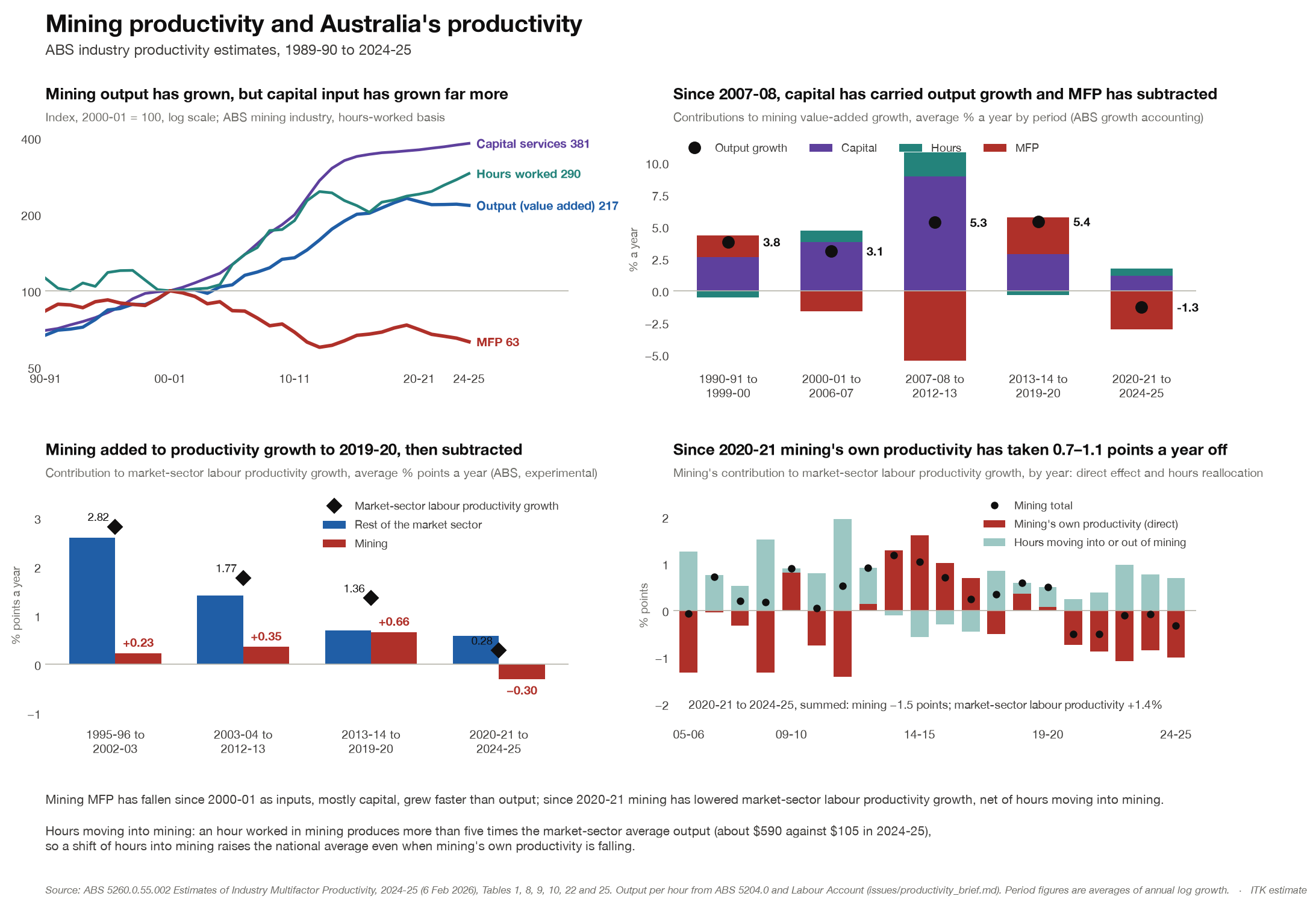
The basic story starts with the fact that mining multifactor productivity has fallen for most of the past 25 years and in the last five years mining output per hour went sharply negative. As discussed above it remains one of the most productive areas of the economy but it’s gradually becoming a drag on growth.
In the following panel the top left chart shows mining’s output, hours, capital and multifactor productivity since 2000-01, the bottom left hand compares mining productivity changes with those in the broader economy and the bottom right plot shows the impact of people moving into the mining economy.
The first problem is volume growth. The following panel shows most of our major mining industry product volumes expressed as an index where 100 = volume in 2014-15. Only iron ore, gold, LNG and lithium are over 100 and LNG is flat in recent years, iron ore volume growth is very modest and gold is down from its peak.
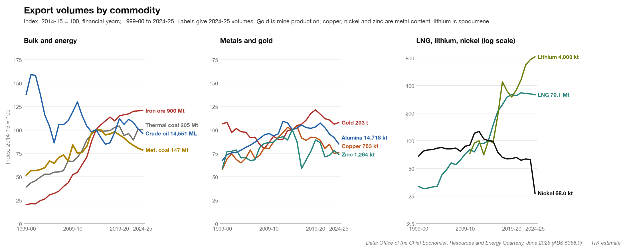
I could have included forecasts from the Office of the Chief Economist (OCE) out to 2030 which change the picture a bit but I don’t think it really moves the dial. In the OCE’s view only copper (about 6.5% a year), lithium (about 7.5%) and nickel (from a collapsed base) see sustained growth to 2030-31.
So the lack of volume growth points, at least in part, to a sense that our best resources are declining or at least declining in competitiveness relative to global alternatives. Gavin Mudd has done a lot of work looking at resource grades and cutoffs. To be clear average gold grades (gold per tonne of ore processed) have fallen for decades but due to improvements in technology and higher prices it becomes economic to mine those lower grades. So for some resources even though the grade is declining the economic quantity of resource can increase. That’s the blue bars in the following plot. The red bars are the reverse: grade and metal content both falling, which is depletion.

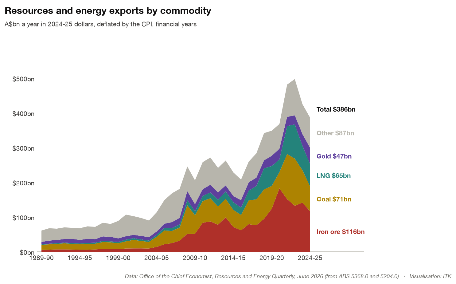
Although this note is about productivity the following plot shows how resource exports, driven by iron ore, coal and LNG, went from about $60 bn a year in 1989-90 to a peak of about $500 bn in 2022-23 (in today’s dollars), and were about $390 bn in 2024-25. You can’t really overstate how important this has been and therefore how important it is for us all to understand it’s over, or at least the growth part is.
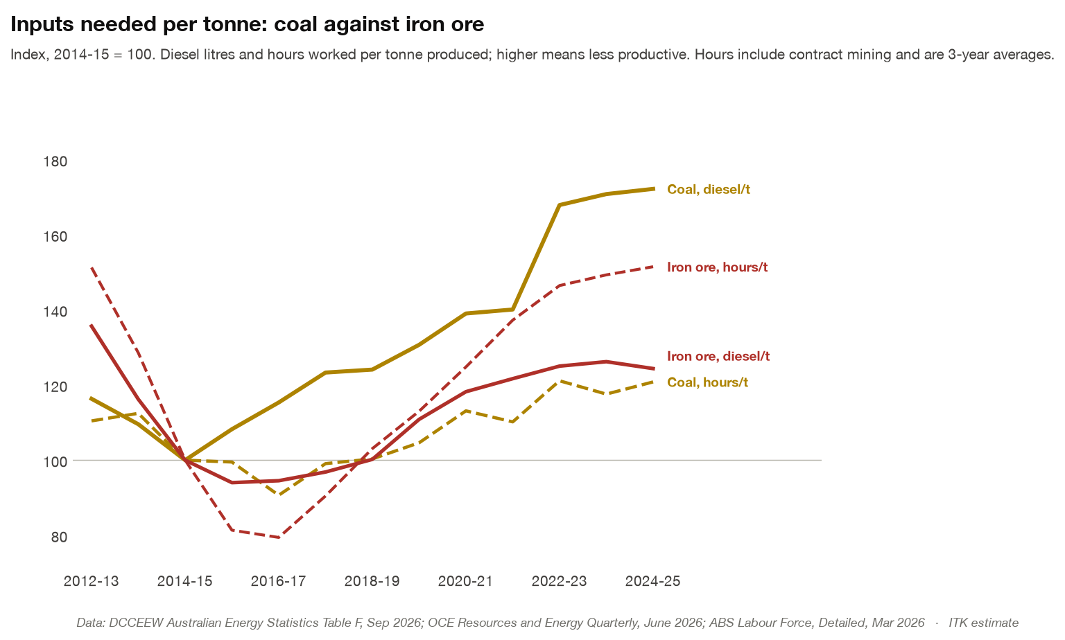
So I first realised there was a problem with coal productivity when looking at diesel consumption. Diesel consumption per tonne of coal produced is up about 70% since 2014-15, from 5.7 to 9.8 litres per saleable tonne. That is the “de-electrifying Australia” industry. Western Australia has gone further with mine electrification, although even there diesel per tonne of iron ore has risen (by up to a quarter on my estimate). NSW and Queensland coal mining sucks big time. BHP one of the worst offenders of course.
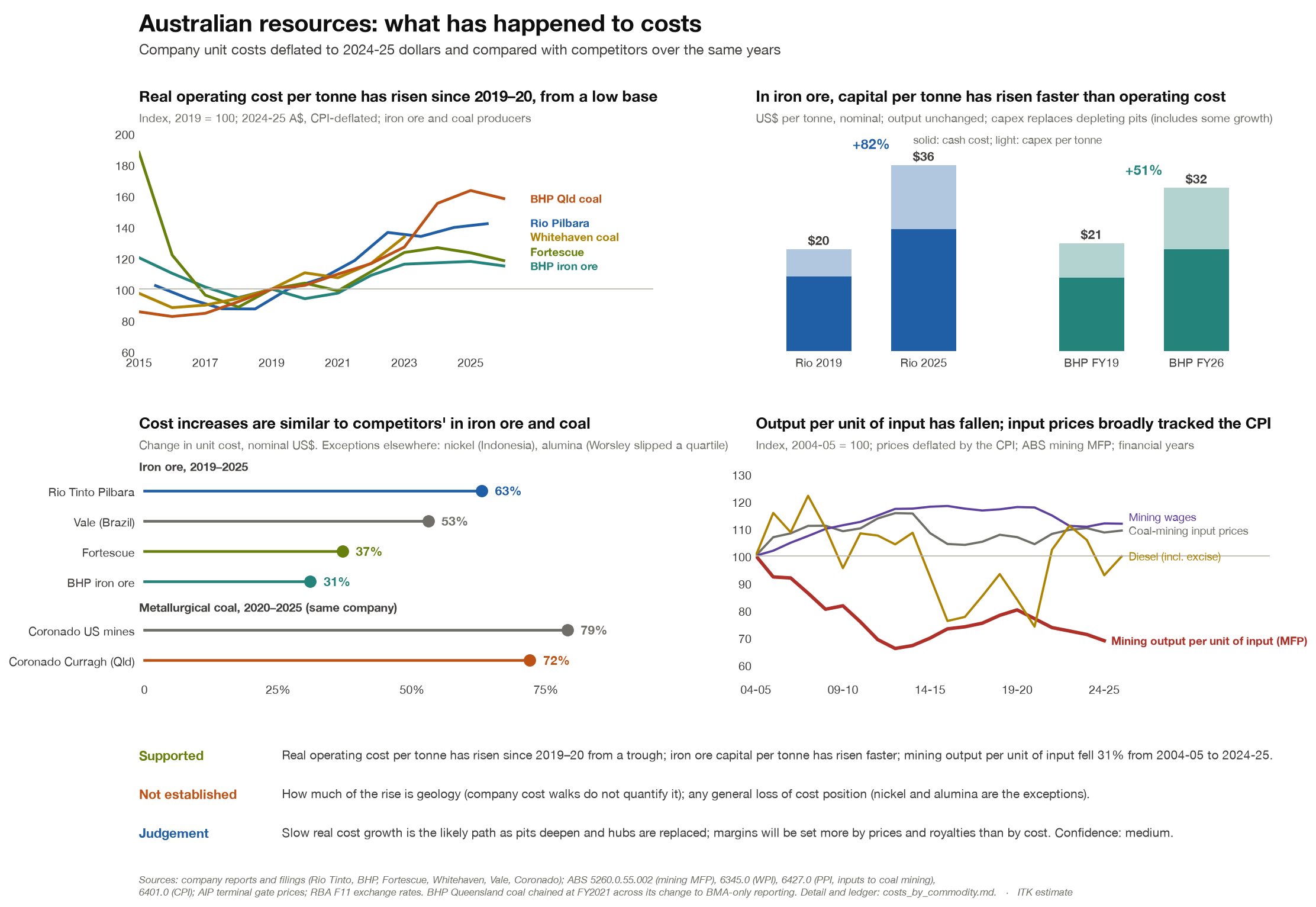
It’s beyond the scope of this note to get a good handle on resource quality and its change, all of which has to be measured relative to global competitors but what is clear is that both Australian and global costs are increasing in real terms in both iron ore and coal. In iron ore as the top right figure in the next exhibit shows Rio’s combined capital and production cash costs are up about 80% per tonne of ore produced from 2019 to 2025 and BHP’s up about 50% from FY2019 to FY2026.
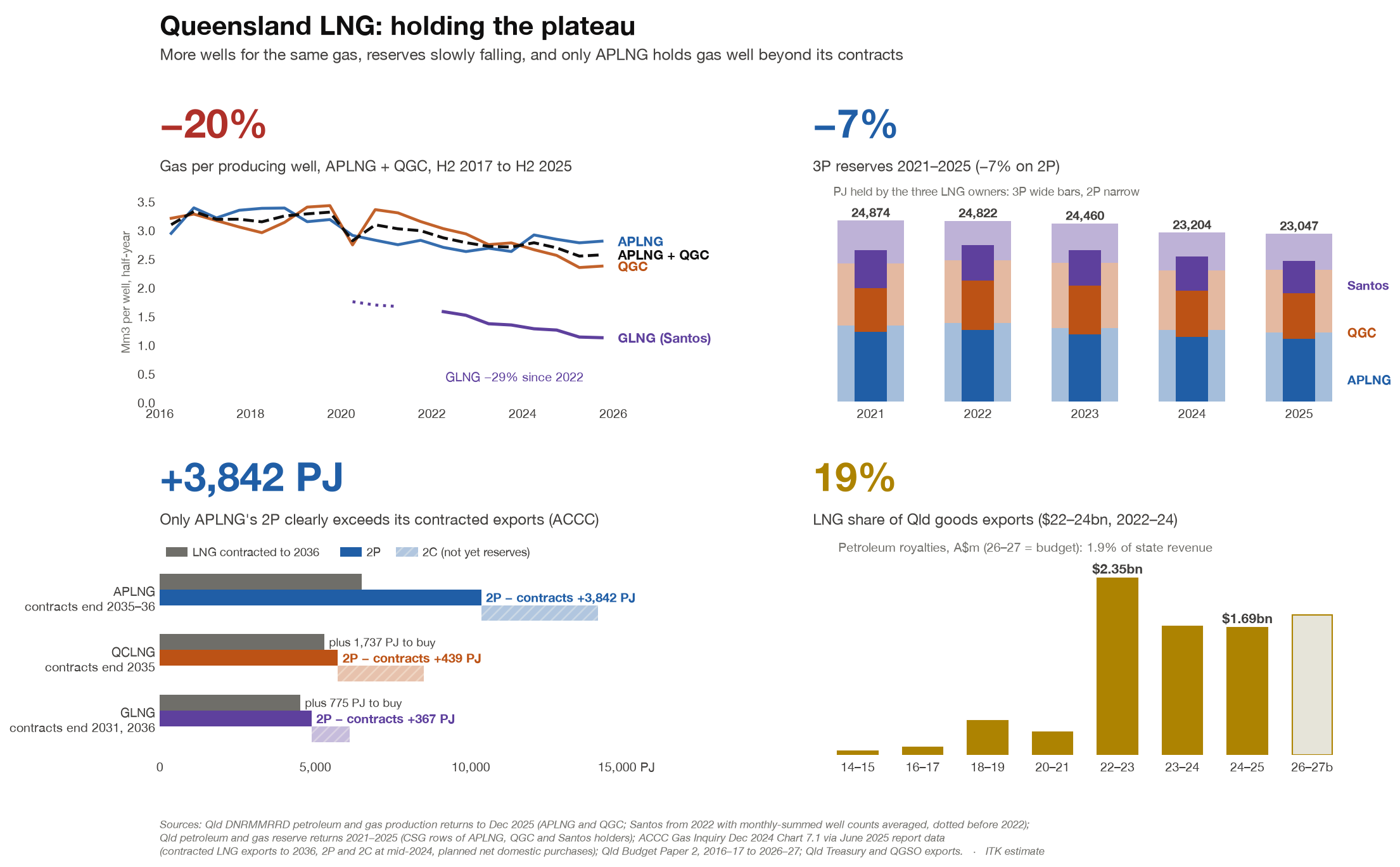
And on LNG, and particularly Queensland LNG we can see, as I have long expected, a broadly similar picture. It’s a finite resource. The bottom left plot is the relevant one, and makes a point I have often made: GLNG doesn’t have enough gas to fill its existing LNG trains, let alone the resource to underwrite new ones. QCLNG’s existing Surat resource was always expected to have a relatively fast decline rate. It may be that gas from Arrow (the Shell and PetroChina joint venture) provides QCLNG with some additional reserves. Historically one could be forgiven for skepticism but times change. Decline in LNG in QLD could yet be another problem for a QLD Govt that refuses to look forward and remains locked into running a loss making Olympic Games. But that’s just me being negative. She’ll be right on the day.
Construction - hours to complete a dwelling have doubled, 2,300 to 4,700
This was another eye opener in a research piece that’s been full of them. And it’s not a size effect, and “better” dwellings could explain at most about three-fifths of the rise since 2002-03. Of course that’s an average number, and it is total labour across all the workers on the job, about 2.7 person-years, not how long the build takes.
I looked at what others have said and didn’t find a clear diagnosis, and as an ex building materials analyst who has been on many housing and apartment site tours in Australia and the USA, I had my own ideas. Here’s a summary of the explanations I tested. 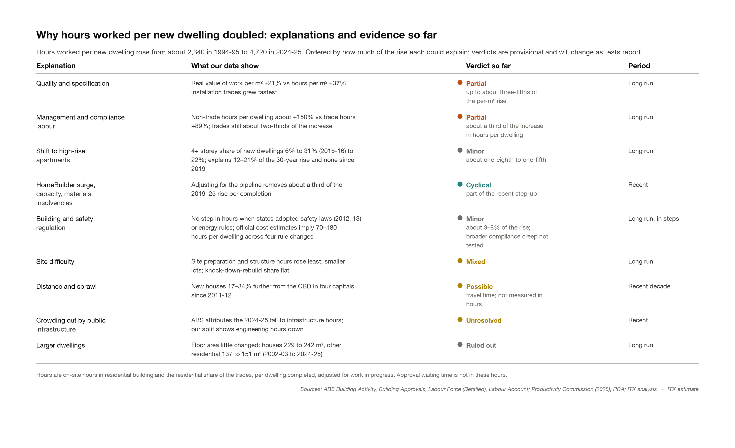
- “Better” dwellings, higher specs and standards eg insulation, solar, fire safety, water proofing on a generous basis that can explain much of the change. Against that, materials’ share of the cost of residential building fell, so the extra value doesn’t seem to have come mainly through materials.
- There seems to be an increase in management and compliance labour.
- More high rise apartments, which take more labour per dwelling, are another smaller part of the explanation.
So better dwellings and more management and compliance labour explain most of the rise since 2002-03, high-rise a smaller part, and individual rule changes very little.
Rule changes that individual States have put in are most likely not the explanation. An “event” test doesn’t find a change in hours per dwelling when States adopted new rules, and the official cost estimates for the main rule changes add up to only 3–8% of the rise.
Houses are not much bigger on average (229 to 242 m² since 2002-03) and nor are apartments (137 to 151 m²).
The industry has many small players and doesn’t use much factory prefabrication, they may or may not hold productivity back but they are constants over the entire period.
I’m not completely happy with these explanations but it’s as much as I can do in this note.