Wind and solar are much more financeable as infrastructure than market facing
In a rather long-winded way this note seeks to make four points.
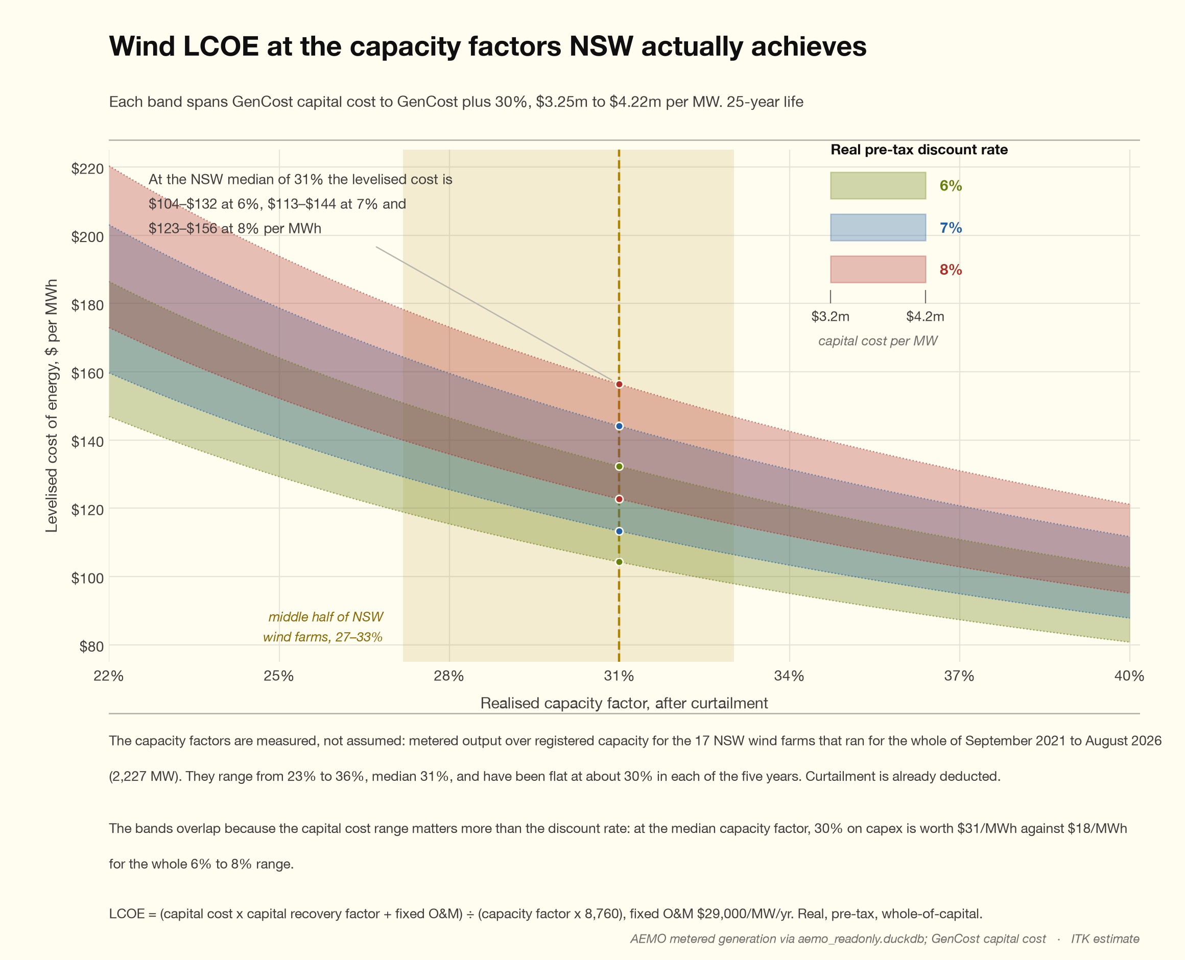
Rising bond rates cause renewable energy sensitive listed stocks to underperform creating negative sentiment for new investment. From a new development perspective a 1% rise in bond rates requires something like a $10/MWh increase in the LCOE at the capacity factors NSW achieves. Bond rates rise because of inflation and that too drives up LCOE. Think concrete costs and wages, construction camps etc.
Australian super funds have, between them, at least $5 bn a year to invest in unlisted infrastructure, most of which goes to anything but renewable energy. If they collectively start putting say $2 bn a year into renewable energy equity, assuming a satisfactory platform existed, it would, at a minimum, create benchmark tracking error. That issue is solvable, and things like MySuper benchmark reform might help. But the bigger issue is that wind and solar projects are not infrastructure. They are assets exposed to short term hard to forecast market prices. So for the super funds to be willing to make those investments, on behalf of their members, wind and solar market exposed equity needs to be converted to less risky infrastructure equity. The obvious way to do that is with long dated PPAs with highly rated counterparties. The evidence is that traditional PPA writers are not willing to pay the prices that wind farm capital providers require. So the market is not clearing and if you want to call it market failure then it provides the rationale for Government intervention. In short decarbonisation, security and long term electricity price goals require Governments to subsidise new generation.
There is an academic argument of sorts going on, most recently in a Cambridge working paper, that unlisted infrastructure has a higher cost of capital than would be estimated using the standard Capital Asset Pricing Model [CAPM]. I think that argument is without merit. The evidence offered for it is that private infrastructure earns a better return per unit of risk than listed. But the returns are the same to within half a point. The entire claimed advantage is a volatility number, and that number is computed from valuations the owners commission themselves.
Ultimately capacity factors for wind in the Orana zone are not that high and the price will reflect that. At the 31% capacity factor the median NSW wind farm has realised over the past five years, and GenCost capital cost plus 20%, the chart below puts the levelised cost at $123/MWh on a 6% real pre-tax discount rate, $134 at 7% and $145 at 8%. A price between $120/MWh and $140/MWh is where we are at. The cost of capital is more important the lower the capacity factor. So my opinion remains that the Federal and State Govts can save something close to $20/MWh in NSW by offering long duration PPAs. Over 10 GW of wind procurement $20/MWh saves $0.5 bn a year as compared to the price that has to be paid if the wind is financed at merchant, but of course it never would be. I see it rather as equivalent to an efficiency gain. The wind has to be built, it has to earn WACC. Making it so that super funds will happily buy the assets seems to me something the Government should be prepared to do. You could look at it I suppose as a transfer from consumers to super fund members but I think it’s better to see it as just having assets that should be infrastructure actually priced as infrastructure.
The financing market for wind and solar is dead or close to it
The financing market for wind and solar assets is dead. Or at least comatose. A large part of the industry is for sale. There are no buyers. Offshore investors were on the point of having insult added to injury by having their mostly meagre profits taxed.
Super funds would infinitely rather invest in an offshore data centre, or a big oil company or something in big tech than in a wind or solar asset. In any case if they wanted to invest in wind or solar it’s very hard to do so. There is no clear platform in serious growth mode. There are various super renewable energy platforms but none is dominant, none of them even look particularly active.
Wind and solar developers have done themselves no financing favours.
Despite banks telling them to get organised into portfolios there is still this piecemeal asset by asset development. The market is still basically dominated by developers as opposed to operators and asset owners. Various bits of practical and theoretical work suggest that if you are only invested in one asset, like a big unlisted wind farm, you require/expect a higher rate of return than if you own the market portfolio of equities. A recent and interesting, if depressing, academic paper on the topic is new approach. I disagree with the conclusions of that paper, see later discussion but I certainly do think that a recognised big business focussed on wind and solar owning say 20-25% of the total Australian market would get taken much more seriously than what we have now.
The Governments have done the industry few favours. Policy support is abysmal Totally abysmal. We went from a carbon tax to a certificate scheme to some so far largely unutilised debt support. Not only that however successful the home battery scheme is, a side effect is to hurt the utility battery market. So the Federal Govt can offer a fairly useless CIS support on the one hand and shoot down the available utility market with the other hand. No wonder the capital providers walk away.
On top of that the Nelson review tinkers with the market structure, first defining a problem that wasn’t THAT obvious and then inventing a really complicated solution, that requires first class people to demonstrate it’s technically feasible. KISS.
Even the NSW State Government having stuck at its REZ policy can’t stop interfering in a bad way. Energyco had been doing well as evidenced by the progress in the Orana Zone, but now looks set for a major reset. NSW Treasurer Daniel Mookhey has never been heard to talk about energy and yet he is one who likely calls many of the shots. Good people walk. Faceless bureaucrats continue to build their careers. No new assets get built.
So it’s a right mess. We have half way crossed the Styx but now there is a general blame game.
Bond rates are building the new walking dead
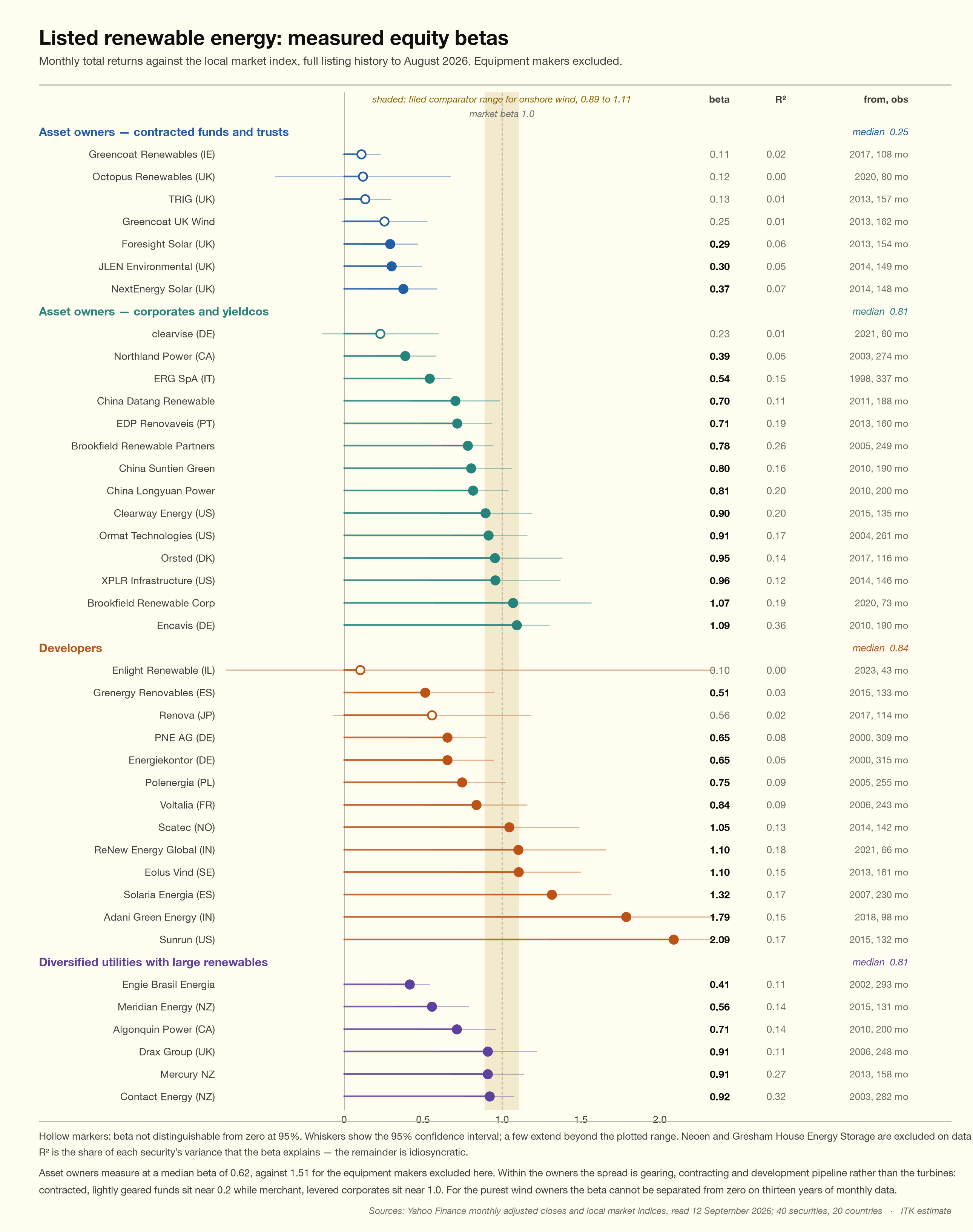
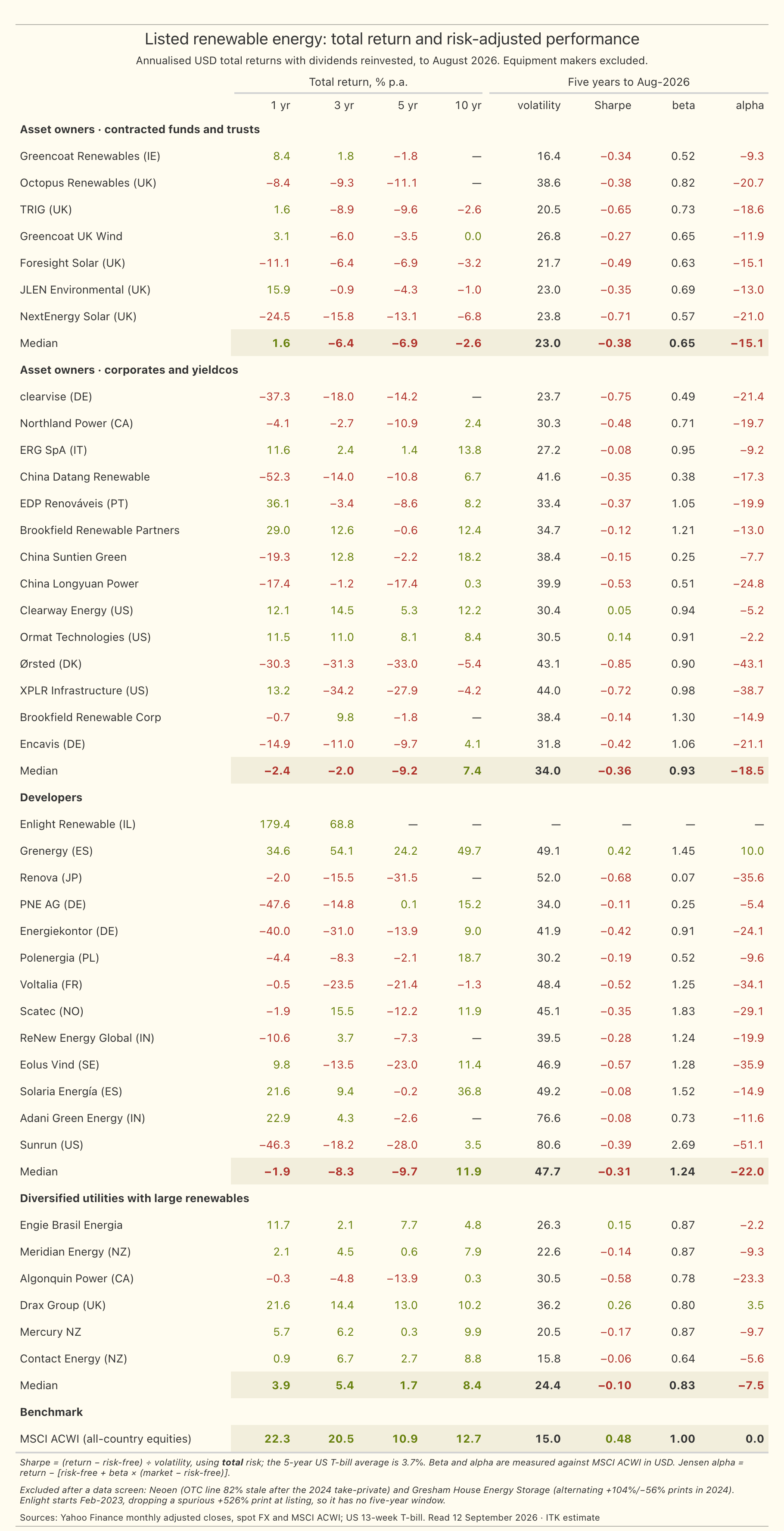
Not only that in terms of finance it’s getting more dead. In the past 12 months 10 year bond rates are up around 1%, which raises the required price for a wind farm by say $10/MWh. The following plot shows about 40 globally listed stock exchange companies where renewable energy is a significant part of the business, asset owners, developers and diversified utilities that focus on renewables. I put a couple of tables at the end of this document. What the plot shows is that since global bond rates (proxied here via US 10 year rates) have risen from 1% to 5% renewable energy has underperformed. This should surprise no-one when you think about it. Infrastructure of all sorts is negatively exposed to rising bond rates.
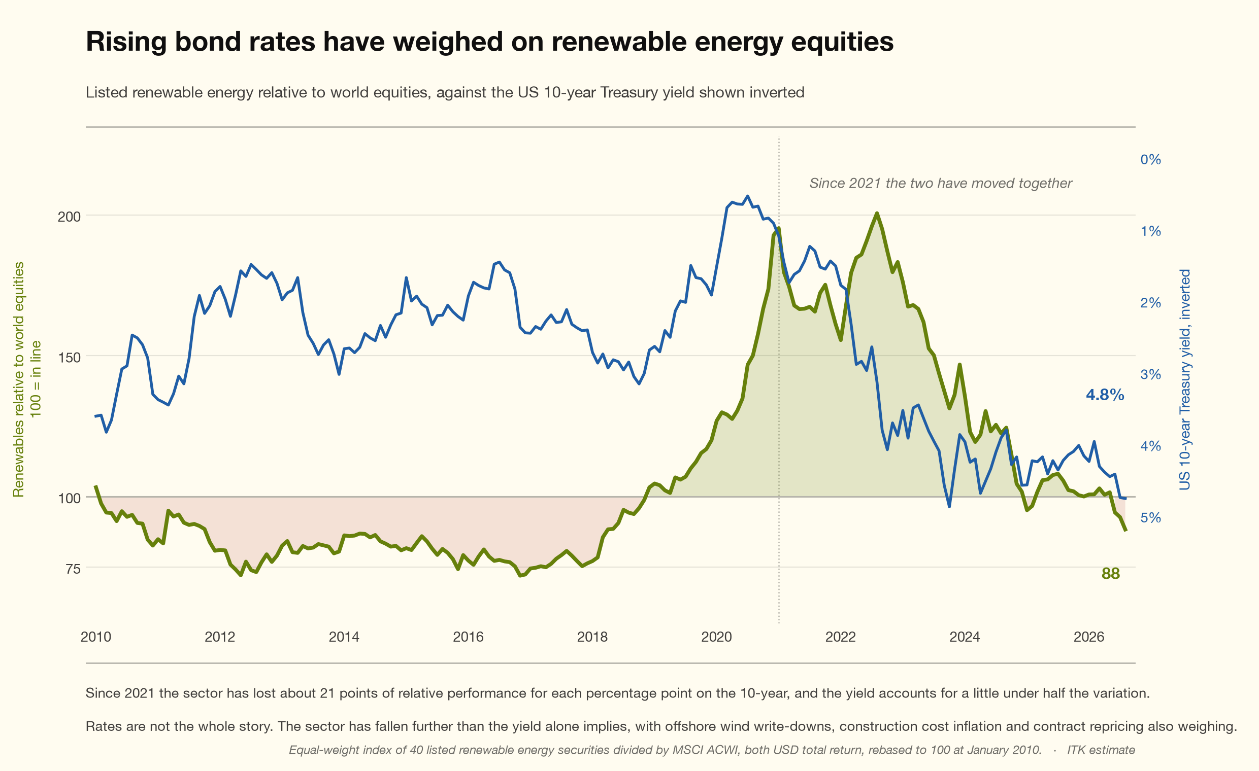
I have a tendency to teach grandma how to suck eggs, but here I think it’s worth pointing out that the longer duration your asset is the bigger the impact of a change in interest rates because, in my view, it explains some of the, bingo, “headwinds” the sector faces.
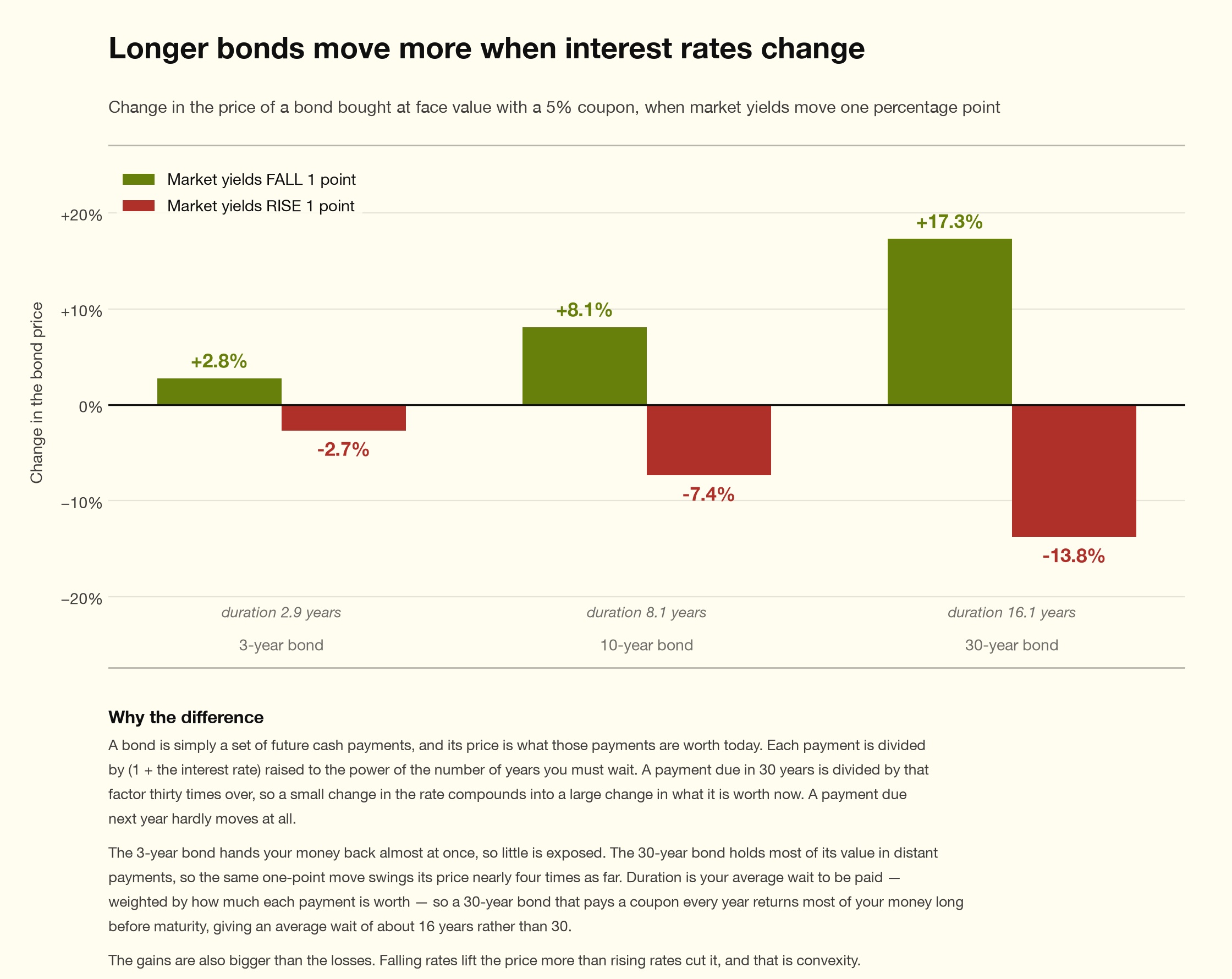
On top of that the reason why bond rates are rising is basically inflation, although there may be other factors at work. And inflation also impacts, as we know, directly on the capital costs of wind and solar farms. Particularly it impacts concrete and labour prices. And obviously there is a third factor which is that some underlying components, particularly and above all, transformers are seeing demand increase faster than supply.
On the other hand electricity prices rise with inflation to some extent in nominal terms. As discussed new wind and solar farms require higher nominal prices.
Wind and solar only work if actually infrastructure
There are only two ways to make renewable energy investment attractive. On the one hand it can be made into infrastructure. Infrastructure is a term that everyone understands but harder to define.
For me it is capital intensive, long life assets with guaranteed returns. It’s the guaranteed returns part that is relevant here.
Look at toll roads and airports. In the case of toll roads they typically have 20 -100 year leases where tolls increase at the higher of some fixed rate eg 3% or inflation.
Closer to home wires and poles assets get a regulated monopoly return into perpetuity.
Wind and solar farms don’t get that. They are exposed to market prices.
The other way to make the sector investible is to offer high returns and growth. What makes Anthropic and for that matter OpenAI so attractive to investors? It’s the incredible growth and the value add. The same goes for Tesla, for Amazon, for, in the early days, realestate.com.au and so on. CIOs at super funds are human beings, they get excited by growth like everyone else
Wind and solar assets by contrast start with volume subject to curtailment either by negative prices (most commonly) or line limits. And then they have to sell a commodity product with little or no ability to manage price. Wind and solar are pretty much pure commodities:
“A commodity is a standardised, fungible good — one unit is interchangeable with any other of the same grade and delivery point — so it trades on price alone rather than on brand or seller identity.”
I don’t think you can easily make wind and solar attractive to investors who focus on price and growth. There just isn’t any sustainable moat. The argument would have to be that ongoing growth in demand would keep prices above new investment levels into the foreseeable future so that investments would earn above their cost of capital. It has to be above the cost of capital as well. And I think that is too hard a sell.
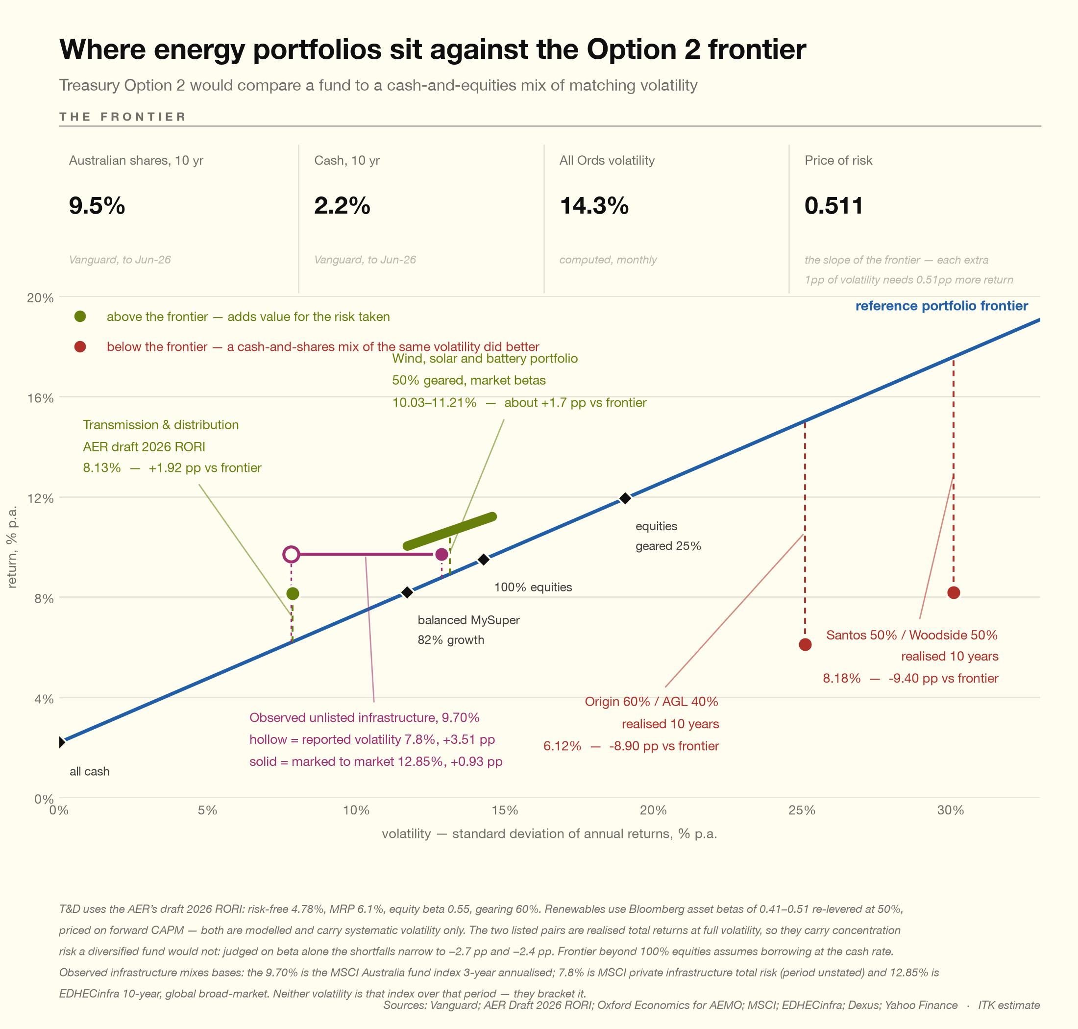
All investments sit on return risk line. I discuss this more in relation to MySuper acceptable return review Treasury Option 2 below (phew what a mouthful) However the following plot I put together when considering that option is useful in showing the tradeoffs.
Super fund perspective
Super funds have about $103 bn in unlisted Australian infrastructure out of a bit over $3 trillion of total assets so about 3% in that asset class, then there is another $110 bn in international unlisted infrastructure for a total of about 6%.
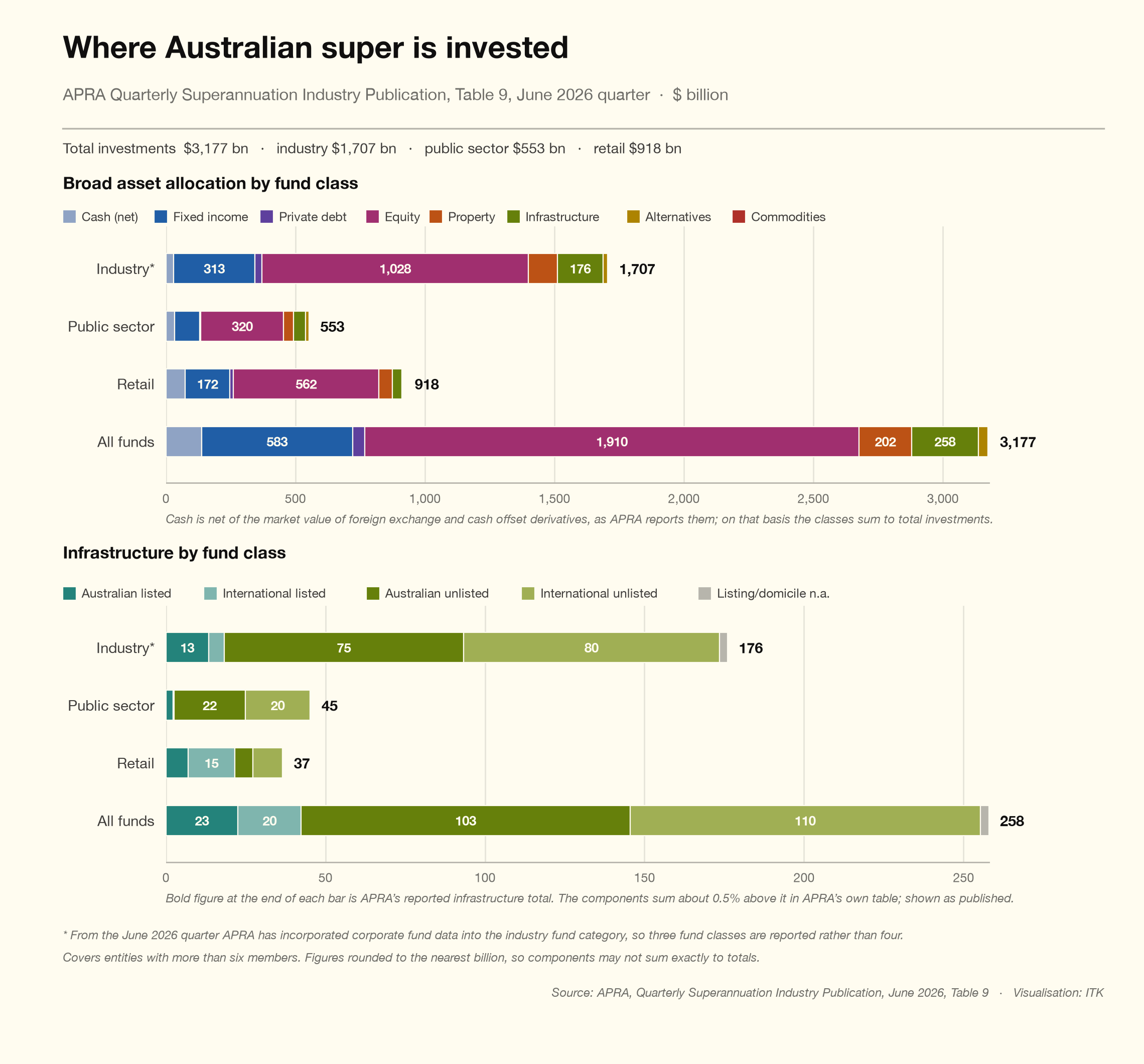
Super funds are unlikely to sell existing assets to buy wind and solar generation as a general rule. Almost by definition unlisted infrastructure is designed to be held long term.
And without wanting to make too much of it for most super funds assets are withdrawable at will. Imagine if One Nation’s idea of letting members put all their super into housing was to actually happen.
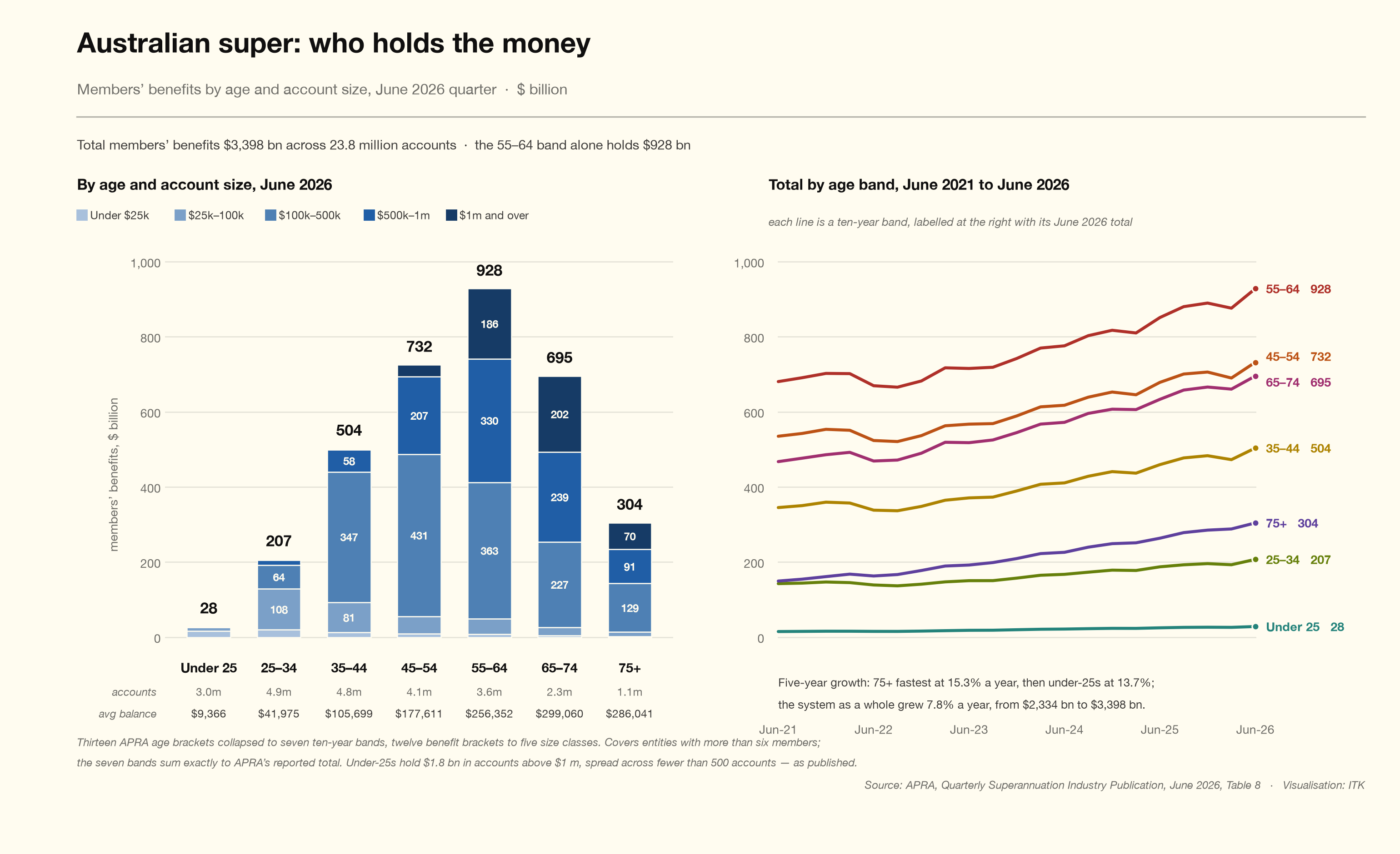
The table below shows the obvious point about saving, most of the wealth is available in the second half of your working life and beyond.
Super funds will allocate $5-$15 bn a year of inflows/recycle to unlisted infrastructure
Without any change in asset allocations super funds will allocate at least $5 bn a year from annual inflows to unlisted infrastructure. Unlisted infrastructure assets already in the portfolio will likely generate at least a further $5 bn a year that could be reinvested.
Again without any change in the domestic international split this gives a range for domestic unlisted infrastructure investment of $2.5-$5 bn
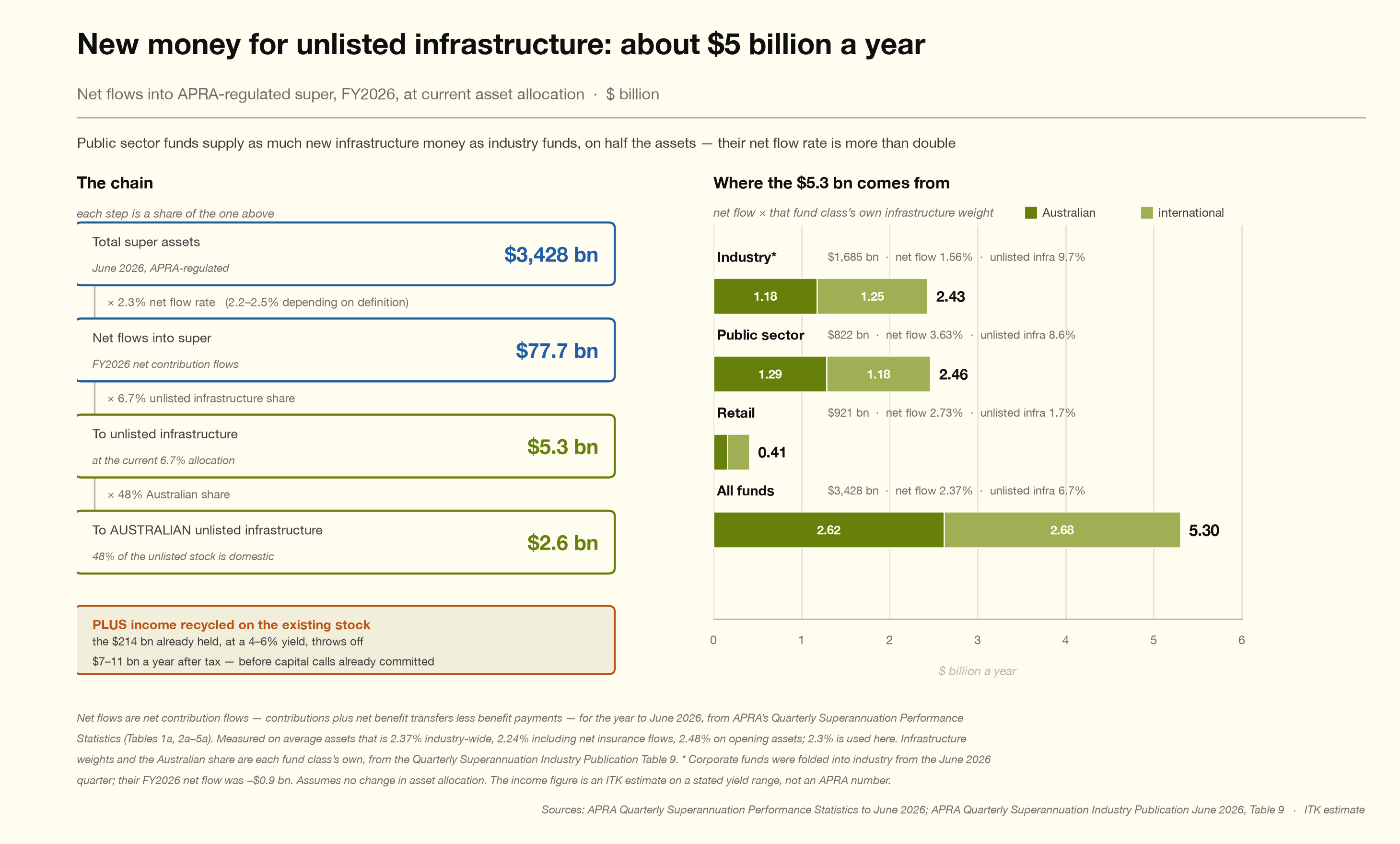
Interestingly the Public Sector funds are just as important as the industry funds in unlisted infrastructure.
You’d have to write your own adventure as to what share if any should go to renewable energy. Let’s say it was $2 bn. Then that could provide the equity for up to 2 GW of wind a year.
Giving the infrastructure tick to renewable energy
Renewable energy assets can be either commodities or infrastructure. If they are commodities super funds almost certainly will have very low allocations. Commodity risk is the last thing most super funds want. You can have your alternative (crypto, hedge funds, long short, private debt, venture capital) little plaything that every CIO needs to keep up the job interest but the meat and three veg are going to consist of equity, property and fixed interest. Unlisted infrastructure will have a place.
So what does it take to get wind and solar and battery assets out of commodities and into infrastructure? There is basically only one way. You have to provide investors with low risk returns. Very simply this is a long term (15-20 years) PPA with pricing either starting low and rising in either nominal and or real terms or you can start the prices high and keep the increase less, making their contribution to nominal inflation less.
Infrastructure investors are comfortable with construction risk. That’s a normal risk for infrastructure investors. Generally it’s managed by having a higher return, cost of capital during construction and then refinancing post construction. It’s a well trodden route made famous by Macquarie Bank if not earlier.
What infrastructure investors don’t want is commodity price risk. Having to deal with futures, and competition and all the other issues associated with running a profitable operating business is not what happens with infrastructure investments. Those guys want a bond with a modest but respectable and predictable growth.
Infrastructure investors want to own cashflows that resemble a Gordon Growth model. That model is V = D/(k − g) where D is the dividend, k is the cost of capital and g is the perpetual dividend growth rate. Eg D = 10, k = 7%, g =3% then V =250. A toll road represents that kind of model very well. Super funds like toll roads in their portfolios. They will take even lower returns for even more certainty as with regulated assets but all else being equal they will take a toll road with its built in franchise growth over a regulated asset, provided the road franchise is long enough.
Cost of capital for renewable energy assets
There are various ways to come to an opinion about the cost of capital required to invest in a wind, solar or battery investment. In this note I look at the theory and the evidence.
In general as far as I am aware the standard calculation uses the Capital Asset Pricing Model [CAPM]. Despite finance theorists who wish to make a name for themselves regularly considering alternatives the CAPM continues as the standard. This is not just because of its simple and robust theory but also because it’s easy to calculate and requires only a few inputs.
The CAPM says that the weighted average cost of capital is the after tax cost of debt * percentage of debt + cost of equity * percentage of equity.
The cost of debt is the risk free debt rate + a risky debt margin;
The cost of equity is the risk free debt rate + a return for risky equity. The risky equity consists of the return the equity share market earns adjusted for the “undiversifiable” risk which is approximated as the relative movement of the security in response to a movement in the market.
My Super review, Treasury option 2
Default superannuation products are assessed each year on how their returns have gone over the previous decade, and today that assessment works asset class by asset class: a fund’s property holdings are measured against a property index, its infrastructure against an infrastructure index, and so on down the list. Treasury’s Option 2 would replace all of that with a single comparison. The fund’s whole portfolio would instead be measured against an imaginary low-cost alternative built from two ingredients — cash and listed shares — blended so that its returns rise and fall by the same amount as the fund’s own do. Beat that alternative and the trustee has earned its keep; fall short by more than a set margin and the product fails the test. Treasury’s own worked example: a fund returning 6% a year, whose returns vary by 2.75%, is set against the cash-and-shares mix of matching variability, which returned 3.5% — so the fund comes out 2.5 percentage points ahead. The attraction of the approach is that it stops funds shadowing one index after another, and stops penalising investments that no listed index describes well, renewable energy among them.
Unlisted asset returns are not measured directly in this approach but just sit within the measured volatility of the portfolio.
There are a few points about this that may not be immediately obvious.
- A portfolio can be riskier than the equity market.
- The equity market already has a level of gearing that is implicitly allowed for. That is when we say the market went up 9.5% per year on average over the past decade, within that most companies in the index will have their own debt. So an equity market return of 9.5% is already a geared return. By contrast house prices are measured with no debt.
Theory and practice appendix
The challenge to CAPM
There is a live academic argument that CAPM understates what unlisted greenfield infrastructure should earn. The vehicle is a Cambridge working paper — Baumgärtner, Cárdenas Prieto, Hepburn and Ritz, all four affiliated with the consultancy Vallorii — proposing what they call the Infrastructure Risk Pricing Model [IRPM]. The claim is that the marginal investor in a greenfield asset is not diversified, so prices the asset’s total risk rather than only the part that moves with the market. Their hurdle rate is the risk-free rate plus the investor’s own Sharpe ratio multiplied by the asset’s total volatility.
Their case study is Sizewell C, where the competitive equity raise produced a cost of equity of 10.8% in real terms, against the 5.70% real that Ofgem allows electricity transmission networks on a CAPM equity beta of 0.74. Reproducing 10.8% under CAPM would need a beta close to 2, which no infrastructure data supports. So something other than market risk is being priced, and the paper says it is the investor’s lack of diversification.
In my extremely humble ex investment banking analyst perspective, and particularly for Australian super funds, it isn’t convincing.
Practice points the other way
If owning infrastructure privately required a higher discount rate, the same asset would be worth more in listed hands, and the traffic would run toward the stock exchange. It runs the other way. Sixteen pure-play renewables owners have left public markets since 2018 — Infigen, Tilt and Genex here, Pattern, TerraForm, Atlantica, Encavis, Neoen, Innergex and others offshore. A takeover is by definition someone paying above the listed price. Sixteen of them in seven years is sixteen revealed preferences that private capital will pay more for these assets than the share market will, which is hard to square with private capital demanding a higher return from them.
The paper does gesture at reasons a diversified buyer might not be the marginal one, via its citations rather than by making the case itself:
- Information acquisition costs (Van Nieuwerburgh–Veldkamp) — you cannot underwrite a greenfield wind farm without specialist capability, and acquiring that capability only pays if you then concentrate.
- Agency (Ewens, Jones and Rhodes-Kropf) — and note what that paper shows: hurdle rates are high and diversifiable risk is priced even when the investors are diversified, because the manager’s own compensation and career risk is concentrated. That is an agency cost, not a risk premium.
The Australian numbers
Separately, and this is a different piece of work by a different organisation, Oxford Economics Australia produced the discount rates AEMO uses for energy infrastructure. For onshore wind it gives an equity beta of 1.28 and a real pre-tax WACC of 7.5%. The 1.28 is a survey average of thirteen responses, and the asset beta of 0.59 is de-levered from it rather than being an input. Market comparators for renewables sit at 0.41 to 0.51 on an asset basis. The implied betas seem far too high to me.
Equally, the 7% real rate GenCost adopts never varies whether bond rates rise or fall. It has not moved since 2018, when the ten-year bond was around 2.6%. It is now over 5%. In short I don’t like the numbers that are published, in either direction.
The volatility is appraised, not observed
The IRPM hurdle needs the investor’s Sharpe ratio, and the academics take it from KKR, which reports about 1.0 for private infrastructure against 0.5 for global equities over 2005 to 2024. Claiming a higher Sharpe ratio for unlisted infrastructure because the return is similar but the volatility is lower is investment banking and academic BS. Of course the unlisted volatility is lower.
Look at KKR’s own numbers. Over the same twenty years global equities returned 9.3% a year, listed infrastructure 9.6% and private infrastructure 9.2% — within half a point of each other. The volatilities were 17.6%, 16.8% and 8.5%. The entire risk-adjusted advantage is one number, and that number is a standard deviation which is built from quarterly net asset values that the fund manager estimates itself.
Two things follow. KKR’s axis is labelled “Return Per Unit of Risk” and equals return divided by volatility with no deduction for the risk-free rate, so it is not a Sharpe ratio as the term is normally used — it reproduces all seven of their asset classes to within 0.009 on that definition. And the appraisal effect can be measured rather than asserted. Valuations that are partly carried over from the previous quarter behave like a moving average, which suppresses variance; reversing that is standard practice in property research. At an autocorrelation of 0.6, which is unremarkable for a private asset, the 8.5% becomes 17.0% — against listed infrastructure’s 16.8% in the same chart. The advantage disappears entirely.
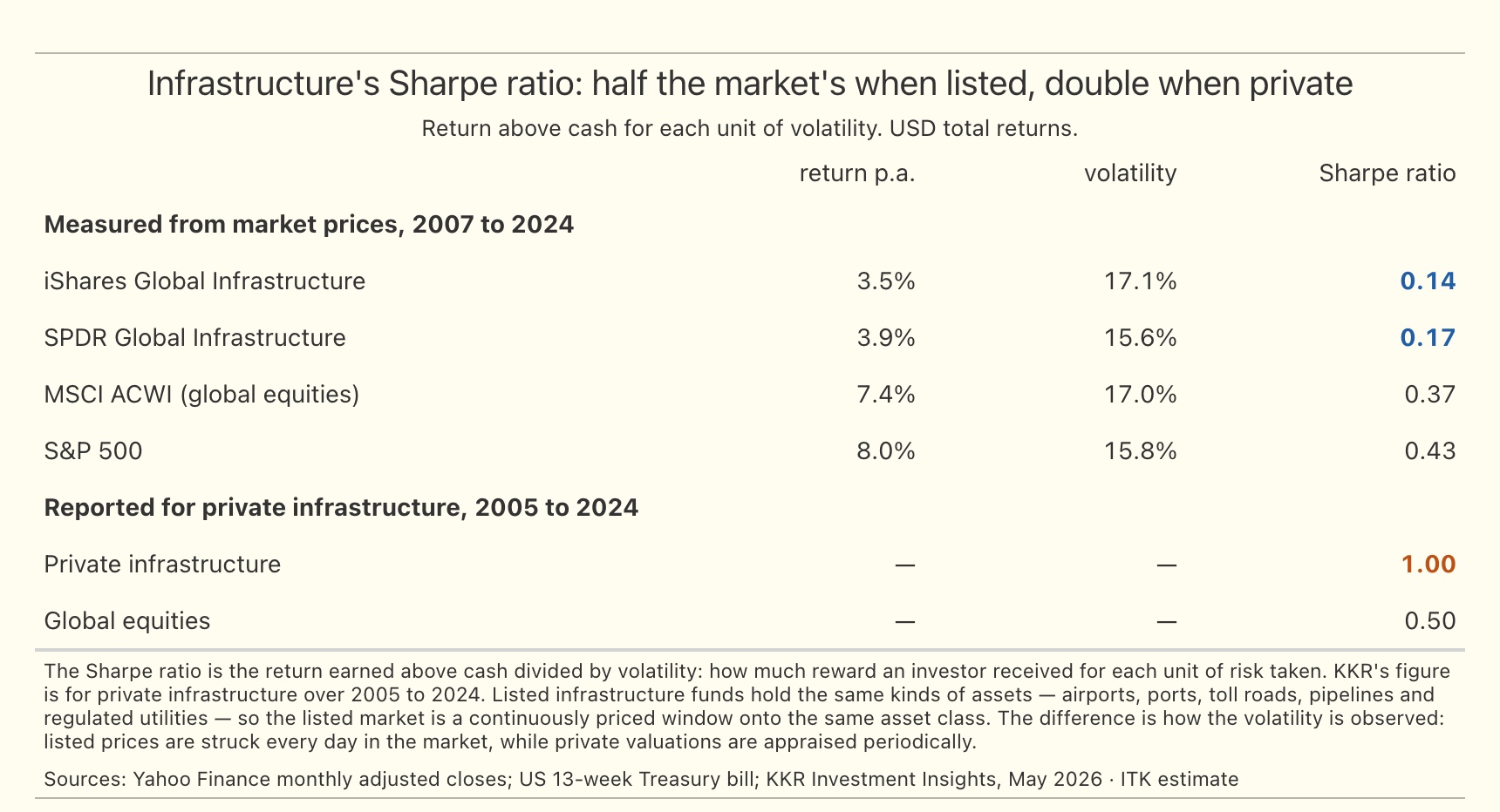
No valuer paid by the owner moves the appraisal the way listed equities move. One reason to go private is to remove PERCEIVED volatility.
The listed sample
These are the forty listed companies behind the earlier plot, with the measured betas and the realised returns.