El Niño 2026: what the evidence says, and what it means for Australia
Background research note. Effort tier: T2 (briefing). Claim ledger at el_nino_ledger.md. Data and analysis scripts described in Section 10.
Summary brief
Bottom line. An El Niño is not a forecast for later this year. It is already here, it is strengthening quickly, and the international agencies now put the odds of a very strong event at the end of 2026 at around four in five. What remains uncertain is not the Pacific — it is how much of that Pacific signal reaches Australia, and where. On the historical record the answer is: a great deal in Queensland, the Northern Territory and inland New South Wales; much less in Tasmania and south-west Western Australia; and in Victoria and the Murray-Darling it depends almost entirely on whether the Indian Ocean joins in. That second question is still open, and it is the one worth watching.
The eight judgements this note supports:
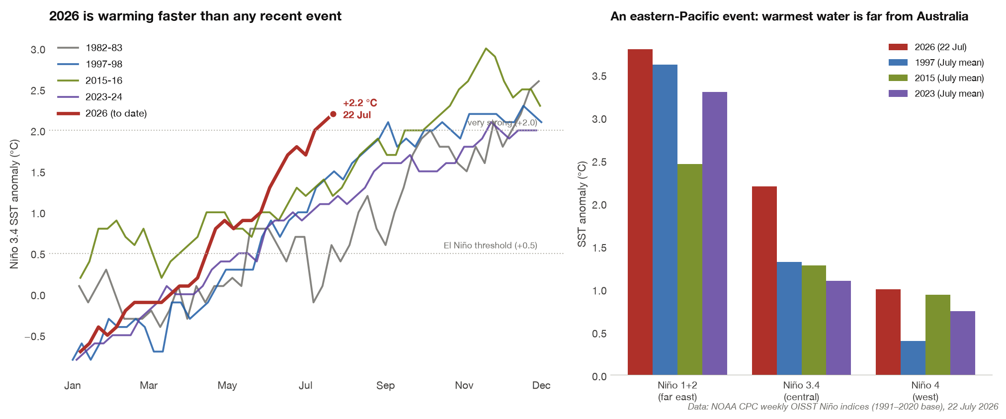
El Niño is established. The US Climate Prediction Center has carried an El Niño Advisory since its 9 July 2026 discussion; the Bureau of Meteorology states the event “has been underway since mid-June” (Bureau of Meteorology, 2026d; NOAA Climate Prediction Center, 2026a). In the week centred on 22 July the Niño 3.4 sea surface temperature anomaly was +2.2 °C on the conventional index (NOAA Climate Prediction Center, 2026d). Likelihood: observed. Confidence: high.
It will very probably get stronger. CPC gives an 81% chance of a very strong event in October–December, one that “would rank among the largest El Niño events in the historical record going back to 1950”, and a 97% chance the event persists into early 2027 (NOAA Climate Prediction Center, 2026a). The Bureau reports that most models put the peak “among, or above, the highest observed since 1950” (Bureau of Meteorology, 2026d). Likelihood: high. Confidence: high — the autumn predictability barrier is behind us and ocean and atmosphere are coupled.
Event strength is a poor guide to Australian rainfall. Across 24 events since 1951 the correlation between spring Niño 3.4 and Australian spring rainfall is −0.04; effectively zero (Section 4.3). The strongest event on record before 2015, 1997–98, delivered close to normal Australian spring rain. Three of the four driest El Niño springs came from weak or moderate events. Confidence: high — the result holds across three separate rainfall measures (national, eastern, Murray-Darling), so it is not an artefact of one metric.
Strength does predict heat. The same correlation against spring daytime temperature is +0.42. Warmth is the reliable part of the El Niño signature; rainfall deficit is the variable part. Confidence: moderate-high.
The impact is strongly regional, and the split is north–east versus south–west rather than a uniform national drying. Averaged over all events, spring rainfall runs at 64% of baseline in the Northern Territory and 65% in Queensland, against 91% in Tasmania and 80% in Western Australia. Queensland is below normal in 92% of events; Tasmania in 75% (Section 5). Confidence: high.
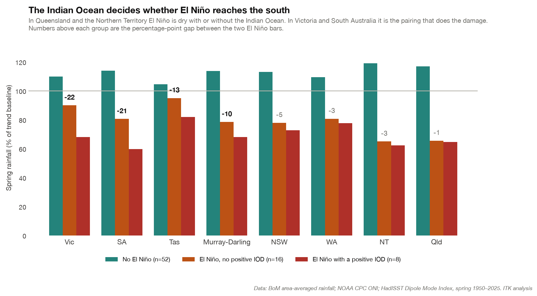
For southern Australia the Indian Ocean Dipole is the swing factor. In El Niño springs that coincided with a positive Indian Ocean Dipole, Victorian spring rainfall averaged 68% of baseline; in El Niño springs without one, 90% — only marginally below normal. South Australia runs 60% against 81%. Queensland shows no gap at all (65% against 65%): there, El Niño alone does the work (Section 3.3). As at 26 July the Dipole Mode Index had just touched the positive threshold at +0.44 °C and models favour a positive event developing through winter and spring (Bureau of Meteorology, 2026d). Likelihood of a positive IOD: moderate-high. Confidence: moderate — model skill for the IOD at this lead is worse than for ENSO.
Australia enters this event with a split starting position, and antecedent conditions matter more than the index. Northern New South Wales and southern Queensland were extremely dry to mid-May; southern WA, SA and Victoria had average to very much above average February–April rain (ABARES, 2026). ABARES already forecasts winter crop production down 21% nationally, but the damage is concentrated: New South Wales −37%, Queensland −38%, against Victoria −4% and South Australia flat. That forecast was published in June on a May climate outlook and does not incorporate the El Niño now declared.
The heat lands on a warmer baseline than in any previous event. In the five very strong events, New South Wales spring daytime temperatures averaged 2.1 °C above the 1961–90 mean. Roughly 1.3 °C of that is the El Niño signal and 0.8 °C is background warming that has accumulated regardless. Fire weather, heat-health and evaporative demand respond to the total, not the anomaly (Section 4.5).
What would change this assessment. A stall or reversal in Niño 3.4 through August–September; a failure of the Dipole Mode Index to sustain values above +0.4 °C into September; or a persistently positive Southern Annular Mode through spring and summer, which would push moist onshore flow into the eastern seaboard and offset part of the ENSO drying. The first is now unlikely; the second and third are live.
What this does not support. It does not support treating 2026–27 as a scheduled repeat of 2019–20 or 2002–03. The rainfall outcome is not determined yet, and on the historical record it is only loosely tied to how big the Pacific event becomes.
1. What is happening in the Pacific
1.1 The observations
The tropical Pacific has moved from La Niña-leaning conditions at the start of 2026 to a strong El Niño in roughly six months. The Oceanic Niño Index — the three-month running mean used by NOAA to classify events — ran −0.37 °C in December–February, crossed zero in February–April, and reached +0.98 °C by April–June (NOAA Climate Prediction Center, 2026c). Weekly values have kept climbing. In the week centred on 22 July 2026 the four Niño regions read (NOAA Climate Prediction Center, 2026d):
Weekly sea surface temperature anomalies, week centred 22 July 2026
| Region | Longitude band | Anomaly (°C) |
|---|---|---|
| Niño 1+2 | 90°W–80°W (far eastern Pacific, off Peru) | +3.8 |
| Niño 3 | 150°W–90°W (eastern Pacific) | +2.5 |
| Niño 3.4 | 170°W–120°W (central Pacific, the standard index) | +2.2 |
| Niño 4 | 160°E–150°W (western Pacific, nearest Australia) | +1.0 |
Source: NOAA Climate Prediction Center weekly OISST analysis, 1991–2020 base period (NOAA Climate Prediction Center, 2026d)
The atmosphere has coupled to the ocean, which is what distinguishes a real event from a warm blip. The Bureau’s 30-day Southern Oscillation Index to 26 July was −28.0, deeply negative (Bureau of Meteorology, 2026d); CPC describes both the traditional and equatorial Southern Oscillation indices as “significantly negative”, with trade winds reversed or weakened and convection displaced east toward the Date Line and suppressed over Indonesia (NOAA Climate Prediction Center, 2026a). That displacement of tropical convection away from the Maritime Continent is the physical mechanism by which the Pacific reaches Australia: it moves the ascending branch of the Walker circulation thousands of kilometres east, leaving descending, drying air over eastern Australia.
1.2 Two indices, two numbers, and why they differ
Readers comparing sources will encounter different values for what looks like the same quantity. The Bureau quotes a “Relative Niño 3.4” of +1.94 °C for the week ending 26 July, against an El Niño threshold of +0.8 °C (Bureau of Meteorology, 2026d). CPC’s July discussion quotes a weekly Niño 3.4 of +1.2 °C (NOAA Climate Prediction Center, 2026a). The raw weekly file gives +2.2 °C (NOAA Climate Prediction Center, 2026d). All three are correct.
The conventional index measures sea surface temperature against a fixed historical baseline. Because the whole tropical ocean has warmed, that index now includes a background warming component that has nothing to do with ENSO. The relative indices subtract the tropical-mean sea surface temperature (20°N–20°S) first, isolating the east–west gradient. This matters because the atmosphere responds to the gradient, not the absolute temperature: convection goes where the water is warm relative to its surroundings. Both agencies have moved to relative indices for this reason, and CPC’s discussion text quotes relative values while its long-running weekly data file continues the conventional series.
For assessing Australian impacts the relative index is the better guide. It is also the more conservative one: +1.94 °C relative is a strong event, but it is not as far outside historical experience as +2.2 °C conventional would suggest.
1.3 The flavour of this event, and why it may matter
The right panel of Figure 1 shows something that a single headline number hides. The warming is heavily skewed to the eastern Pacific: +3.8 °C off South America against +1.0 °C in the Niño 4 region nearest Australia. This is a canonical “Eastern Pacific” event, in the pattern of 1982–83 and 1997–98, rather than a “Central Pacific” or Modoki event where the warm anomaly sits closer to the Date Line.
The distinction has a body of literature behind it, and the direction of the finding is counterintuitive for Australia. Because the Australian teleconnection runs through displacement of tropical convection, and because convection responds to warming near the Date Line more efficiently than to warming 8,000 km further east, Central Pacific events have generally produced stronger eastern Australian drying per unit of Niño 3.4 than Eastern Pacific events (Taschetto & England, 2009; Wang & Hendon, 2007).
Our own compositing is consistent with this for winter, though not uniformly. Classifying the 24 events by whether the spring Niño 3 or Niño 4 anomaly was larger gives 17 Eastern Pacific and 7 Central Pacific events. In winter, Central Pacific events were markedly drier in Queensland (54% of baseline against 68%) and New South Wales (66% against 88%). In spring the difference largely washes out (Queensland 60% against 67%; Australia-wide 74% against 72%). With only seven Central Pacific events the sample is thin and we would not lean on it hard.
The practical implication is a caution rather than a forecast: the eastern-Pacific character of the 2026 event is a reason not to scale expected Australian impact linearly with the size of the Niño 3.4 anomaly. It is one of several reasons, and Section 4.3 gives a stronger one.
2. What the models say, and how much weight they carry
2.1 The forecasts
The 9 July CPC discussion is the primary statement of the international position (NOAA Climate Prediction Center, 2026a):
“El Niño continues and will strengthen through the end of the year, with a 97% chance it will persist through early spring 2027.”
and
“There is an 81% chance of a very strong El Niño during October-December that would rank among the largest El Niño events in the historical record going back to 1950.”
The Bureau’s assessment on 28 July is consistent: “The majority of models indicate this event is likely to peak at levels among, or above, the highest observed since 1950”, with the peak expected in late spring or summer and persistence possible into autumn 2027 (Bureau of Meteorology, 2026d).
2.2 How much to trust them
Two features of the current situation raise confidence relative to a typical mid-year ENSO forecast.
The first is timing. ENSO forecasts issued in the southern autumn are notoriously poor — the “autumn predictability barrier” — because that is when the coupled system has least memory and small errors amplify. Forecasts issued from July onward for the following summer peak skip that barrier. The current forecasts sit on the good side of it.
The second is coupling. CPC notes explicitly that “a strong coupling of the atmospheric and oceanic circulation across the Pacific contributes to very high confidence that El Niño will continue through early 2027” (NOAA Climate Prediction Center, 2026a). An SST anomaly without atmospheric response can decay quickly; one with a reinforcing wind and convection response generally does not. The SOI at −28.0 and the observed westerly wind anomalies say the coupling is present.
Against that, one caution applies to the strength forecast specifically. The 81% figure is a probability of exceeding a threshold on an index, not a probability of any particular Australian outcome. Section 4.3 shows those are close to independent.
2.3 What the Bureau itself says about reading across to Australia
The Bureau attaches a warning to its own product that deserves repeating in full, because it is the single most important qualifier in this note (Bureau of Meteorology, 2026d):
“A strong El Niño signal in the Niño 3.4 region does not necessarily mean strong impacts on Australia’s climate; ENSO is only one of many factors.”
3. The other two drivers
Australian seasonal rainfall responds to at least three large-scale modes. Treating El Niño in isolation is the most common error in public commentary on this topic.
3.1 The Indian Ocean Dipole
The Indian Ocean Dipole measures the temperature difference between the western and eastern tropical Indian Ocean. In its positive phase, cool water sits off Indonesia and north-west Australia and warm water off east Africa. The cool eastern pole suppresses the north-west cloud bands that carry moisture across the continent into south-eastern Australia — a major source of cool-season rain for the Murray-Darling and the southern cropping belt.
As at the week ending 26 July 2026 the Bureau’s IOD index stood at +0.44 °C, “the first week that the index has reached the positive IOD threshold (+0.4 °C)”, with sustained values above threshold required before an event is declared. Models “suggest a positive IOD may develop during the southern hemisphere winter and persist into spring, although there remains some variation in the timing and strength” (Bureau of Meteorology, 2026d).
The IOD and ENSO are not independent. Over 1950–2025 the correlation between spring Niño 3.4 and the spring Dipole Mode Index is +0.55 — they co-occur more often than not, which is why 16 of the 24 El Niño events in our sample fell in the top third of the IOD distribution. But the eight that did not are the informative cases.
3.2 The Southern Annular Mode
The Southern Annular Mode describes how far north or south the belt of Southern Ocean westerlies sits. Its Australian effect is strongly seasonal and, unusually, changes sign by region and season.
In winter, a positive SAM pulls the westerlies south, away from southern Australia, reducing rain in Tasmania, southern Victoria and south-west Western Australia. In spring and summer, a positive SAM allows the subtropical ridge to shift south, which drives moist onshore easterlies into the New South Wales and Queensland coasts and increases rainfall there. A negative SAM does the reverse: wetter southern margins in winter, drier eastern Australia in summer (Bureau of Meteorology, 2026c).
The current state is unsettled. The CPC monthly Antarctic Oscillation index for June 2026 was +2.51, an unusually positive month. By late July the Bureau reported the index negative and forecast to remain so until at least early August (Bureau of Meteorology, 2026d). SAM varies on one-to-two week timescales, so this is normal behaviour rather than a contradiction; it also means SAM is not forecastable at seasonal lead in the way ENSO is. It should be treated as a source of variance around the seasonal outlook rather than as a predictor.
The magnitude of its effect is not small. Over 1979–2025, Australian spring rainfall averaged 121% of the trend baseline in the top third of SAM years against 81% in the bottom third — a spread comparable to the ENSO signal itself. Restricting to non-El Niño years, so the two are not confounded, the spread is 128% against 92%. New South Wales runs 131% against 83%. Tasmania runs the other way, 99% against 114%, exactly as the mechanism predicts. The correlation between spring SAM and spring Niño 3.4 over 1979–2025 is only −0.25, so most of this is independent of ENSO.
3.3 The interaction that matters most
Combining the three gives the central empirical result of this note. Figure 2 splits spring rainfall from 1950 to 2025 by whether an El Niño was underway and whether the spring Dipole Mode Index reached the conventional +0.4 °C positive-IOD threshold.
Spring rainfall by climate driver combination, % of local trend baseline, 1950–2025
| Region | El Niño + positive IOD | El Niño, no positive IOD | Gap | No El Niño |
|---|---|---|---|---|
| Victoria | 68 | 90 | −22 | 110 |
| South Australia | 60 | 81 | −21 | 114 |
| Tasmania | 82 | 95 | −13 | 105 |
| Murray-Darling Basin | 68 | 78 | −10 | 114 |
| New South Wales | 73 | 78 | −5 | 113 |
| Western Australia | 78 | 81 | −3 | 109 |
| Northern Territory | 62 | 65 | −3 | 119 |
| Queensland | 65 | 65 | −1 | 117 |
| Number of years | 8 | 16 | 52 |
Source: Author calculations from Bureau of Meteorology area-averaged rainfall, NOAA CPC ONI and HadISST Dipole Mode Index. Positive IOD defined as a spring Dipole Mode Index at or above +0.4 °C, the Bureau’s operational threshold. The fourth possible cell — a positive IOD without an El Niño — occurs only once in this record and is not interpretable, so it is omitted rather than estimated.
The gap column is the finding. In Queensland it is one percentage point and in the Northern Territory three: El Niño produces drought in the tropical north and north-east whether or not the Indian Ocean cooperates. In Victoria the gap is 22 points and in South Australia 21 — and without a positive IOD, Victorian spring rainfall at 90% of baseline is only marginally below normal.
The ordering of that column is a clean north-to-south gradient, which is what the mechanism predicts: the north responds to the Pacific directly, the south responds to the north-west cloud bands that the Indian Ocean governs.
The conclusion for policy is specific. Queensland and the Northern Territory should be planned for on the basis of the El Niño alone. Victoria, South Australia and the southern Murray-Darling should be planned for on the basis of the Indian Ocean Dipole, and that question will not be settled until September.
The result survives a change of threshold. Using the looser criterion of one standard deviation above the mean (a spring Dipole Mode Index of +0.25 °C, which reclassifies three events), the gaps become 27 points in Victoria, 33 in South Australia, 15 in the Murray-Darling and 9 in Queensland — larger in the south, still small in the north, and the same ordering.
This also resolves an apparent puzzle in the recent record. The 2019 drought and the Black Summer fires occurred in a year when ENSO was, at most, marginally warm — our mechanical classification picks up 2019 as a weak event with a spring Niño 3.4 of just +0.39 °C, and the Bureau never declared an El Niño. What 2019 did have was the strongest positive Indian Ocean Dipole in our sample, with a spring Dipole Mode Index of +0.90. Australian spring rainfall that year came in at 35% of baseline, the driest in the 24-event sample. The Indian Ocean, not the Pacific, drove that outcome.
4. What past El Niños have done to Australia
4.1 Method
We identified El Niño events using the standard CPC definition — five consecutive overlapping three-month seasons with the Oceanic Niño Index at or above +0.5 °C — applied to the ONI series back to 1950. That gives 24 events between 1951 and 2023, of which five are very strong (peak ONI ≥ 2.0): 1972–73, 1982–83, 1997–98, 2015–16 and 2023–24.
Australian climate response uses the Bureau’s area-averaged rainfall (from 1900) and ACORN-SAT temperature (from 1910) series for each state, the Murray-Darling Basin and Australia as a whole. Every value is expressed against a 31-year centred rolling baseline at that location, so the composite measures the ENSO signal and not the long-term trend. Section 4.5 reports the undetrended numbers separately, because for impact purposes the total is what matters.
A note on what the state series can and cannot do. Western Australia and Queensland are large enough that a state average blends climatically distinct regions — the north-west monsoon zone with the south-west winter-rainfall zone, the Queensland tropics with the southern grain belt. Section 5 uses gridded data to look inside the states.
4.2 The seasonal cycle of the signal
El Niño is not a year-round influence on Australia. Its effect is concentrated in winter and spring and largely gone by mid-summer.
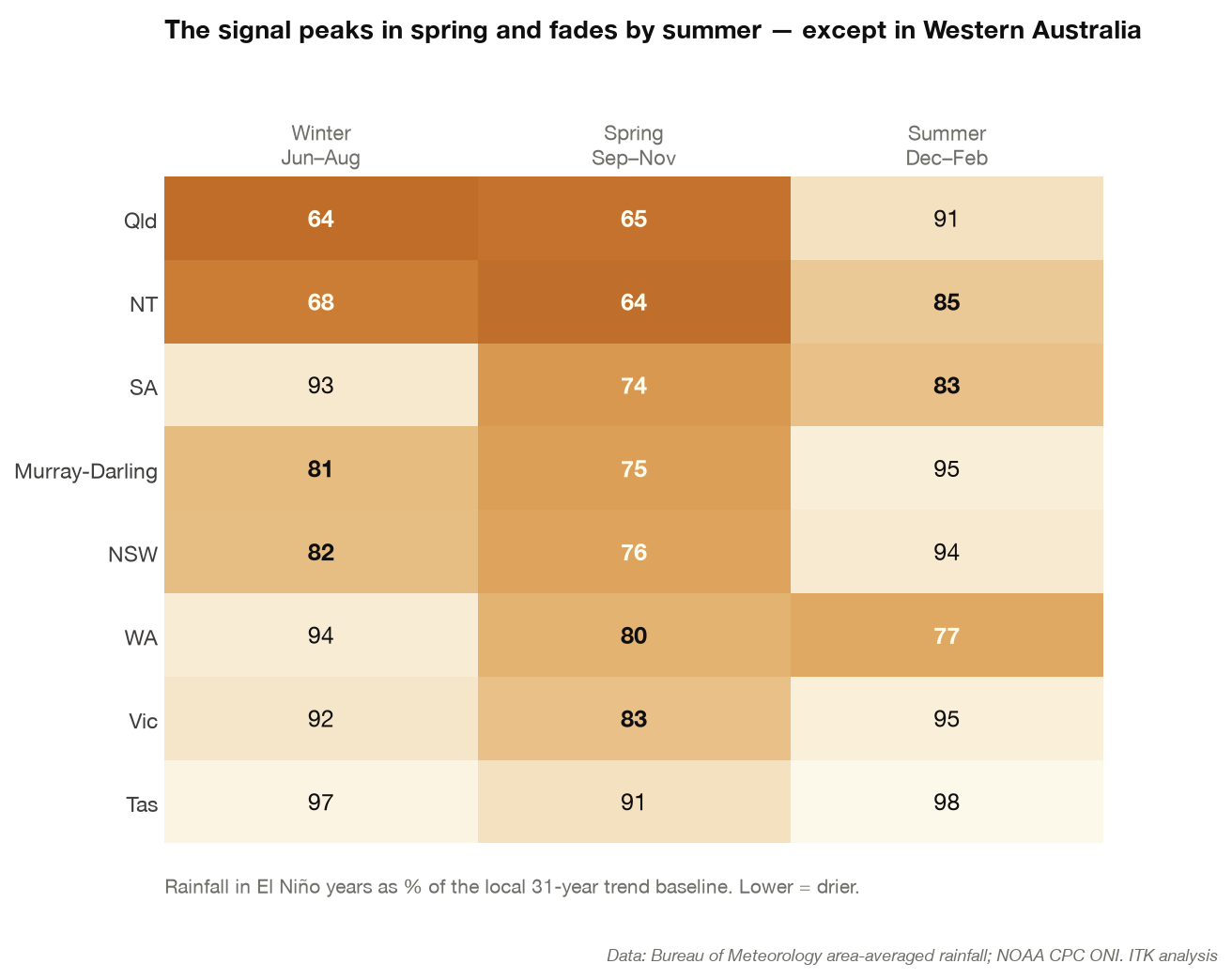
Three features stand out.
Spring is the peak. Australia-wide spring rainfall in El Niño years averages 73% of baseline, and is below normal in 92% of events. No other season comes close for consistency.
Winter is close behind in the north and east, and absent in the south. Queensland runs 64% and the Northern Territory 68% in winter, while South Australia (93%), Western Australia (94%) and Tasmania (97%) show effectively nothing. The tropical and subtropical signal arrives early; the southern signal waits for spring, and even then is weaker.
Summer is when the signal fades — except in Western Australia. By December to February most regions are back near normal: Victoria 95%, Tasmania 98%, the Murray-Darling 95%. Western Australia is the exception, running 77% of baseline and below normal in 88% of events — the strongest and most consistent summer signal in the country. The mechanism is tropical cyclones. El Niño suppresses cyclone formation in the Australian region and delays the monsoon onset, and a large share of north-west Western Australia’s annual rainfall arrives in a handful of cyclone and monsoon burst events. Fewer systems means a drier wet season, and the effect shows up in the state average even though south-west WA is barely touched.
That reversal — the east recovering while the west stays dry — is the sharpest east-west contrast in the record, and it runs opposite to the direction most people would assume.
4.3 The strength paradox
The single most decision-relevant result in this note is negative.
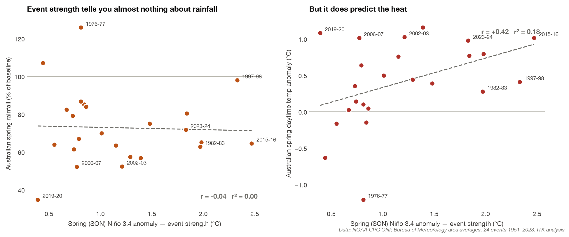
Across the 24 events, the correlation between the spring Niño 3.4 anomaly and Australian spring rainfall is −0.04, with an r² of 0.00. For eastern Australia alone it is −0.03; for the Murray-Darling, −0.01. Knowing how big the Pacific event is tells you essentially nothing about how dry the Australian spring will be.
The individual events make the point more forcefully than the correlation:
Selected El Niño events: strength against Australian outcome
| Event | Spring Niño 3.4 (°C) | Classification | Australian spring rainfall (% of baseline) |
|---|---|---|---|
| 1997–98 | 2.33 | very strong | 98 |
| 2015–16 | 2.47 | very strong | 65 |
| 1982–83 | 1.97 | very strong | 63 |
| 2023–24 | 1.83 | very strong | 72 |
| 2002–03 | 1.21 | moderate | 52 |
| 2006–07 | 0.77 | weak | 52 |
| 2019–20 | 0.39 | weak | 35 |
| 1976–77 | 0.81 | weak | 126 |
Source: Author calculations from NOAA CPC ONI and BoM area-averaged rainfall
The three driest springs in the sample came from a moderate event, a weak event and a marginal one. The strongest event before 2015 produced a near-normal Australian spring, and a wetter-than-normal Murray-Darling. One weak event, 1976, was the wettest spring of the 24.
There is a plausible physical reading of 1997–98 in particular: the warm anomaly was so far east, and Niño 4 so much cooler by comparison, that the convective displacement never propagated efficiently into the Australian teleconnection. That reading is relevant to 2026, which shares the same east-skewed structure. We flag it as a hypothesis consistent with the mechanism rather than as an established result for this event.
The opposite holds for heat. The right panel of Figure 4 shows the same scatter against spring daytime maximum temperature: correlation +0.42, r² 0.18. Not a tight relationship, but a real one. Warmth is the dependable part of an El Niño; drought is the contingent part.
The practical translation for planning: a very strong El Niño is a strong reason to prepare for heat, and only a moderate reason to prepare for drought. The drought case rests on the Indian Ocean and on antecedent soil moisture, not on the size of the Pacific anomaly.
4.4 The rainfall footprint
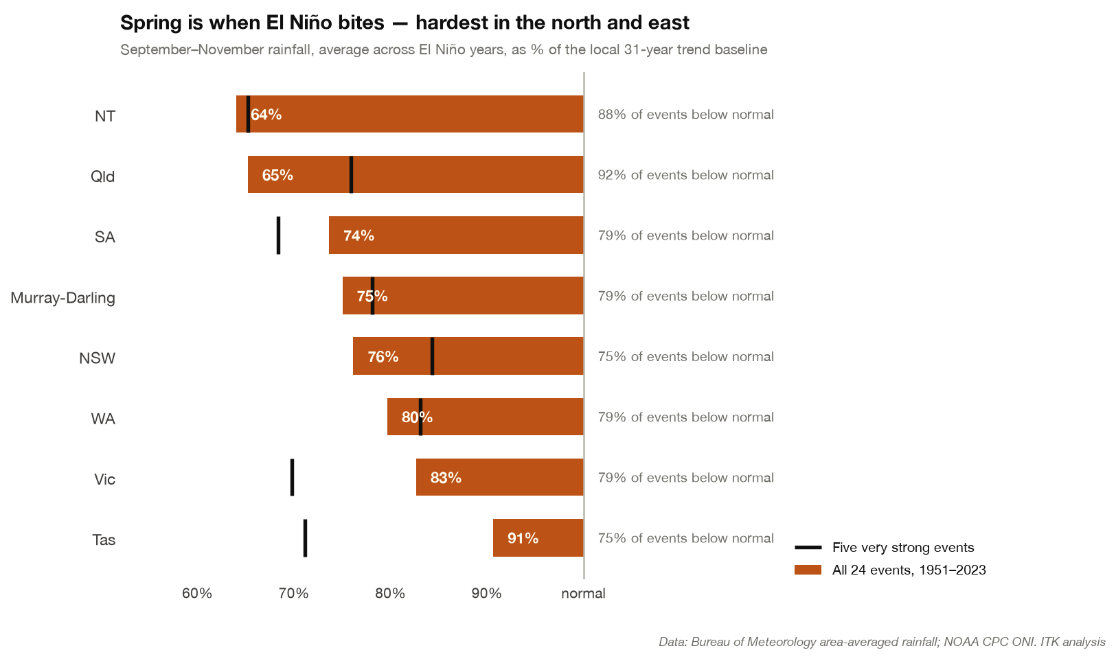
Spring rainfall in El Niño years by region, % of local 31-year trend baseline
| Region | All 24 events | Five very strong | Share of events below normal |
|---|---|---|---|
| Northern Territory | 64 | 65 | 88% |
| Queensland | 65 | 76 | 92% |
| South Australia | 74 | 68 | 79% |
| Murray-Darling Basin | 75 | 78 | 79% |
| New South Wales | 76 | 84 | 75% |
| Western Australia | 80 | 83 | 79% |
| Victoria | 83 | 70 | 79% |
| Tasmania | 91 | 71 | 75% |
| Australia | 73 | 75 | 92% |
Source: Author calculations from BoM area-averaged rainfall and NOAA CPC ONI
Two columns deserve separate reading. The middle column is how dry; the right column is how often. They do not rank the same way, and for planning purposes the right column is often the more useful. Queensland is below normal in 92% of El Niño springs — close to a certainty. Tasmania is below normal in 75% of them, but only by 9% on average, which is well inside ordinary year-to-year variation and would not be noticed without the statistics.
Note also that the very strong subset is not systematically worse. Queensland, New South Wales and the Murray-Darling all did better in very strong events than in the average event. This is the strength paradox of Section 4.3 appearing at regional level, and it is based on only five events, so it should be read as “no evidence that very strong events are worse” rather than as evidence that they are better.
4.5 Heat, and the baseline it lands on
Temperature behaves more predictably than rainfall. Detrended, the spring daytime maximum temperature anomaly in El Niño years averages +0.41 °C nationally, rising to +0.63 °C in the Murray-Darling and +0.62 °C in New South Wales. In very strong events the Murray-Darling figure is +1.30 °C and New South Wales +1.29 °C.
But detrending is the wrong frame for impact. Fire behaviour, evaporative demand, heat stress in livestock and human heat mortality respond to absolute temperature, and the absolute number is 0.5 to 0.8 °C higher than the detrended figures imply.
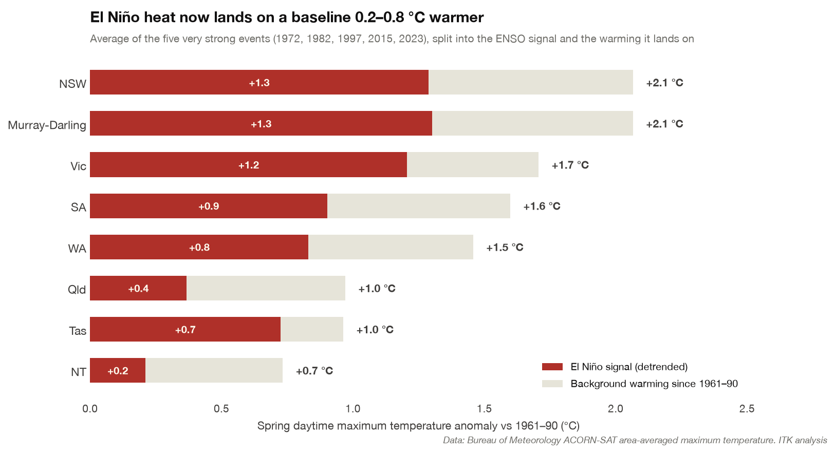
Spring daytime maximum temperature in very strong El Niño events, °C above the 1961–90 mean
| Region | El Niño signal | Background warming | Total |
|---|---|---|---|
| New South Wales | +1.29 | +0.78 | +2.07 |
| Murray-Darling Basin | +1.30 | +0.76 | +2.07 |
| Victoria | +1.21 | +0.50 | +1.71 |
| South Australia | +0.90 | +0.70 | +1.60 |
| Western Australia | +0.83 | +0.63 | +1.46 |
| Queensland | +0.37 | +0.60 | +0.97 |
| Tasmania | +0.73 | +0.24 | +0.96 |
| Northern Territory | +0.21 | +0.52 | +0.73 |
Source: Author calculations from BoM ACORN-SAT area-averaged maximum temperature. “El Niño signal” is the composite against a 31-year centred baseline; “background warming” is the residual against the fixed 1961–90 mean.
The share attributable to ENSO ranges from 29% in the Northern Territory to 75% in Tasmania. In the south-east — the region where fire risk and heat mortality are highest — the El Niño contributes rather more than half, and the accumulated warming supplies the rest. A 2026–27 event of the same ENSO magnitude as 2015–16 will be hotter in absolute terms than 2015–16 was, because the baseline has kept moving.
4.6 Tropical cyclones and the monsoon
Two northern-Australia effects are well established and both work in the direction of reduced hazard, at least from wind and flood.
El Niño reduces tropical cyclone numbers in the Australian region, with the effect strongest in the eastern sub-region north-east of Queensland, and delays the first coastal crossing, which in El Niño years can be as late as mid-January (Bureau of Meteorology, 2026e). Monsoon onset in tropical Australia is typically two to six weeks later than in La Niña years (Bureau of Meteorology, 2026e).
For the north this cuts both ways. Lower cyclone risk means lower expected damage to coastal infrastructure, mining and ports, and fewer flood events. It also means less water: the northern wet season is the recharge mechanism for northern rivers, station water supplies and the Queensland grazing belt, and a late, weak monsoon extends the dry season into a period when pasture and stock water are already depleted by the preceding dry spring.
5. East and west, north and south
The question of how the impact differs across the continent has a clear answer, and it is not a simple two-way split. Figure 7 maps rainfall and daytime heat together, by season, from the Bureau’s own 5 km gridded analysis, so the pattern can be seen inside state boundaries.
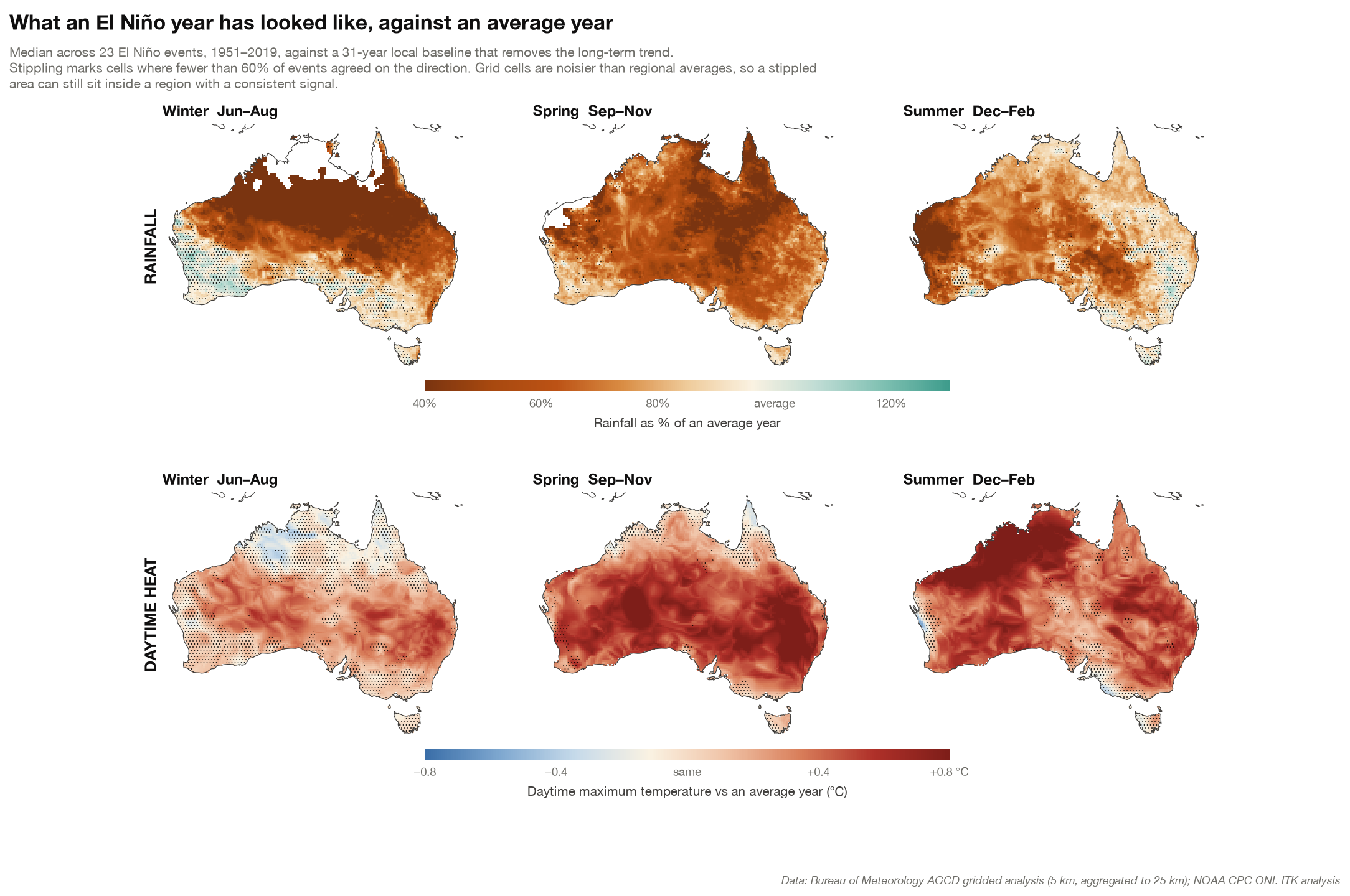
Read the top row left to right and the story of Section 4.2 appears geographically. Winter dries the tropical north and leaves the southern margins alone. Spring spreads the deficit over almost the whole continent. Summer releases the east while the north-west stays dry. The bottom row shows heat building in the opposite direction — weak in winter, strongest in spring across the south-east and in summer across the north.
Spring rainfall and heat by region box, 23 El Niño events 1951–2019
| Region box | Rainfall (% of average) | Share of events below normal | Daytime heat |
|---|---|---|---|
| North-east Australia (12–22°S, 142–154°E) | 43 | 90% | +0.17 °C |
| Northern Australia (10–20°S) | 55 | 83% | +0.16 °C |
| Eastern Australia (140–154°E) | 59 | 79% | +0.51 °C |
| North-west WA (15–23°S, 114–129°E) | 63 | 75% | +0.35 °C |
| Southern Australia (30–40°S) | 70 | 73% | +0.53 °C |
| South-east Australia (33–39°S, 140–152°E) | 72 | 74% | +0.41 °C |
| South-west WA (30–35°S, 114–120°E) | 84 | 65% | +0.46 °C |
Source: Author calculations from Bureau of Meteorology AGCD gridded analysis, area-weighted. Cross-checked against the independent GPCC gauge analysis, which agrees within 2–6 percentage points on every box.
5.1 North versus south
This is the stronger of the two axes. Northern Australia in spring runs at 55% of average against 70% in the south, and the north-east corner — the Queensland tropics and the Gulf country — is the driest region in the country at 43%, below normal in 90% of events.
The mechanism is direct. The tropical north sits closest to the displaced Walker circulation, so it feels the suppressed convection first and hardest. Southern Australia is reached only indirectly, through changes in the subtropical ridge and through the north-west cloud bands that the Indian Ocean Dipole controls. That is precisely why the southern signal is contingent on the IOD and the northern signal is not.
5.2 East versus west
This axis is weaker at the continental scale, and it inverts by season.
In spring, eastern Australia (59% of average, 79% of events dry) is drier than western Australia’s coastal south-west (84%, 65%). South-west Western Australia is the least ENSO-sensitive agricultural region in the country. Its winter rainfall is governed by the Southern Annular Mode, by the subtropical ridge position and by the long-term drying trend that has already removed roughly a fifth of its May–July rainfall since the 1970s — a trend that is not an ENSO phenomenon and does not reverse in La Niña years.
In summer the ranking flips. North-west Western Australia is dry in El Niño summers because the monsoon and cyclones fail; eastern Australia has largely recovered. This is why the state-level Western Australian figures look contradictory across Figure 3: the state contains both the least ENSO-sensitive region in the country and one of the most, in different seasons.
5.3 The synthesis
Four practical categories:
- Reliably and severely affected: Queensland (especially the tropics, Gulf and the southern grain belt), the Northern Territory, inland northern New South Wales. Dry in winter and spring, high consistency, largely independent of the Indian Ocean.
- Conditionally affected: Victoria, South Australia, the southern Murray-Darling, southern New South Wales. Dry in spring if a positive Indian Ocean Dipole develops; close to normal if it does not.
- Seasonally affected: north-west Western Australia. Effect concentrated in summer through suppressed cyclones and delayed monsoon.
- Weakly affected: Tasmania, south-west Western Australia. Detectable in the statistics, small in magnitude, dominated by other drivers.
6. Where Australia starts from in 2026
Antecedent conditions modulate the impact of a given rainfall deficit more than the deficit itself does. A 25% spring rainfall shortfall on a full soil profile is a yield reduction; the same shortfall on an empty profile is a crop failure.
The starting position going into this event is split along the same line as the climatology in Section 5.
ABARES reported in June 2026 that “extremely dry conditions across northern New South Wales and southern Queensland up until mid-May had resulted in very low soil moisture levels”, with rainfall in the New South Wales North West, Northern Tablelands, Central West and northern Riverina “below the 20th percentile in the year to mid-May”. Against that, “average to very much above average February to April rainfall across major cropping regions of southern Western Australia, South Australia and Victoria” supported close to normal planting in the south (ABARES, 2026).
The consequences are already in the crop forecasts, and the two halves of the country are more than 30 percentage points apart:
ABARES winter crop production forecast, 2026–27
| State | Production (Mt) | Change on 2025–26 |
|---|---|---|
| New South Wales | 11.7 | −37% |
| Queensland | 2.4 | −38% |
| Western Australia | 21.5 | −21% |
| Victoria | 9.7 | −4% |
| South Australia | 9.1 | flat |
| Australia | 54.5 | −21% |
Source: ABARES Australian Crop Report, June 2026 (ABARES, 2026)
Three points about this table matter for interpretation.
First, the eastern states have already taken their hit, and it happened before the El Niño was declared. The −37% and −38% figures are the consequence of an autumn drought in the northern cropping zone, not of the Pacific.
Second, the southern states have not. Victoria at −4% and South Australia flat reflect a good autumn break. Those crops are in the ground with moisture beneath them and are now exposed to exactly the spring outcome that Section 3.3 says depends on the Indian Ocean Dipole.
Third, the forecast is stale in a specific way. ABARES built it on the Bureau’s three-month outlook issued 21 May 2026, which gave a “60% to 80% chance that winter rainfall will be below average” across the cropping regions, and noted only “an increasing chance of an El Niño and/or positive IOD event emerging throughout 2026” (ABARES, 2026). The event has since been declared. The September crop report is the first one that will carry it.
The Bureau’s long-range forecast issued 30 July 2026 for August to October is “Below average August to October rainfall likely across the south-west and east; above average in the north-west” and “Above average temperatures likely across much of Australia”, with an elevated risk of unusually dry conditions in the south-east and south-west where longer-term deficits already exist, and a greater than 80% chance of unusually high maximum temperatures in western Western Australia and the south-east (Bureau of Meteorology, 2026b).
Two features of that outlook are worth flagging. The above-average signal for north-west Australia runs against the classical El Niño expectation and reflects the very warm surrounding ocean. And the below-average signal for the south-west is not primarily an ENSO signal — Section 5.2 — but it compounds an existing deficit.
On water, storage across the southern Murray-Darling has been drawn down over two years and sits below the long-term average for the time of year. Menindee Lakes, the supply buffer for Broken Hill and the lower Darling, was reported at 33% and falling; Blowering at 25%; Wyangala at 61%. The 2026–27 opening allocation projection for South Australia was 62% of entitlement, with 100% reached by year end under wet, average and moderate inflow scenarios but not under dry or extreme dry ones (Australian Rural and Regional News, 2026). The Darling catchment draws from southern Queensland and northern New South Wales — the part of the country where the El Niño signal is least conditional.
7. Consequences by sector
7.1 Agriculture
Grain is the most exposed sector and the one where the mechanism is best understood. Yield in the Australian winter crop is set principally by August–October rainfall, which arrives during grain fill. This is precisely the window in which the El Niño signal is strongest.
The historical range is wide. In 2002–03 farm gross domestic product fell 24.8% and the drought subtracted around 0.9 percentage points from national GDP growth (Australian Treasury, 2004). In 2006–07, wheat, barley and canola production fell by more than 60% and the reduction in economic growth was estimated at 0.5 to 0.75 percentage points. Both were moderate-to-weak El Niño events by Pacific standards. The 1997–98 very strong event produced no comparable agricultural shock.
For 2026–27 the position is asymmetric. The northern crop is already written down and further deterioration has limited additional room to fall — an area not planted cannot fail. The southern crop is where the remaining downside sits: 40.3 Mt of the 54.5 Mt national forecast comes from Western Australia, Victoria and South Australia, and those crops depend on spring finishing rain. A positive Indian Ocean Dipole is the specific event that would convert the current forecast into a materially worse one.
Livestock follows a different and slower path. Reduced pasture growth through spring forces supplementary feeding, then destocking. Destocking floods the market and depresses prices at the moment producers most need revenue, then constrains the herd rebuild for three to five years afterwards. The northern beef herd, in Queensland and the Northern Territory, sits in the region with the highest and most consistent El Niño signal.
Horticulture and irrigated agriculture are exposed through allocations rather than rainfall directly, with a one-season lag: it is the following year’s allocation that a dry spring determines.
7.2 Water
The immediate effect is on inflows rather than storage. Storages deplete on a one-to-two year timescale; a single dry spring reduces the inflow that would otherwise have refilled them. With southern Murray-Darling storages already below average and the Darling headwaters in the high-confidence drought zone, a dry spring in 2026 raises the probability of constrained allocations in 2027–28 more than in 2026–27.
Urban supply is less exposed than it was during the Millennium drought. Desalination capacity in Sydney, Melbourne, Adelaide, Perth and the Gold Coast provides rainfall-independent supply that did not exist in 2002 or 2006, at a cost. The decision points for the Commonwealth are more likely to concern regional and remote town supply — where the buffer is thin and the intervention is trucking water — than the capital cities.
7.3 Bushfire
The fire risk transmission is indirect but reliable: dry spring plus hot spring produces cured fine fuel and reduced fuel moisture entering summer. This is the one hazard where the heat signal, which Section 4.3 shows is the dependable part of El Niño, matters as much as the rainfall signal.
The relevant qualifier is fuel load. In the grassy inland, a dry spring reduces fuel growth and can lower fire risk; in forested south-eastern Australia, where fuel is already present, a dry spring lowers moisture content and raises it. The 2019–20 season is the reference case for the second mechanism: 33 direct deaths, an estimated 417 further deaths attributable to smoke exposure, over 3,000 homes destroyed and roughly 24 million hectares burned (Grattan Institute, 2020). That season followed a record positive Indian Ocean Dipole and near-neutral ENSO — another reason to watch the Indian Ocean rather than the Pacific.
AFAC’s Winter 2026 outlook, issued in May, identified increased fire risk in the northern Great Sandy Desert region of Western Australia and in parts of central and northern New South Wales (Australasian Fire and Emergency Service Authorities Council, 2026). The Spring 2026 outlook, due around the start of September, will be the first to incorporate the declared El Niño and is the single most useful forward document for fire-season planning.
7.4 Health
Heat is the largest and most direct health pathway, and unlike drought it scales with event strength. The exposed populations are the elderly, people with cardiovascular and respiratory disease, outdoor workers and people without air-conditioning or with insecure electricity supply. Section 4.5’s finding — that absolute temperatures in a very strong El Niño spring now run 1.5 to 2.1 °C above the 1961–90 baseline across southern Australia — means that heat-health thresholds calibrated on older data will be crossed more often than historical event frequencies imply.
Bushfire smoke is the second pathway and, on the 2019–20 experience, can exceed direct fire mortality by an order of magnitude. It affects a far larger population than the fires themselves; smoke haze reached most of the eastern seaboard for weeks.
Third-order pathways include mental health in drought-affected rural communities, where the effect is cumulative across seasons rather than acute, and water-borne and vector-borne disease risk associated with reduced river flows and stagnant water bodies.
7.5 Insurance and the economy
The insurance effect of El Niño is a change in the composition of loss rather than a simple increase. Flood and cyclone losses, which dominate Australian catastrophe experience in La Niña years, decline. Bushfire and hail losses rise. Drought is largely uninsured in Australia outside of multi-peril crop products with low take-up, so the agricultural loss falls on producers, lenders and eventually government rather than on insurers.
At the macro level, the historical analogues put a bad El Niño drought at roughly 0.5 to 1.0 percentage points of GDP growth in the affected year, concentrated in the farm sector, with partial offset from lower flood and cyclone damage. The 2002–03 figure of 0.9 percentage points is the upper end of recent experience (Australian Treasury, 2004).
7.6 Marine environment and tourism
Warm Pacific conditions and reduced cloud cover raise sea surface temperatures on the Great Barrier Reef in the southern summer. The 2015–16 El Niño triggered the most severe bleaching event recorded on the reef at that time, part of the third global mass bleaching event (Australian Institute of Marine Science, 2026). The reef has since experienced repeated events with progressively shorter recovery intervals, so the marginal effect of a further thermal stress season is larger than it was in 2016.
Western Australian marine systems are exposed differently. The Leeuwin Current weakens in El Niño years, which historically reduced marine heatwave risk off Western Australia — the 2011 Ningaloo Niño marine heatwave was a La Niña event. This is one of the few Australian impacts where El Niño reduces rather than increases risk.
7.7 Energy
Briefly, since it is not the focus of this note. The energy-sector effects run through higher summer peak demand from cooling load, reduced hydro inflows in the Snowy and Tasmanian schemes, elevated bushfire risk to transmission corridors, and thermal derating of generation and network plant on hot days. Each is a well-understood operational risk with existing planning processes, and none of them is new.
8. What would change this assessment
Stating falsifiers explicitly is the discipline that separates a forecast from a prediction. The judgements in the summary brief would be revised on the following observables.
On the event itself. A stall or decline in the Niño 3.4 anomaly through August and September, or a weakening of the Southern Oscillation Index back toward zero, would indicate the coupling is breaking down. The next CPC diagnostic discussion is scheduled for 13 August 2026 (NOAA Climate Prediction Center, 2026a) and the Bureau updates weekly. On current evidence this is unlikely; we would treat two consecutive fortnights of decline as the trigger to reassess.
On southern Australian rainfall. The Dipole Mode Index sustaining values above +0.4 °C through August and into September would confirm the positive IOD and shift Victoria, South Australia and the southern Murray-Darling from the “conditional” category to the “affected” category. The index falling back below +0.4 °C and staying there through September would do the reverse. On the evidence in Section 3.3 that shift is worth roughly 25 percentage points of spring rainfall in the Murray-Darling and 30 in Victoria, regardless of how large the Pacific event becomes. This is the highest-value single observable between now and October.
On eastern seaboard rainfall. A persistently positive Southern Annular Mode through spring and summer would drive moist onshore easterlies into the New South Wales and Queensland coasts and offset part of the ENSO drying there. SAM is not predictable at seasonal lead, so this cannot be forecast — but it can be monitored, and it is a live source of upside.
On the north. An early monsoon onset, or above-average cyclone numbers in the Australian region, would indicate the tropical teleconnection is weaker than the index implies.
9. Options for government
These are framed as options at graduated levels of commitment, not recommendations. The distinguishing feature of the current situation is that the Pacific is close to settled while the Australian outcome is not, which argues for sequencing rather than for acting on everything at once.
No-regrets, appropriate now. These have low cost and are justified by the information already in hand.
- Bring forward fire-season preparedness for southern and eastern Australia: aerial firefighting contracting, hazard-reduction windows, interstate resource sharing agreements. The heat signal is the dependable part of El Niño and the lead times on aviation contracting are long.
- Activate heat-health planning with state health departments, targeting the populations in Section 7.4. Cost is low; the 2026–27 summer will be hot whether or not it is dry.
- Confirm the readiness of existing drought support architecture — Farm Household Allowance processing capacity, Regional Investment Corporation loan settings, rural financial counselling staffing — without changing settings. Northern New South Wales and southern Queensland producers are already in drought conditions irrespective of what happens next.
- Commission or confirm the delivery timetable for a Bureau briefing to Cabinet around mid-September, when the Indian Ocean Dipole question will have resolved.
Contingent, decide in September–October. These should be prepared now and triggered on the observables in Section 8.
- Scaled drought assistance for the southern cropping belt, triggered on a confirmed positive Indian Ocean Dipole plus below-median September rainfall.
- Water carting and emergency supply arrangements for remote and regional towns in western New South Wales and western Queensland, triggered on storage thresholds rather than on calendar dates.
- Northern Australia wet-season contingency for a delayed monsoon: stock water, road access and remote community supply.
Worth avoiding. Two failure modes are visible in past events.
The first is announcing drought measures on the basis of the Pacific index rather than on Australian conditions. Section 4.3 shows the index does not carry that information. Doing so in 1997 would have produced a large intervention ahead of a near-normal season.
The second is treating the whole continent as a single unit. The evidence in Sections 3.3 and 5 is that Queensland and the Northern Territory face a near-certain dry spring while Victoria and South Australia face an outcome that resolves on a different climate driver and is close to even money. Geographically undifferentiated measures would over-serve the south and under-serve the north.
On communication. Public commentary conflates “very strong El Niño” with “severe Australian drought”, and the record does not support the link. The Bureau’s own qualifier — that a strong Niño 3.4 signal “does not necessarily mean strong impacts on Australia’s climate” — is the accurate framing, and repeating it early is cheaper than correcting expectations later. The corollary is also worth saying: the heat is not conditional in the same way, and the message on heat and fire preparedness should be firmer than the message on drought.
10. Data, method and limitations
Event classification. El Niño events identified from the NOAA CPC Oceanic Niño Index (ERSSTv5, 1950–2026) using the standard criterion of five consecutive overlapping three-month seasons at or above +0.5 °C. This yields 24 events with onset years 1951, 1953, 1957, 1958, 1963, 1965, 1968, 1969, 1972, 1976, 1977, 1982, 1987, 1991, 1994, 1997, 2002, 2004, 2006, 2009, 2015, 2018, 2019 and 2023. The rule is mechanical: it picks up 2019 as a weak event although the Bureau never declared one, and it splits some adjacent warm periods (1957/1958, 1968/1969, 2018/2019) that other catalogues treat as single episodes. Section 3.3 notes where this matters.
Australian climate data. Bureau of Meteorology area-averaged series for rainfall (from 1900) and ACORN-SAT maximum, minimum and mean temperature (from 1910), for each state, the Murray-Darling Basin and Australia (Bureau of Meteorology, 2026a). Retrieved 1 August 2026. Note that www.bom.gov.au refuses non-browser clients; the same files are served from reg.bom.gov.au.
Detrending. Each seasonal value is expressed against a 31-year centred rolling mean at that location (minimum 15 years), so composites measure the ENSO signal rather than the long-term trend. At the ends of the record the window is necessarily one-sided; for the 2023 event the effective baseline spans 2008–2025. Undetrended composites against a fixed 1961–90 baseline are reported in Section 4.5 and give systematically warmer temperature anomalies, as expected.
Gridded data. Bureau of Meteorology AGCD v1 monthly rainfall and maximum temperature at 0.05° (about 5 km), 1950–2020, obtained from the NCI THREDDS server and aggregated to 0.25° for mapping (Bureau of Meteorology, 2020). The collection ends at 2020, so the gridded composites cover 23 of the 24 events but not 2023. Composites use the median rather than the mean across events, because percent-of-average is strongly right-skewed in arid grid cells; cells with a seasonal climatology below 10 mm are masked. AGCD interpolates over ocean rather than masking it, so an Australian land mask (Natural Earth, tested at cell centres) is applied before plotting or averaging.
The independent GPCC v2020 1° gauge analysis (Global Precipitation Climatology Centre, 2020) was used as a cross-check and agrees with AGCD within 2–6 percentage points on every region box in Section 5. Gridded temperature from GHCN-CAMS was examined in an earlier pass and discarded: it disagrees with the Bureau’s station-based series over northern Australia, where its station density is low.
Agreement stippling. The maps mark cells where fewer than 60% of events shared the sign of the composite. With 23 events, 60% is 14 of 23 — better than chance but not strong evidence on its own. Individual grid cells are noisier than area averages, so a stippled cell can sit inside a region whose area-averaged signal is consistent; the state-level hit rates in Section 4.4 are the better guide to reliability at the scale most decisions are made.
Climate indices. Dipole Mode Index from NOAA PSL (HadISST 1.1 basis) (NOAA Physical Sciences Laboratory, 2026). Antarctic Oscillation index (used as the SAM proxy) from NOAA CPC, 1979–2026 (NOAA Climate Prediction Center, 2026b). Southern Oscillation Index from NOAA CPC.
The HadISST-based long Dipole Mode Index has a mean of −0.17 °C and a standard deviation of 0.42 °C over the springs of 1950–2025, so it sits lower than the Bureau’s operational index. The conventional +0.4 °C positive-IOD threshold selects nine of those 76 springs, or 12% — close to, and slightly stricter than, the observed frequency of positive IOD events. Section 3.3 uses that threshold, and reports a robustness check at +0.25 °C (one standard deviation above the mean, 17% of springs).
An earlier version of this note classified the IOD by terciles of the same distribution instead. That was a mistake worth recording: because the series is centred below zero, the upper tercile begins at −0.06 °C, so a group labelled “upper-third IOD” was in substance “IOD above roughly zero” and a reader would reasonably have taken it to mean a positive IOD event. The direction of the finding was unaffected, but the magnitudes were overstated in the south — the Victorian gap was reported as 32 percentage points where the correct figure on a properly-defined positive IOD is 22, and the Murray-Darling gap as 25 where it is 10. The tercile split had been adopted to keep the “positive IOD without El Niño” cell populated; that cell contains a single year on any defensible threshold and is now omitted rather than estimated.
Principal limitations.
- Composite means across 24 events conceal wide spreads. Every regional average in this note has individual events on both sides of normal.
- ENSO, the IOD and the SAM are not independent. Spring Niño 3.4 correlates +0.55 with the Dipole Mode Index and −0.25 with the SAM index over the periods available. The Section 3.3 decomposition separates ENSO and IOD but cannot fully attribute causation between two correlated drivers.
- The Eastern Pacific versus Central Pacific classification uses a simple comparison of spring Niño 3 and Niño 4 anomalies rather than a formal index, and the Central Pacific sample is only seven events.
- State-level averages blend climatically distinct regions, particularly in Western Australia and Queensland. Section 5 uses gridded data to address this but at 1° resolution and with sparse gauge coverage in the interior.
- Nothing in this note is a forecast for 2026–27. It is a description of what past events did, conditioned on drivers whose 2026 values are partly still unknown.
Reproduction. Analysis scripts (fetch_bom.py, analyse2.py, analyse3.py, gridded.py, charts.py) and intermediate CSVs are held with the working files for this note. All source data are public.